Second + Second: The Corner Where Centuries Meet
An award-winning apartment building bridges contemporary design with 20th-century construction innovation in a 19th-century warehouse district
By Justin R. Wolf | November 18, 2021
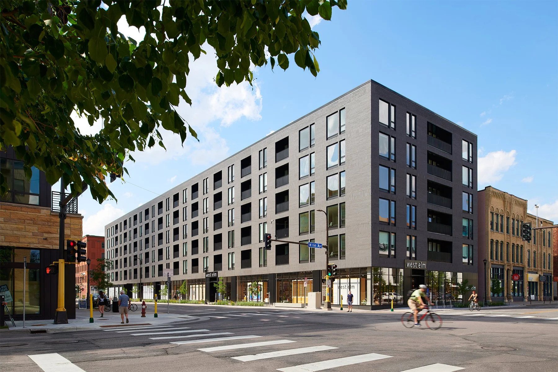
Second + Second stretches a full city block along North Second Street in Minneapolis’s North Loop. Photo by Peter VonDeLinde.
FEATURE
There is a rhythm to the streetscape in downtown Minneapolis’s Warehouse District that is hard to find anywhere else in town. Building lots continuously hug the sidewalks, which on most days hum with pedestrian life. The area’s dense and varied verticality isn’t an imposition. And while this rhythm isn’t always steady or even pleasing to the eye, the district’s continued evolution into a thriving live-work-play neighborhood is an ode to the bustle that once made it the largest distribution point for agricultural goods in the world.
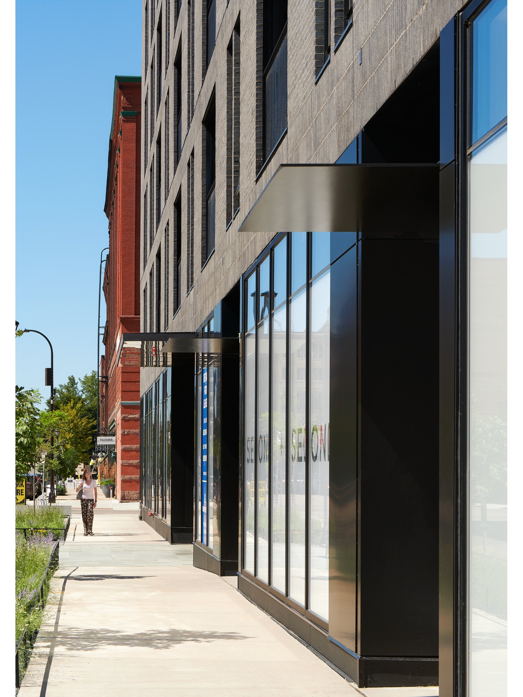
Playing a key role in that evolution is Second + Second, a six-story, mixed-use rental apartment building that opened in May 2020. “This is an area where a lot of people walk, so paying attention to the pedestrian scale was important,” says Snow Kreilich Architects’ Matthew Kreilich, FAIA, the project’s lead designer. “So often, a building’s energy is pushed to the rooftop. But here, we wanted to find a modern design language that worked for people at street level, where each time you pass the building, you pick up on something new.”
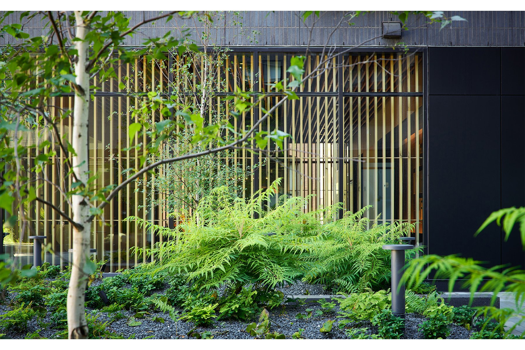
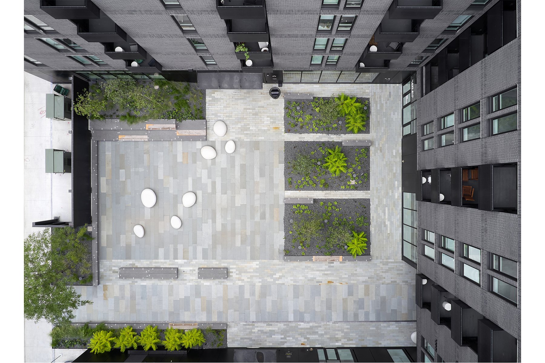
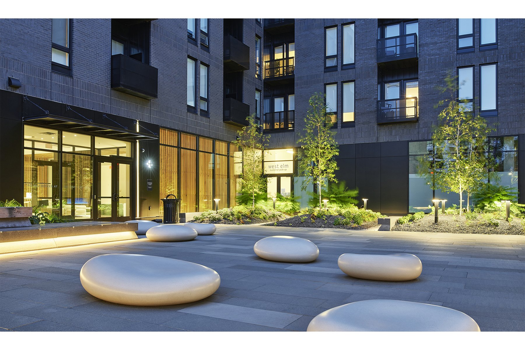
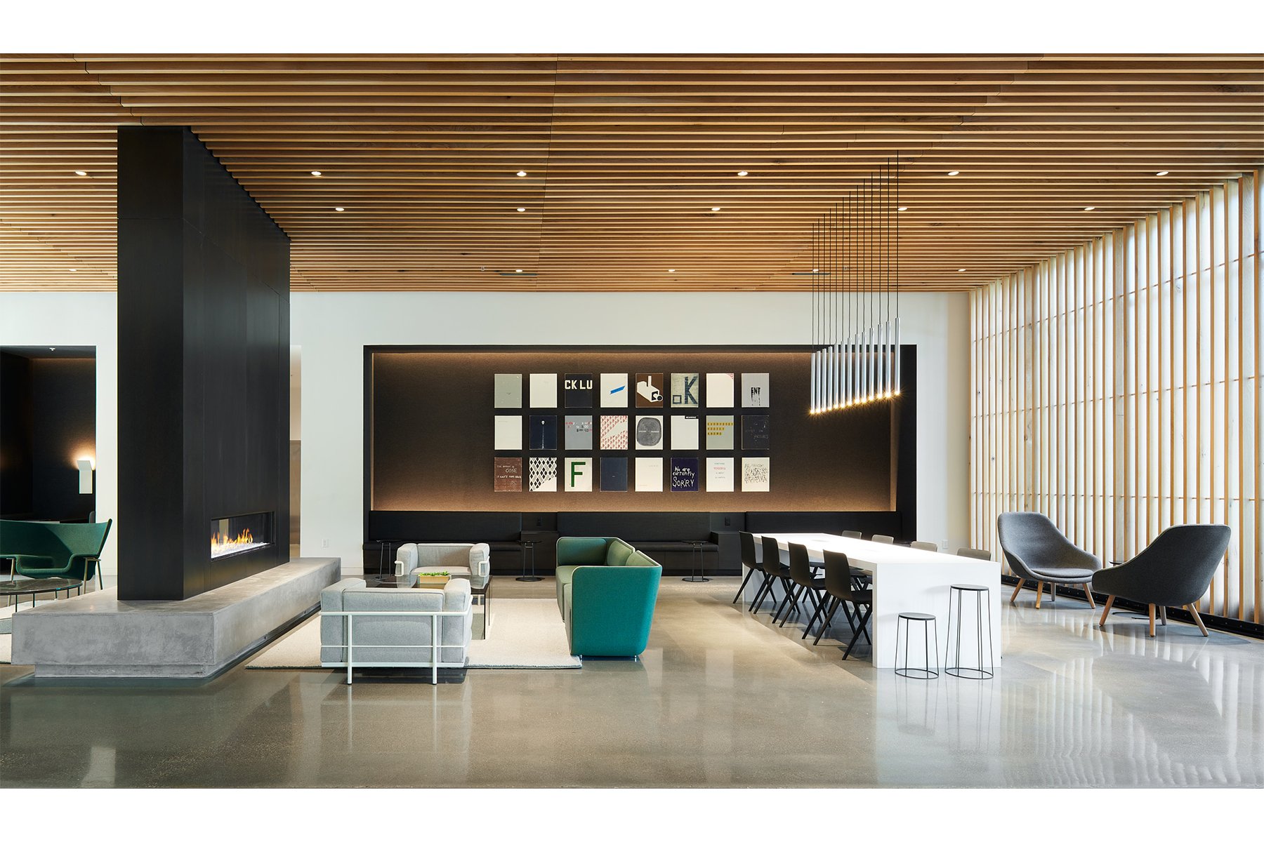
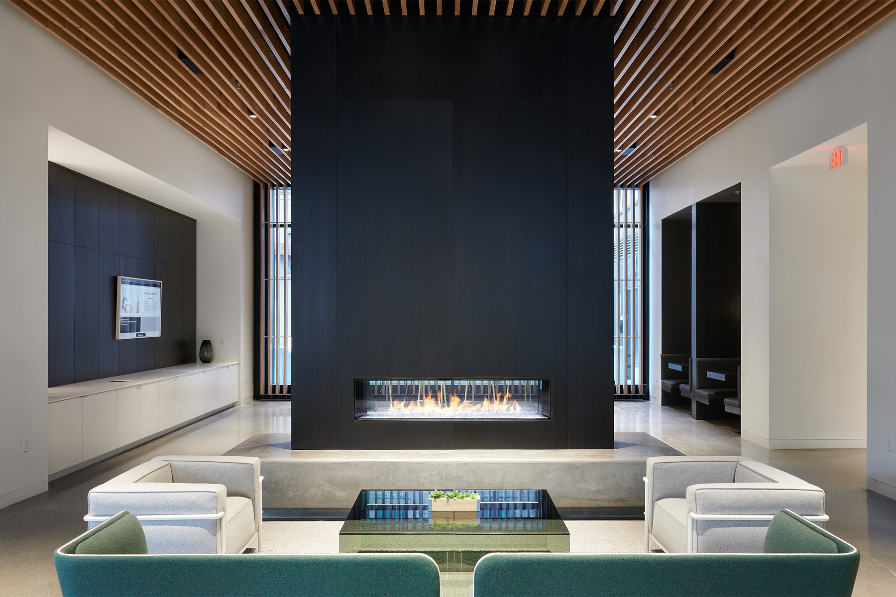
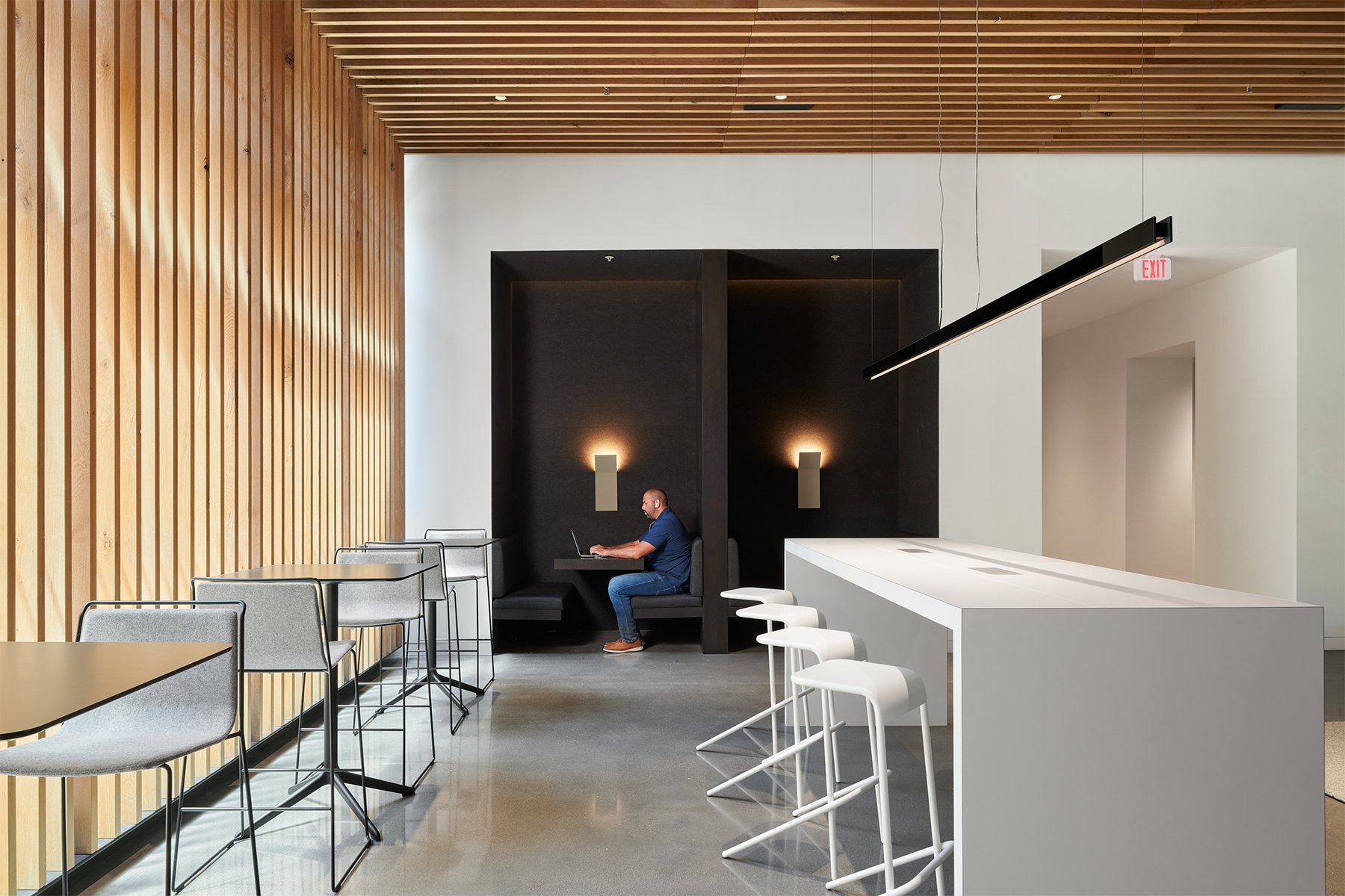
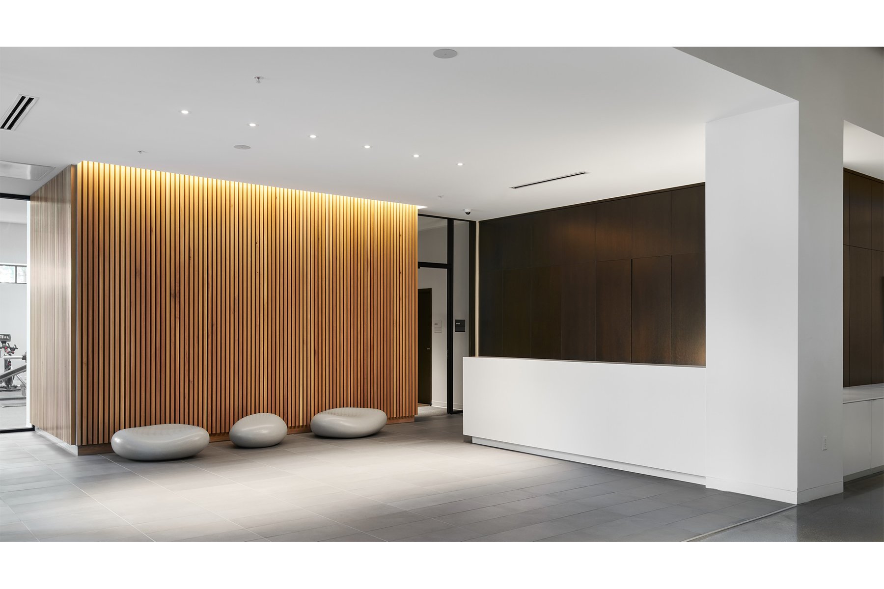
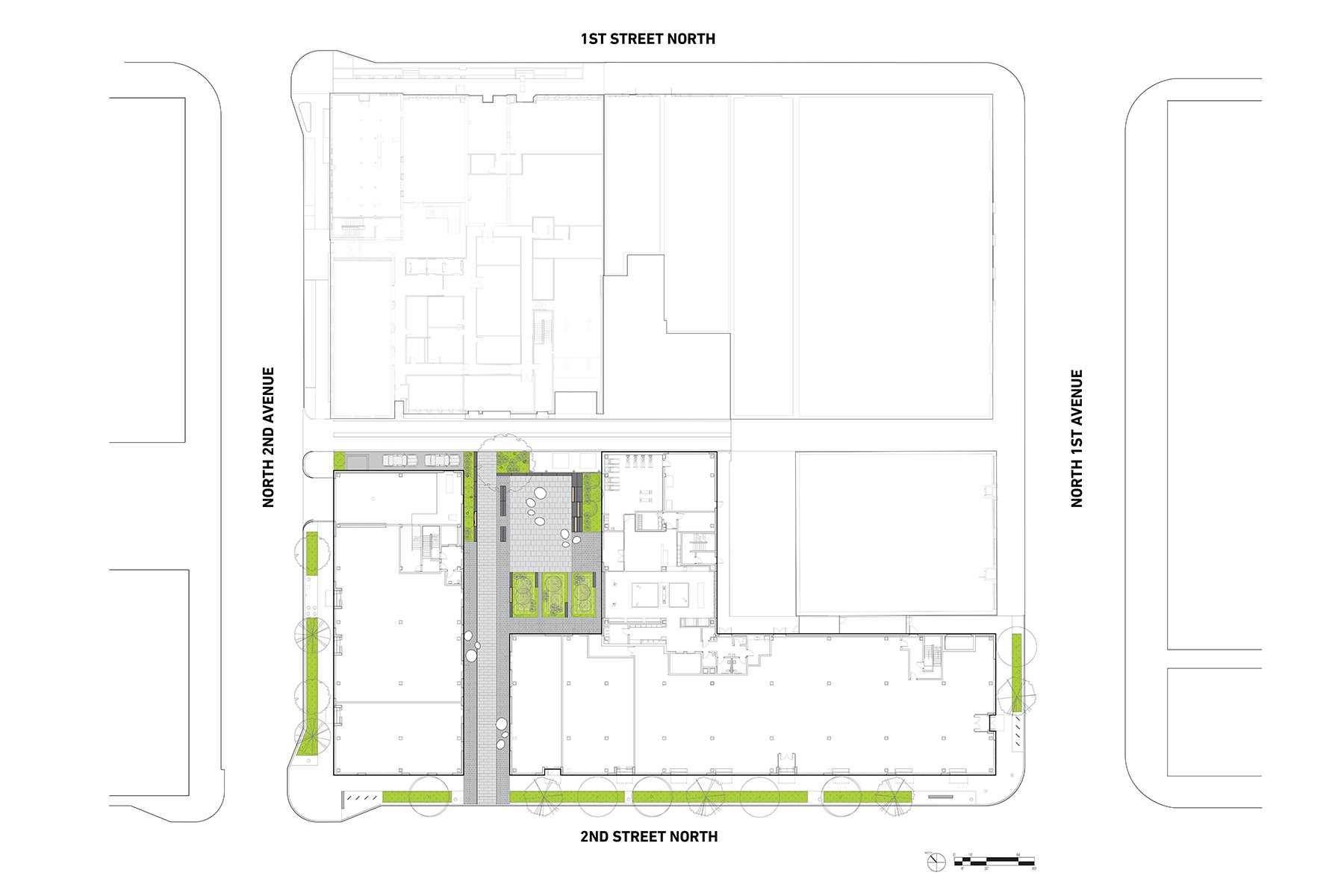
Images 1–10: The masonry facade—unusual for multifamily housing—nods to the district’s history. But the open-to-the-public interior courtyard, reached via a wide pedestrian portal on North Second Street, and the airy, clean-lined interiors are decidedly modern. Photos by Peter VonDeLinde. Site plan by Snow Kreilich Architects.
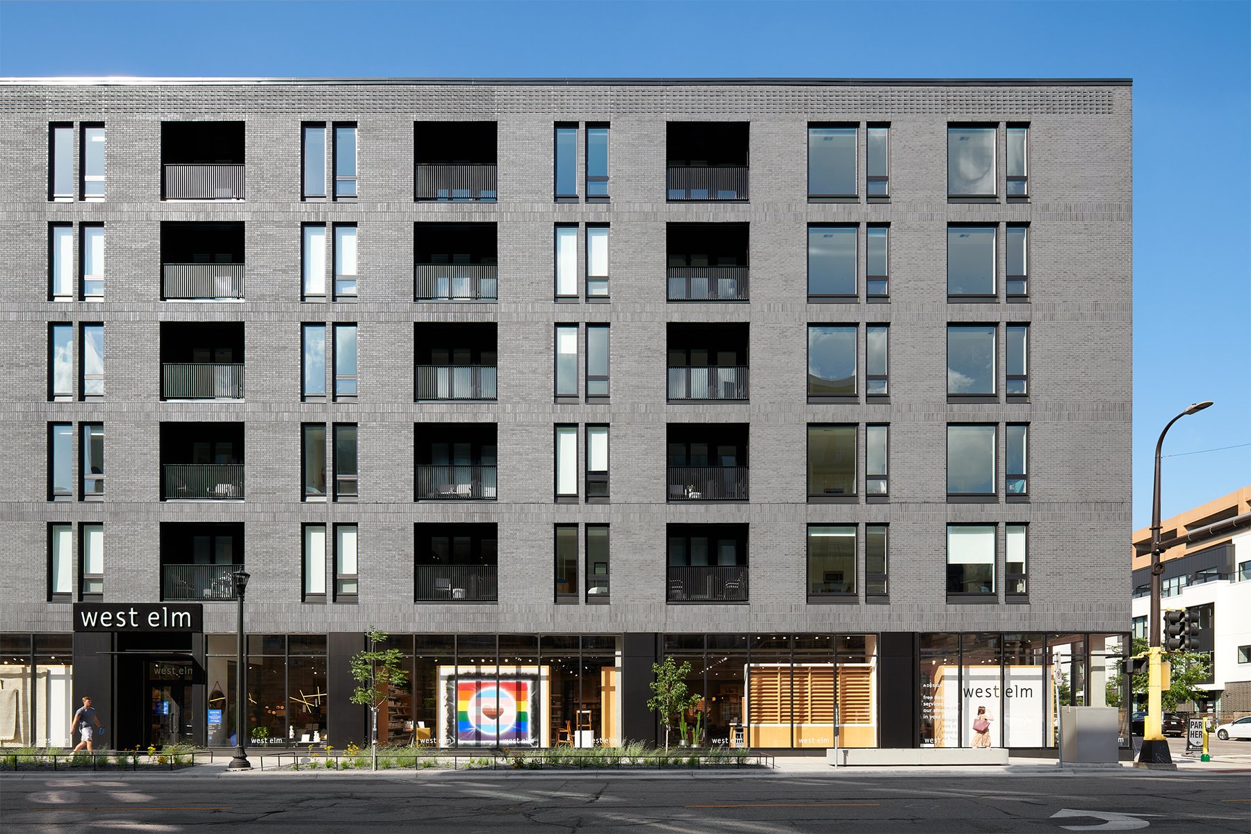
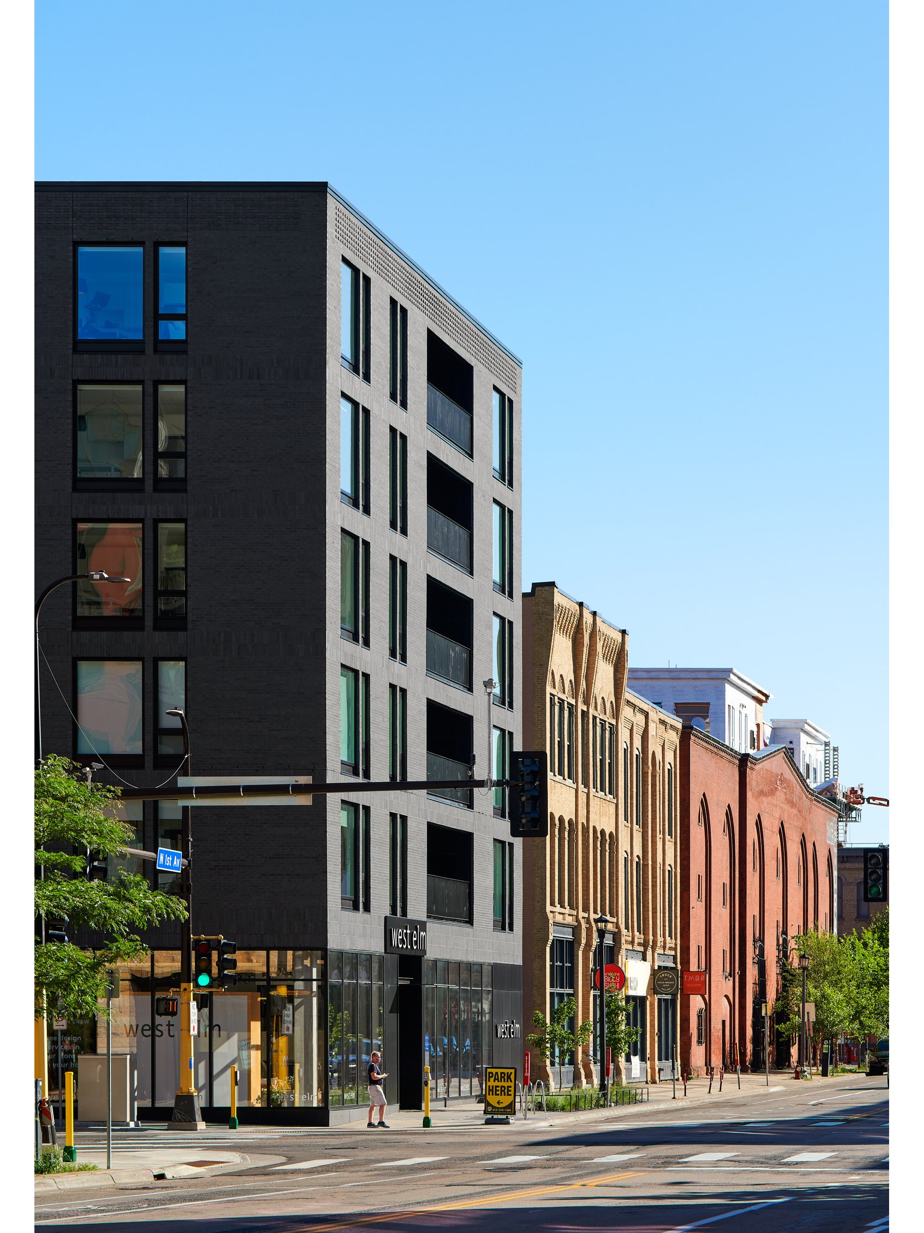
The building’s detailing is pleasingly subtle. Clad in dark brick that shifts to bands of soldier coursing between levels, the rising facade features metronomic alternations of punched windows and recessed balconies. Along the upper edge, evoking a cornice, individual bricks jut out at diagonals to form a pattern that resembles braille. “It’s a modern interpretation,” says Sharon Cohn, president of Solaris Vail, the property’s developer. “We asked the question: How can we simplify this, make it beautiful, and have some of the detailing of historic buildings but in a modern way?” Cohn also notes that Second + Second is “full brick up to the sixth story. You don’t often see that, not in true masonry.”
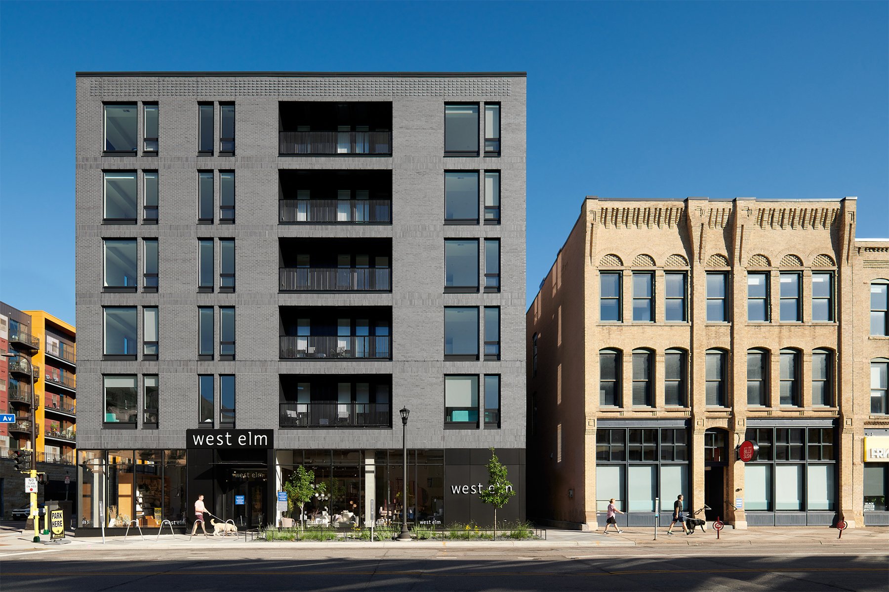
In its location, Second + Second communicates history in motion. “We’re in the 19th-century sector of the Warehouse District,” says Snow Kreilich’s Katie Blaisdell, AIA. (The firm’s office is just one block away.) “The area is known for narrower building faces and smaller lots,” she says, owing to construction practices at the time, which comprised simple load-bearing masonry walls around a wood frame. Up close, Second + Second’s brickwork evokes that early industrial era, yet the building spans an entire city block—a scale that wasn’t commonplace until the 20th century.
“We wanted to find a modern design language that worked for people at street level, where each time you pass the building, you pick up on something new.”
“The building stands at the transition between the 19th-century and the 20th-century Warehouse District,” says Meghan Elliott, Assoc. AIA, whose firm, New History, advised the larger project team on adhering to the Minneapolis Warehouse Historic District’s design guidelines. “Around the turn of the century, as Minneapolis was growing, and with the arrival of the railroads, there was a westward expansion of the Warehouse District concurrent with the arrival of new materials, namely concrete. As you move west, the buildings get bigger, the windows get bigger. Minneapolis was an early innovator in concrete construction, and having that expertise allowed us to have bigger buildings.” Elliott says Second + Second’s location at that historical transition “supports Snow Kreilich’s design, which tells the story of the district moving from the 19th into the 20th century.”
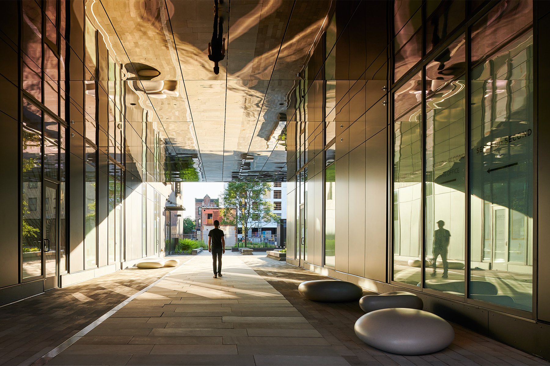
Which isn’t to say that Second + Second’s design is outmoded—far from it. The building’s crisp exterior geometries are unmistakably modern, as are the airy interiors, including a spacious lobby with an array of contemporary furnishings for working and socializing. Another modern gesture is an interior courtyard that’s open to the public. “The building’s actual address is off the courtyard, not the street, which is a little unusual,” says Kreilich. “We like to blur those boundaries between what’s public and private and create some amenity at the street scale.”
Images 1–2: Like its historic neighbors, Second + Second hugs the street. Photos by Peter VonDeLinde.
Pedestrians access the Ten x Ten–designed courtyard—an understated pocket of stonework, pavers, and light vegetation, with seating—via a wide “portal” whose ceiling is lined with reflective bronze-tinted, stainless-steel panels. The portal and the courtyard, which contain off-street retail entrances, are noteworthy contributions to the pedestrian pulse of the neighborhood.
For its thoughtful approach to its historic setting, the project received a 2020 AIA Minnesota Honor Award for achievements in two of the 10 measures in the AIA Framework for Design Excellence: Design for Integration and Economy.
Second + Second didn’t need to stand out from its surroundings to win the state’s most prestigious design award. “We wanted to quiet the voice of the building,” says Kreilich. “If you look at historic buildings in the area, they’re not afraid to be a building. They’re not trying to be multiple things with multiple fake facades. They have a rhythm and a language that works with their scale. It was important to just let the building be a building.”
The Second + Second project team included Solaris Vail, Weis Builders, Snow Kreilich Architects, Ten x Ten, Marx/Okubo, MBJ, Eian Design Lab, New History, TM Light, Collins Electrical, Major Mechanical, Fabick Architects, James Larson, Summit, Fluid Interiors, and Serigraphics.

