Pulling Back the Curtain on Haunted Houses
The operators of two popular Minnesota haunts share their approaches to designing for fear and fun
By Ann Mayhew | October 21, 2021
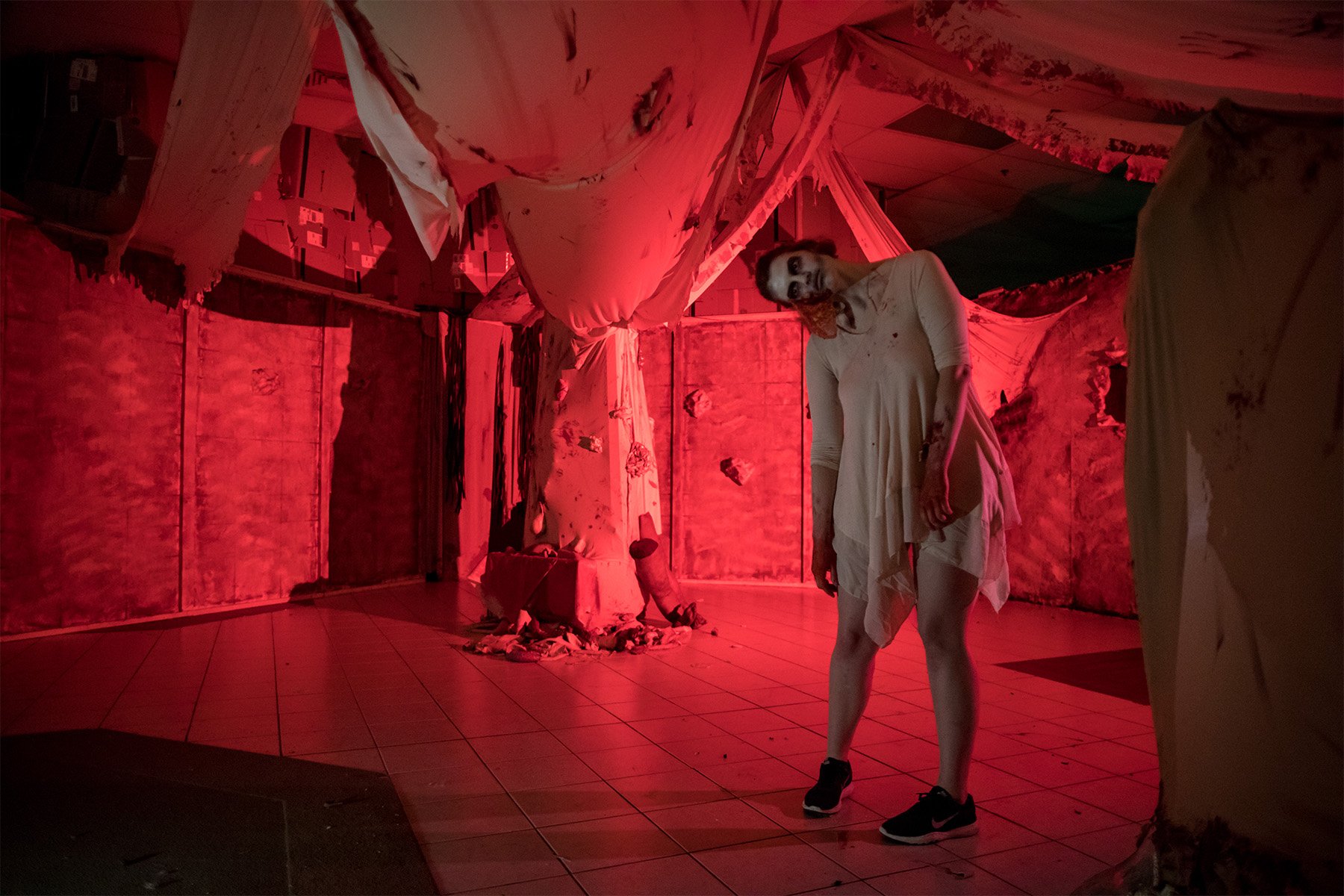
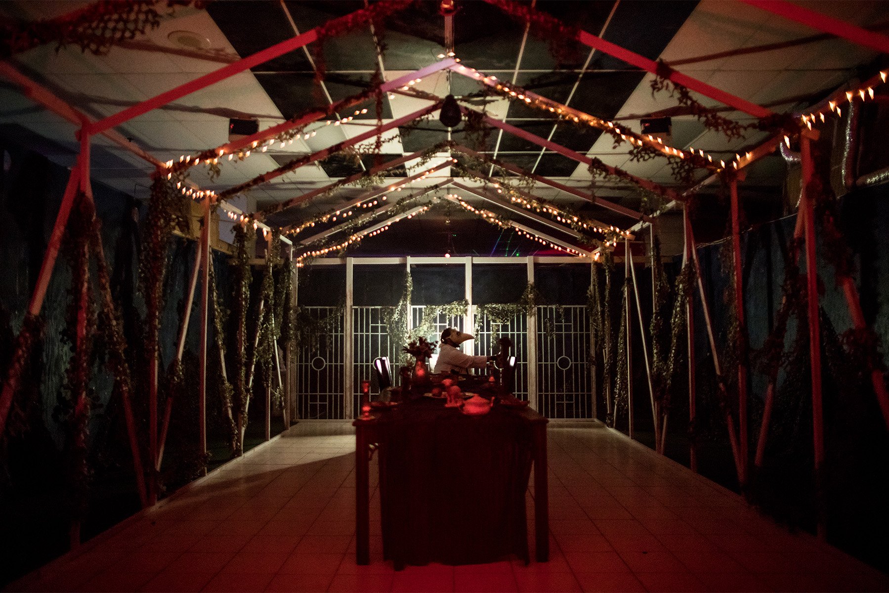
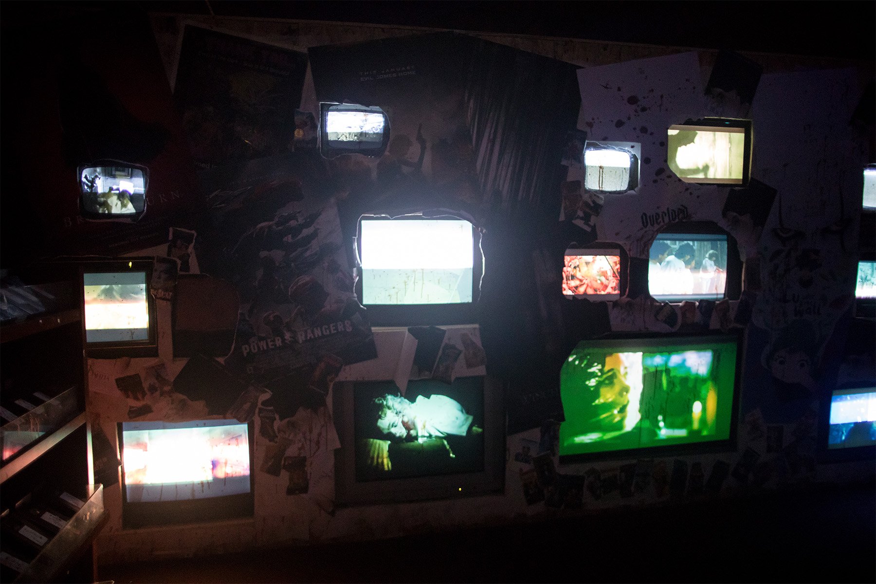
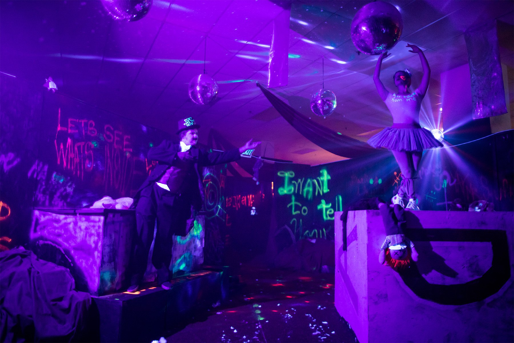
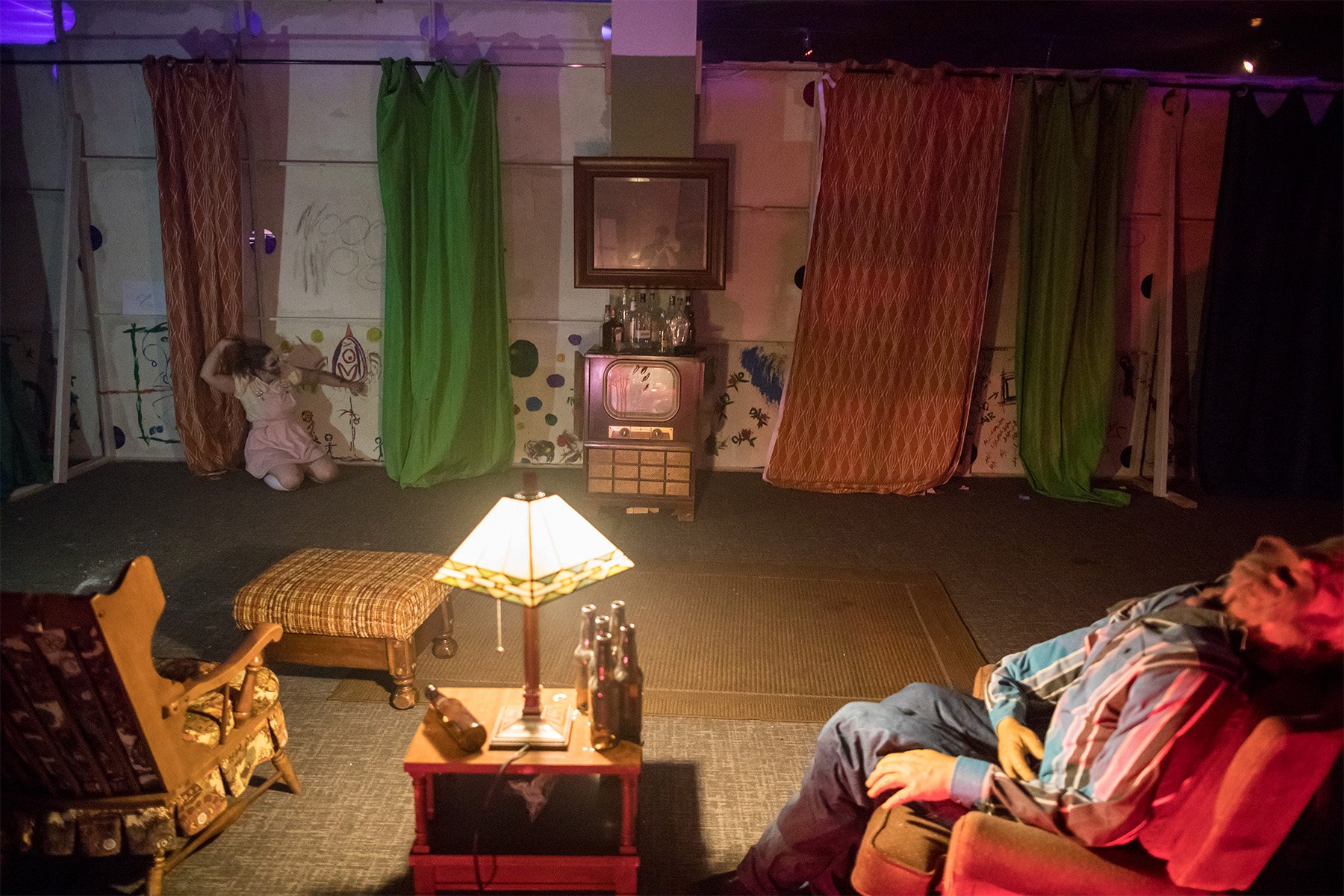
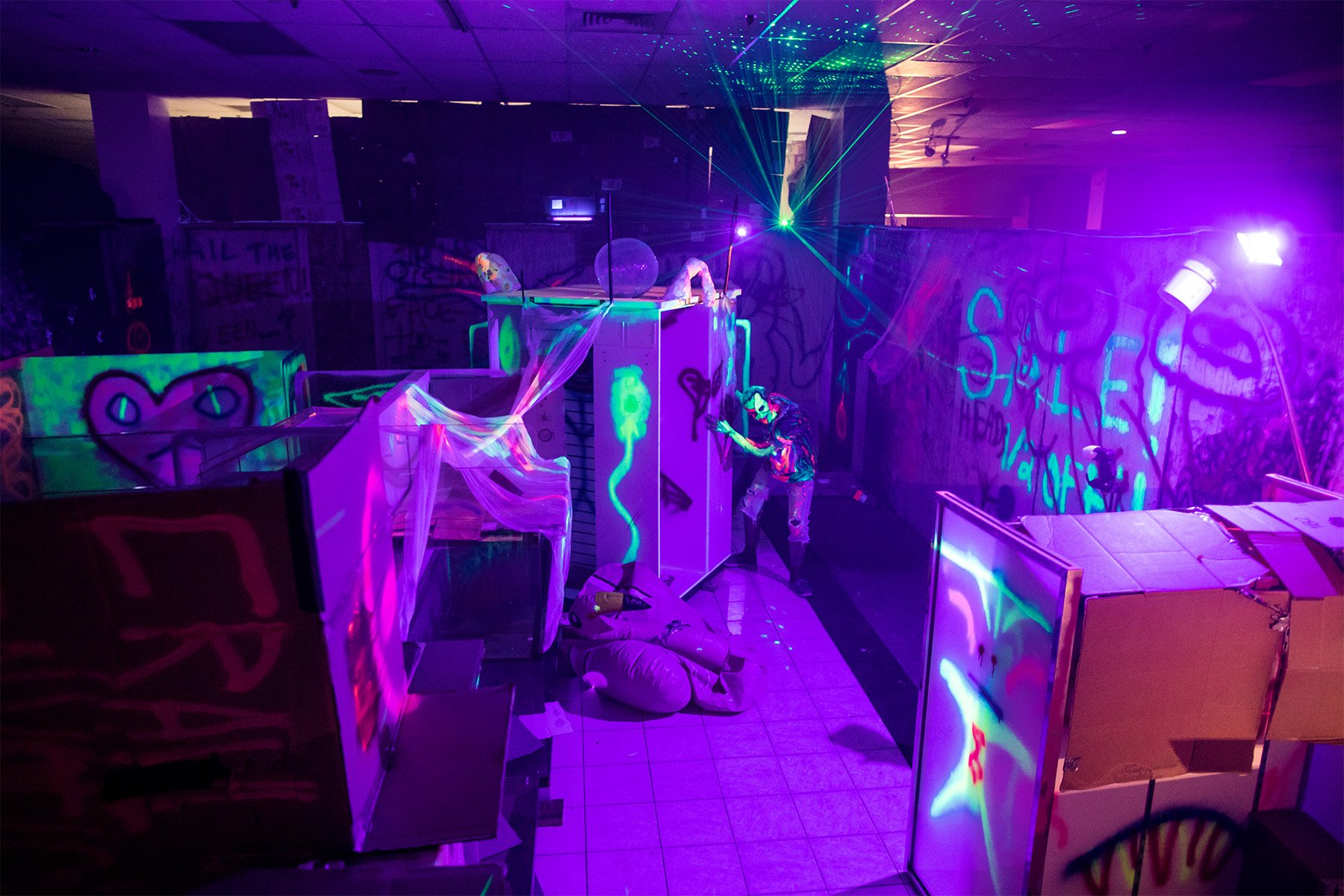
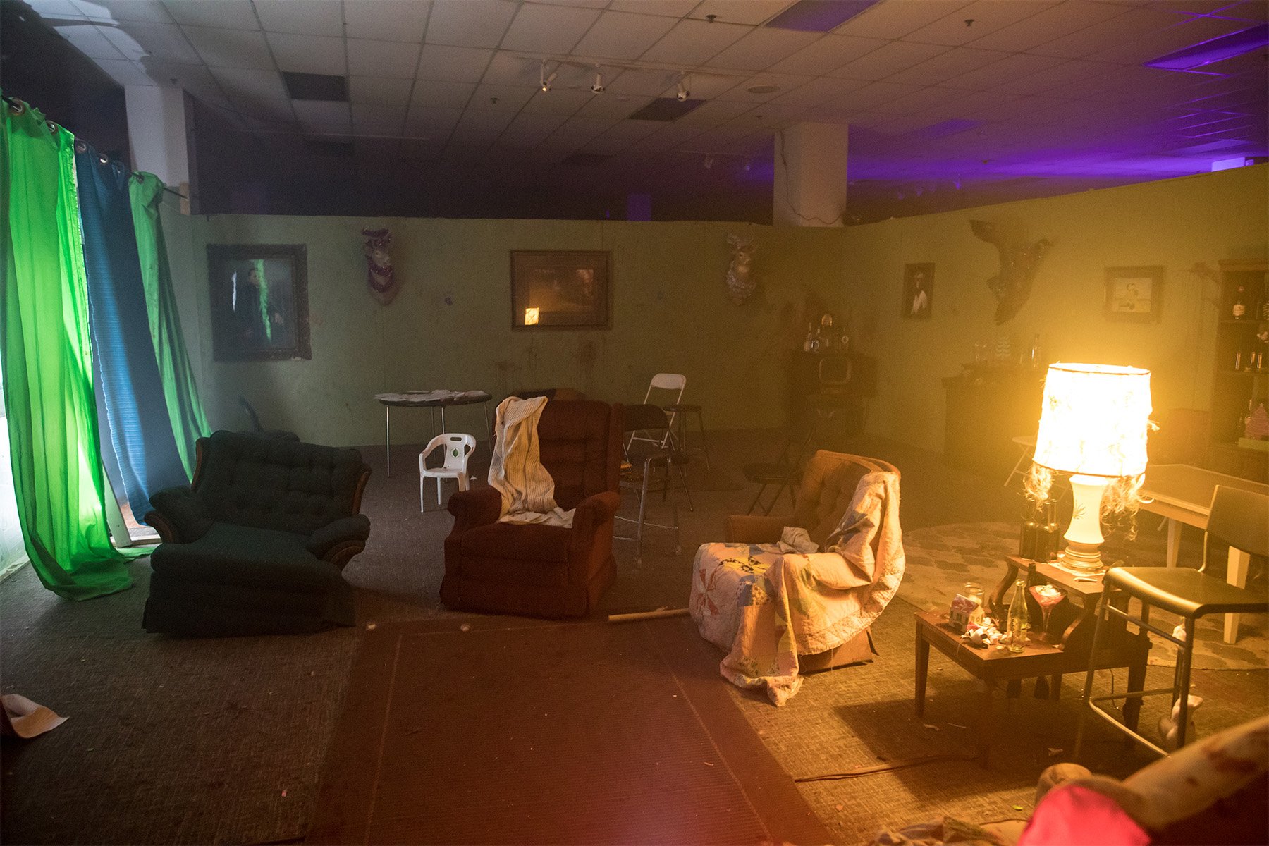
The Haunted Basement. Photo by Dan Norman.
FROM THE ARCHIVES
For most of us, a good scare consists of a boogeyman lurching out from a dark corner, or unexpected creaks and groans in our homes at night. But for haunted-house operators, the most frightening things in life are much more mundane, like the high cost of installing new bathrooms in a long-vacant warehouse.
“After people go through the Haunted Basement, they have [fake] blood on them, sometimes shaving cream,” says Walker Friend, executive director of the Twin Cities attraction. “To operate the way we want to, we need more than a thing of baby wipes and a porta potty for our guests.”
Adequate restrooms are just one aspect of the behind-the-scenes challenges for Halloween haunts, which include meeting building-code requirements in buildings and spaces often chosen for their feeling of neglect. “The biggest thing with the haunted-house industry is safety,” says Matt Dunn, owner of Scream Town in Chaska, Minnesota. “When you decide to do an indoor attraction over an outdoor one, everything changes—you need emergency exits, fireproofing fabrics and walls, and, most important, a sprinkler system.”
Scenes from the Haunted Basement. Photos by Dan Norman.
For the Haunted Basement, an indoor, not-for-profit scarefest whose past locations include the Soap Factory in Minneapolis and the now-demolished Herberger’s at Rosedale Center in Roseville, these code requirements go hand in hand with accessibility. “Every part of the experience needs to be accessible as much as possible,” says Friend. “The path for someone in a wheelchair needs to be exactly the same as the path for a patron without a wheelchair.” The Haunted Basement also offers sensory-friendly nights.
“One of the biggest hurdles is finding a building with a sprinkler system already installed,” says Friend. “A lot of these warehouse spaces—especially ones that are vacant and cheap—don’t have sprinklers in them.”
Dunn opted to set Scream Town outdoors, laid out as a maze, with the night sky serving as an atmospheric “ceiling” that fades into the background as guests anticipate what scare is around the next corner. The outdoor set has been a boon during the pandemic because it naturally maximizes air flow and has simpler code requirements than an indoor attraction.
“Sometimes we have to build it first, and then [we] come back and look at it from above and realize, ‘Hey, you know what? If we cut out a section of this wall, or if we create a particular cavity right here, the actor [in that position] can really increase their amount of scares.’”
The Scream Town team begins their design process each year by developing a theme, applying it to individual “rooms” within the outdoor maze, and finalizing the order in which the rooms will be experienced. They use both design software and wood planks onsite for layout, enabling them to view and walk through the plan throughout development.
“Ideally, when you have 10 actors in a haunted attraction, it should feel like 30,” says Dunn. “They should all be in areas where they’re able to scare to the left, scare to the right.” Dunn credits the haunted-house design theories of Leonard Pickel, who studied architecture at Texas A&M University in the 1970s and now owns Hauntrepreneurs, for revolutionizing haunt floor plans to maximize actors’ ability to surprise guests.
“Sometimes we have to build it first,” says Dunn, “and then [we] come back and look at it from above and realize, ‘Hey, you know what? If we cut out a section of this wall, or if we create a particular cavity right here, the actor [in that position] can really increase their amount of scares.’”
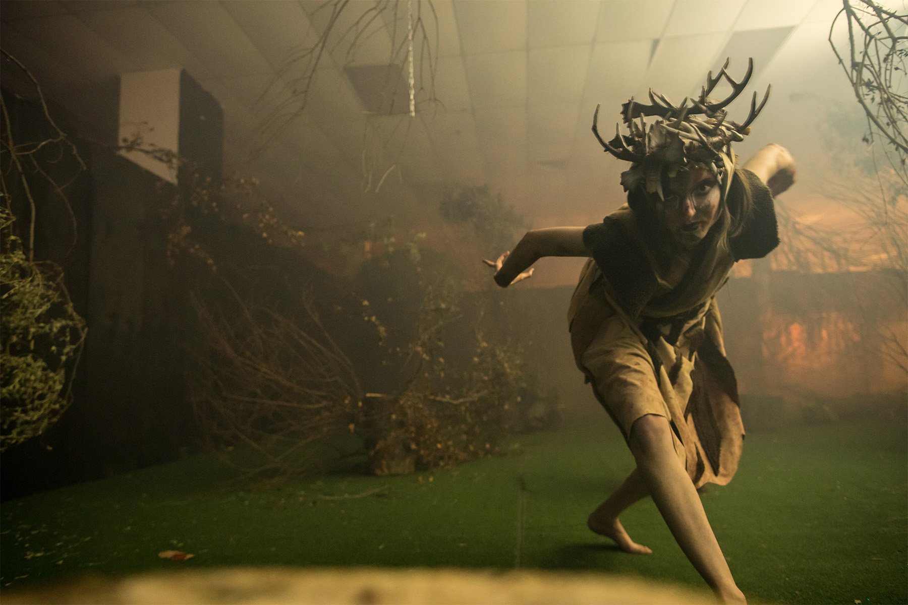
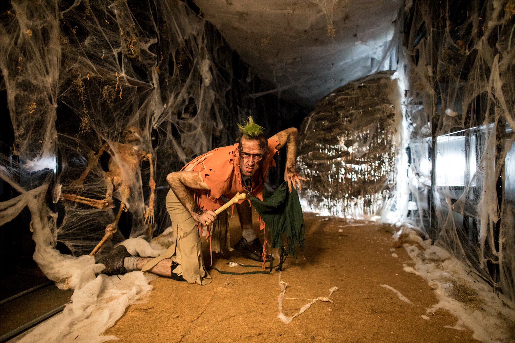
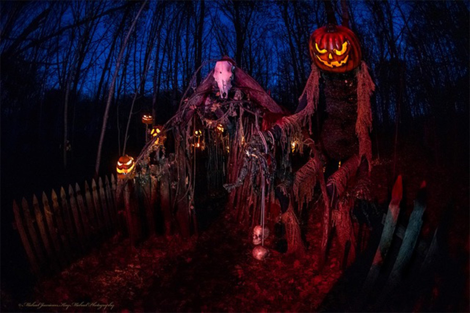
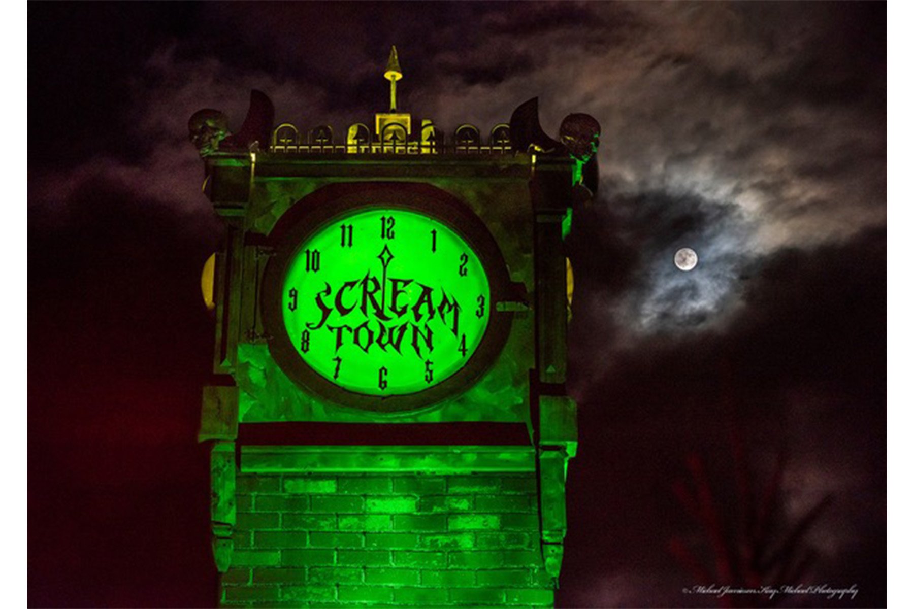
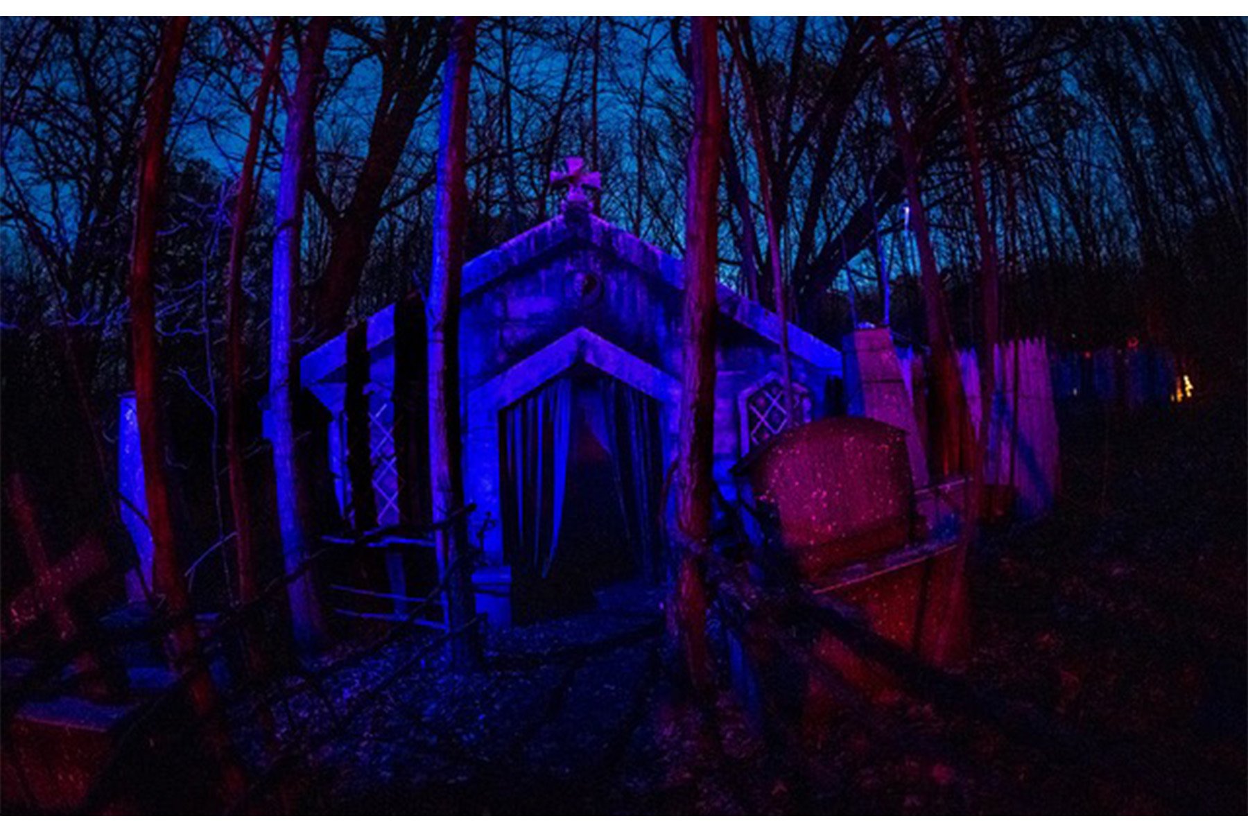
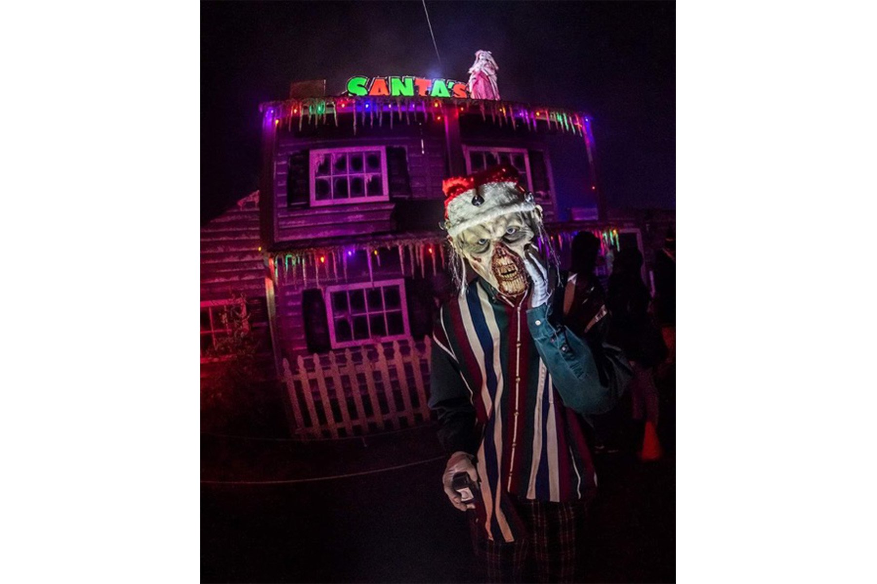
Scenes from Scream Town. Photos by Michael Jameson.
The Haunted Basement balances “jump scares” with what Friend calls “slow burns.” “It’s like a roller coaster,” he says. “You want ups and downs throughout the experience.” At the Haunted Basement, each room is designed by a different “director”; their goal is to ensure experiential variety, not alignment with an overarching theme.
Guest flow and the transitions between rooms are another crucial aspect of haunted-house design. If they’re done well, they mostly go unnoticed by patrons. If they’re not, they can disrupt a deeply immersive experience.
“To someone who is in the dark, scared, an obvious path can become much less obvious,” says Friend. He cites as a past example the use of a flickering light to mark a doorway; it worked well on paper, but in practice it left guests figuratively and literally in the dark. Often, circulation issues become apparent only after the haunt opens, requiring quick interventions. In the example above, the Haunted Basement painted a directional arrow on the wall.
Unnerving smells, too, help create an atmosphere in which the actors can work their magic. “In 2019, [we had a room] that was meant to be a cabin, and the smell inside was like rancid roast beef,” says Friend, with a hint of a smile in his voice. “The smell just made the room more cohesive and unpleasant.”
“At the end of the day, we want to scare people, but we also want them to have a good time,” he adds. “Sometimes, just a room smelling viscerally awful makes it a success. Set design goes along with that.”

