Nine Inspired Spaces for Working from Home
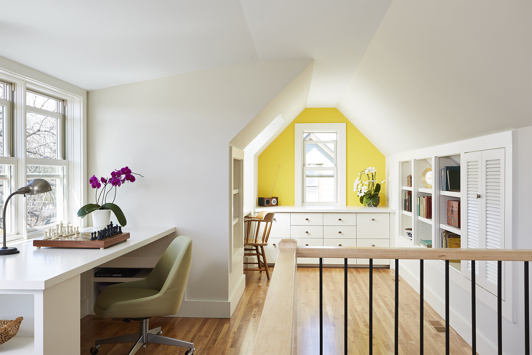
Attic office by Christopher Strom Architects. Photo by Alyssa Lee.
SPOTLIGHT
These solutions for different rooms in the home will make you rethink your own home workspace
By Amy Goetzman | February 4, 2021
Design by Mitlyng Design. Photo by Half Acre House.
Guest Suite
“This addition was designed to provide maximum flexibility over the course of a growing family’s life,” says Mitlyng Design’s Ashley Mitlyng, AIA. The space can be used as a guest bedroom for visiting grandparents, or, in the future, a bedroom for a teen who wants more privacy. It could also be a simple sunroom. Right now, it’s needed as a work-from-home space, but with the sofa being a pull-out, it’s ready to do double-duty. The suite flows off the kitchen and includes a bathroom and French doors to the deck. A sliding door lets the user create a quiet, separate realm.
Design by K Nelson Architects. Photos by Alyssa Lee.
Kitchen Island/Peninsula
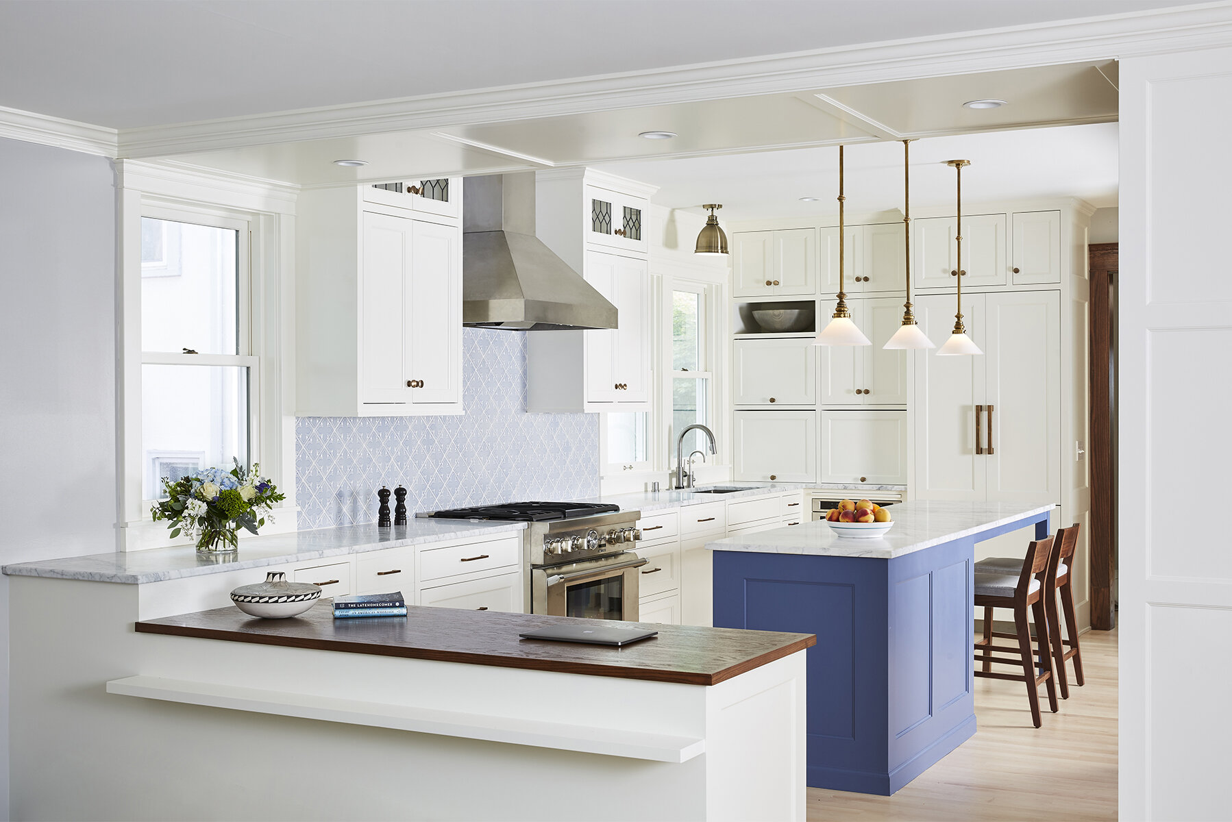
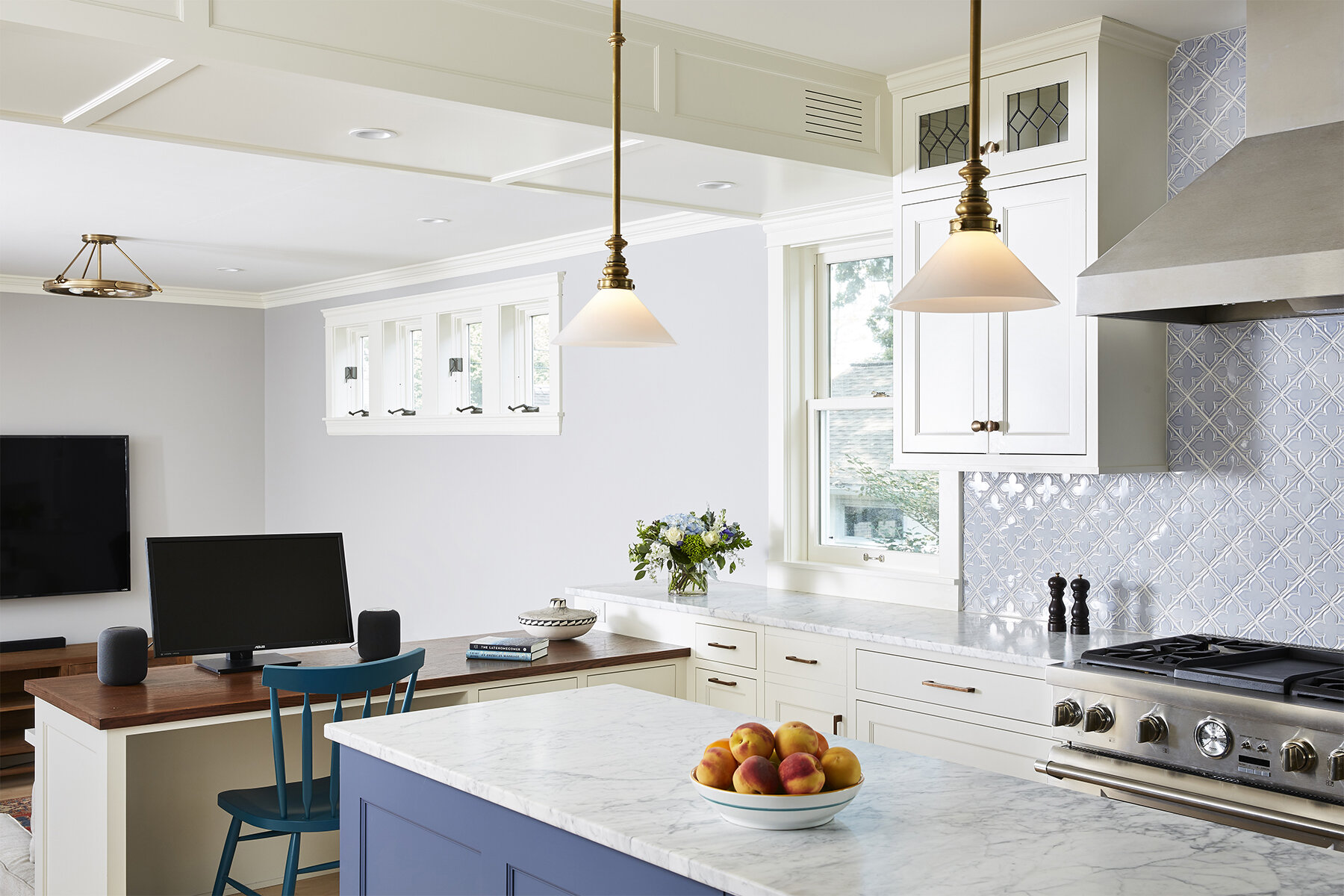
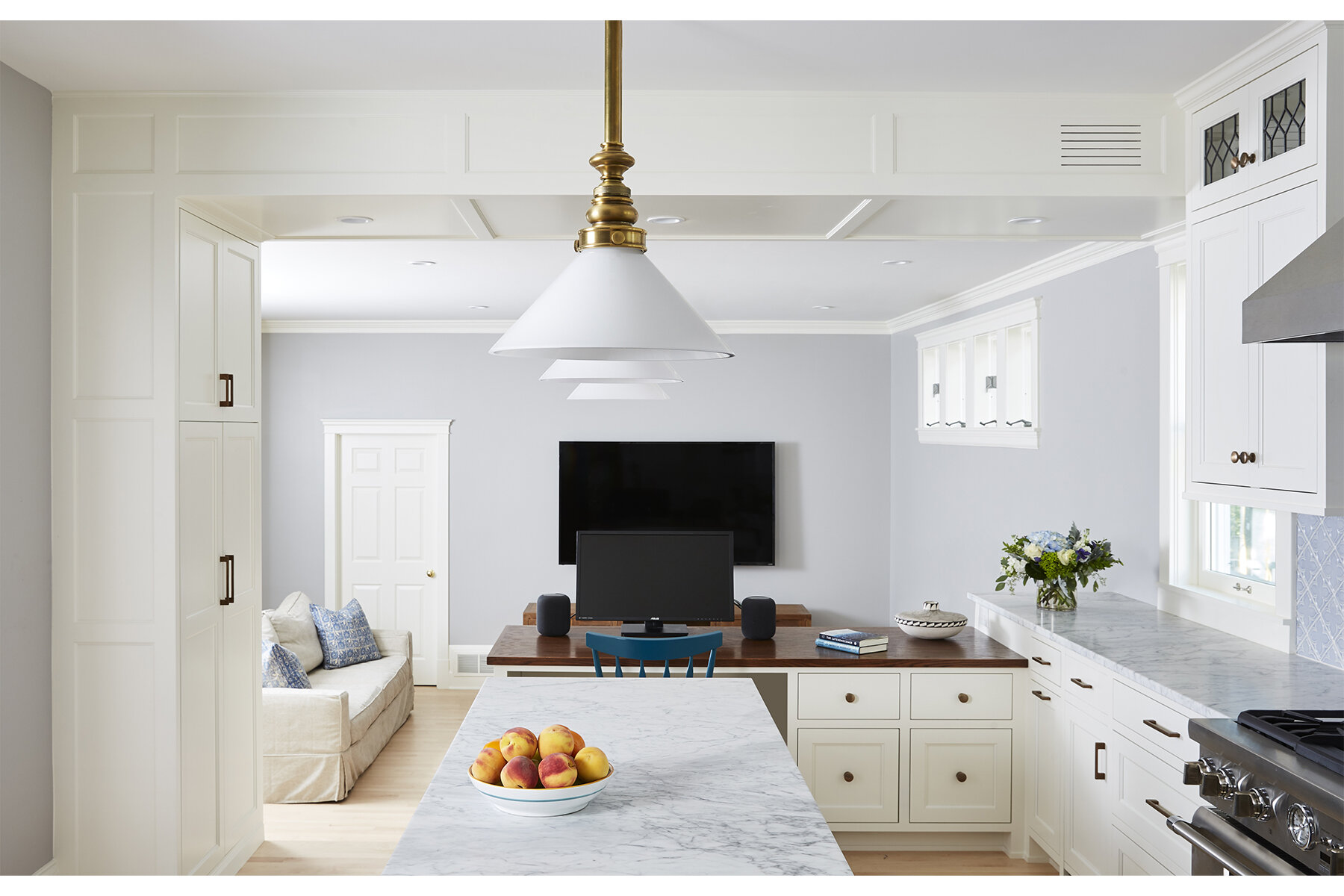
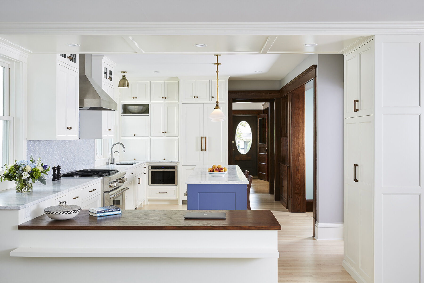
Anyone who works from home knows that scope creep is inevitable. Work materials spill into living spaces in a way that blurs the line between working and living. K Nelson Architects’ Kari Nelson, AIA, needed to carve out a workspace in the center of a home, one that felt separate yet gracefully part of the two rooms it adjoins. The resulting space could be described as a peninsula, but a separate dark-wood desk surface drops away from the kitchen countertop to designate it as an office zone. A lowered ceiling, unique cabinets, and a window further signal this as a transition space, no food prep allowed.
Design by K Nelson Architects. Photos by Seth Hannula.
Kitchen Nook
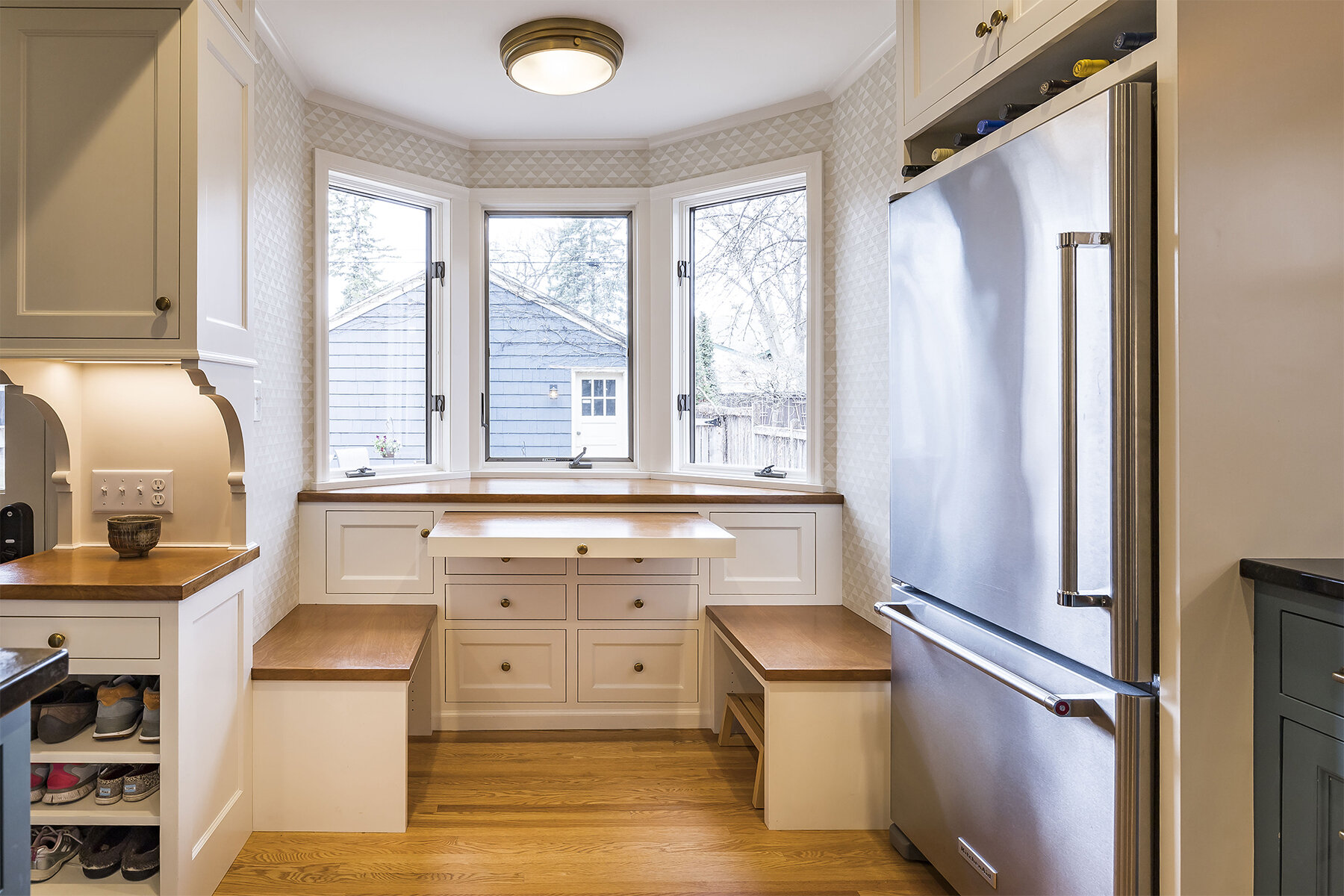
It’s a breakfast nook. A home office. A game room. A distance-learning classroom. It’s a space that morphs, with the help of a hidden tabletop and storage drawers, to accommodate the continually changing needs of a growing family. “That’s the work of design,” says Kari Nelson. “You need to look at how a space is needed now and in the future, and create a plan that balances present needs with the inevitable changes that come in how we use our homes.”
“That’s the work of design. You need to look at how a space is needed now and in the future, and create a plan that balances present needs with the inevitable changes that come in how we use our homes.”
Design by Rehkamp Larson Architects. Photos by Andrea Rugg.
Hallway
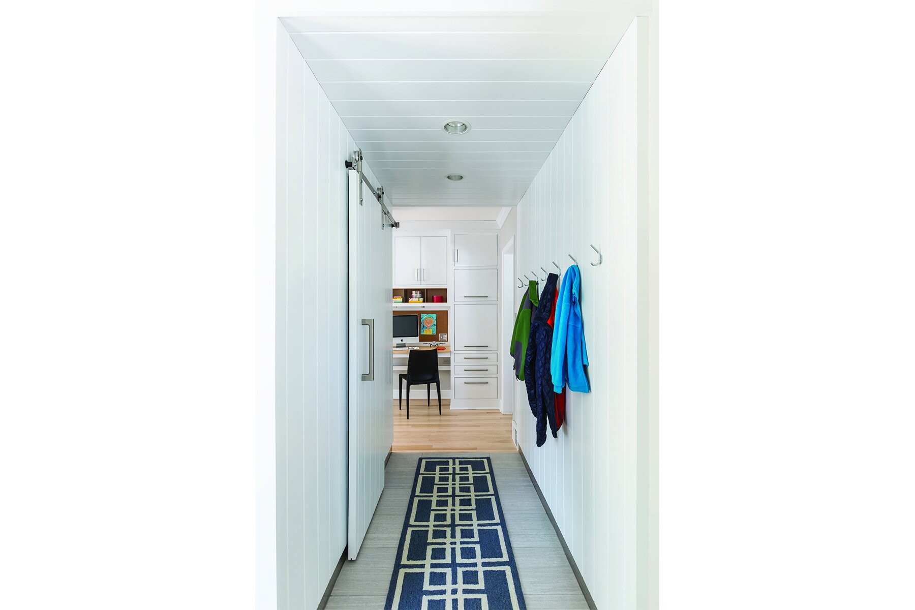
Kitchens built in the 1980s and 1990s often included a “command center,” says Rehkamp Larson Architects’ Jean Rehkamp Larson, AIA. “They were too small and close to the action to work as an office space.” But Rehkamp Larson’s version of a command-center office works exquisitely. Lining a hallway to the kitchen, this workspace has functionality designed into every square inch, from cabinetry to hide a printer and office clutter, to durable steel cubbies and a solid wood desktop that will endure real use and look good forever.
Design by Joy Martin Architecture. Photos by Peter Atkins.
Sunroom
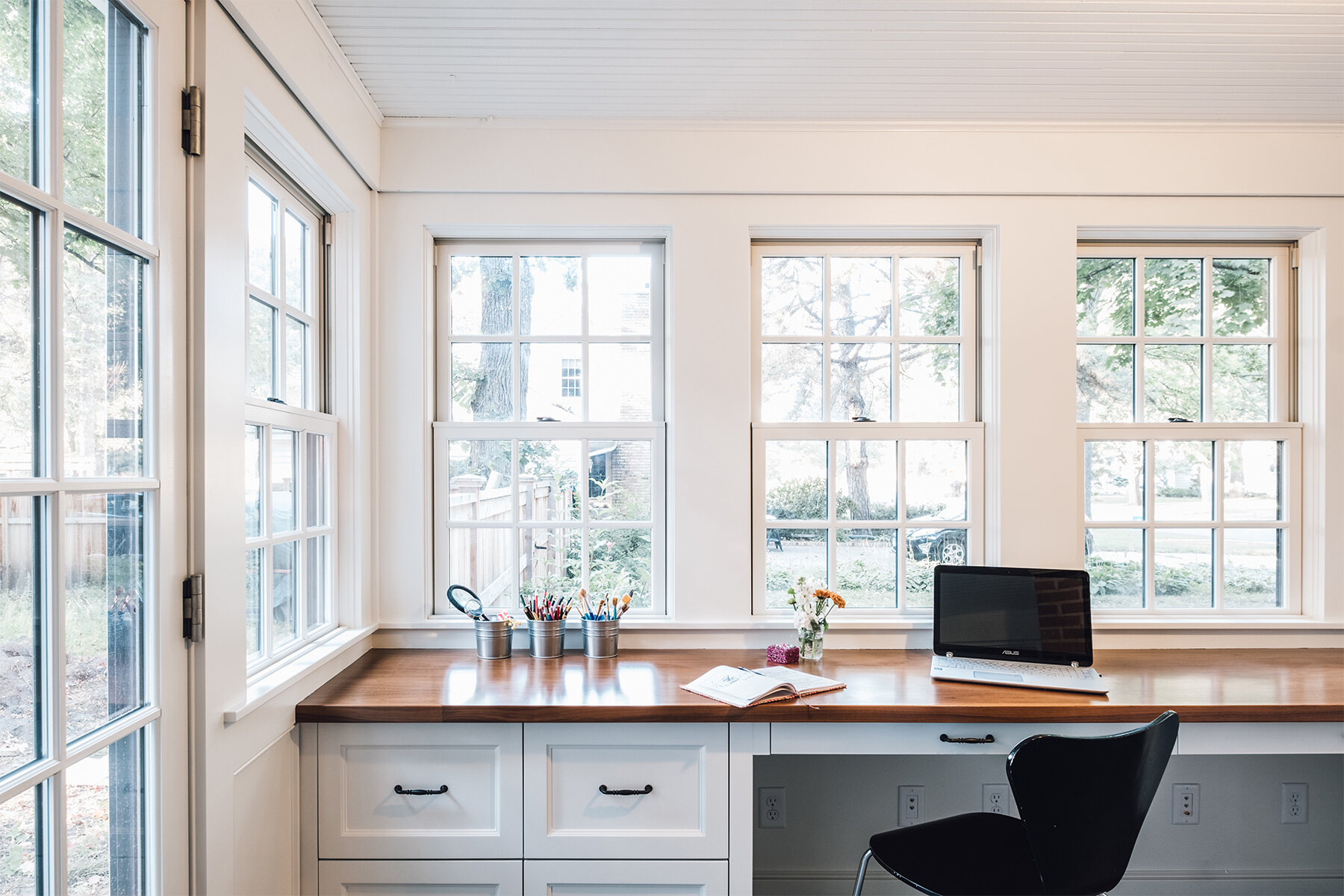
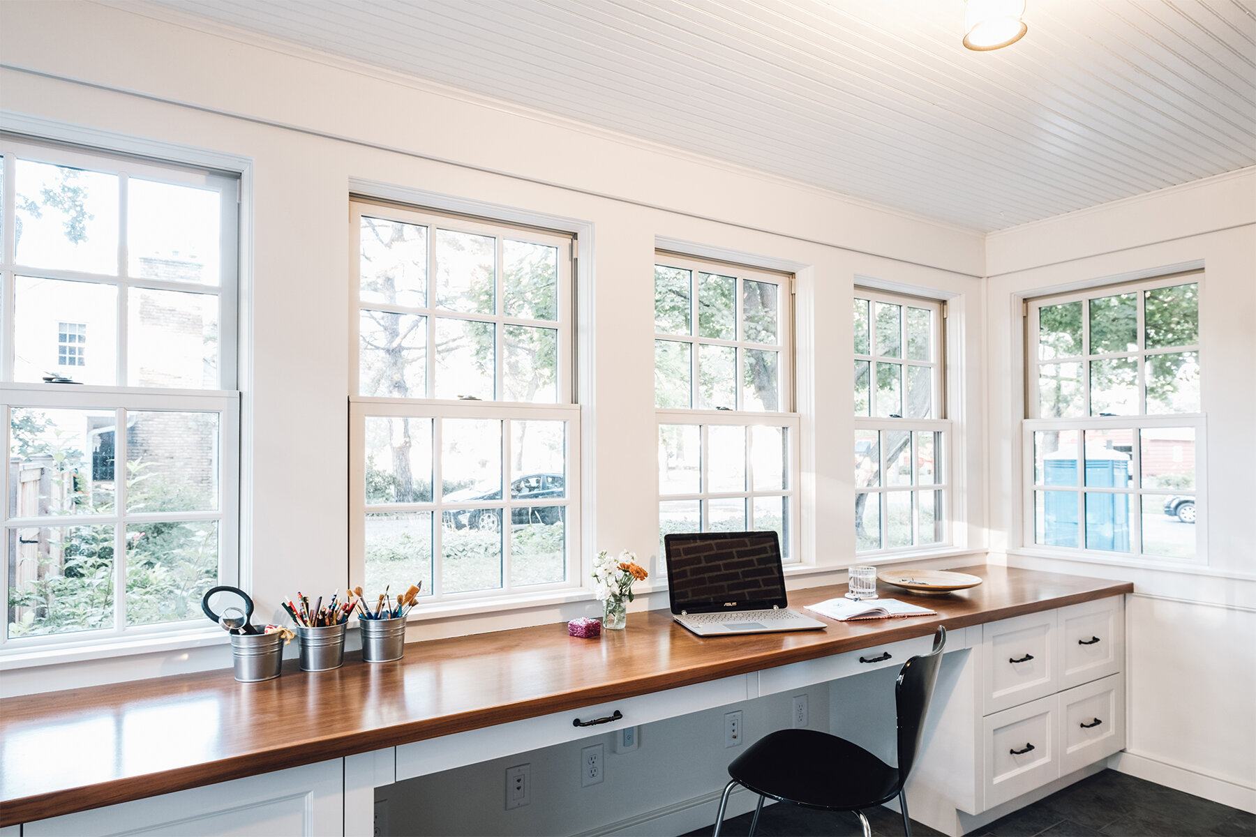
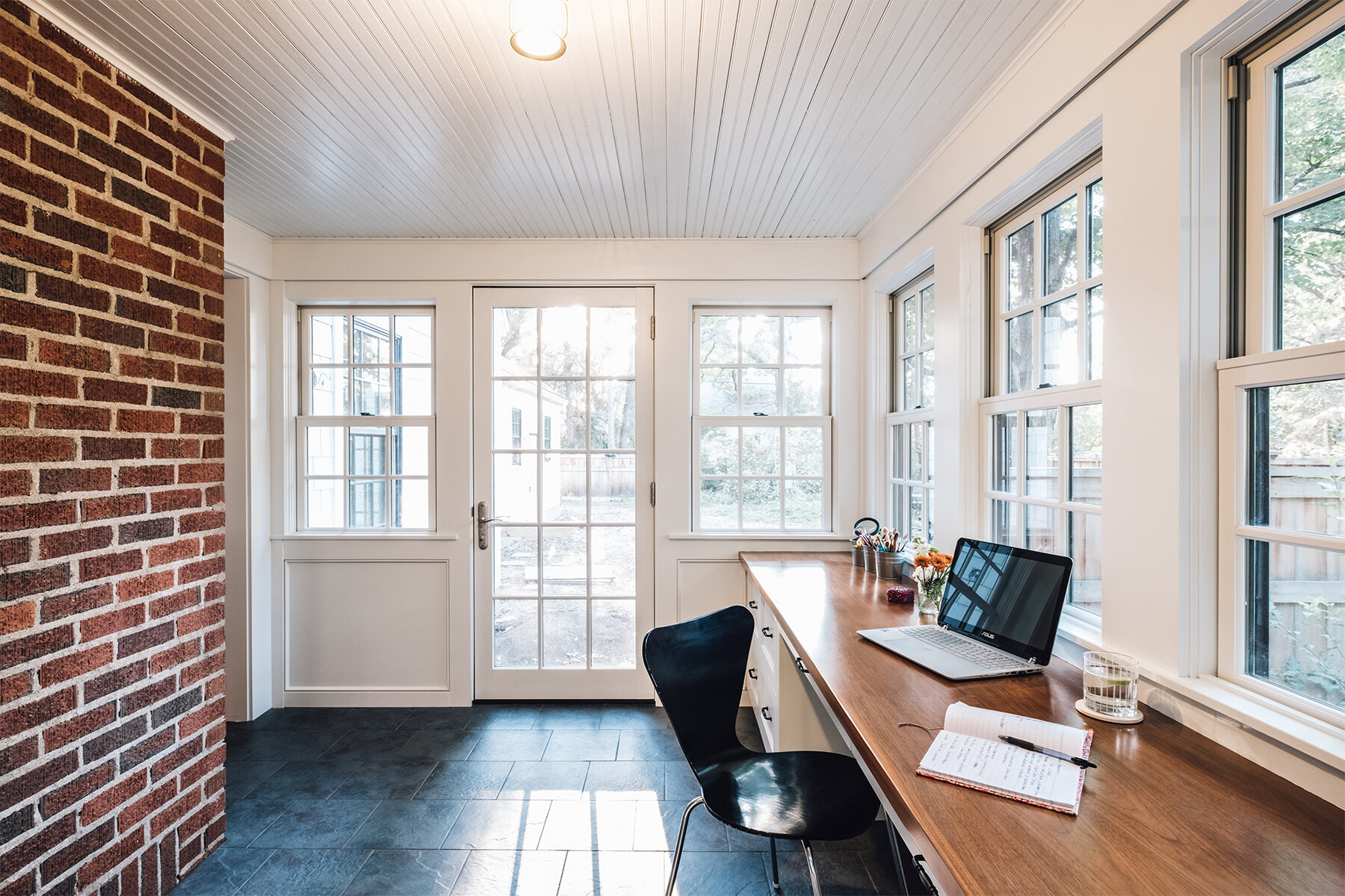
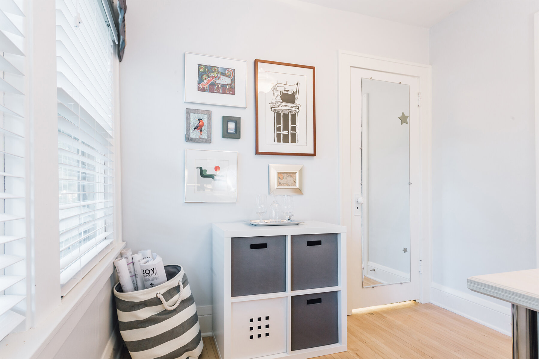
The oft-neglected sunroom can make an ideal home office. “With this project—a whole-house renovation and addition, the client wanted the renovation to unify the style of the home,” says Joy Martin Architecture’s Joy Martin, AIA. Martin carried the kitchen woodwork and trim details into the sunroom, replaced windows, and added a stunning 12-and-a-half-foot-long walnut desktop across the back wall, with built-in desk cabinets beneath. Attention to accessibility details, including a flush entry to the sunroom, will make it easier for the owner to age in place.
Design by Joy Martin Architecture. Photos by Peter Atkins.
Leftover Space
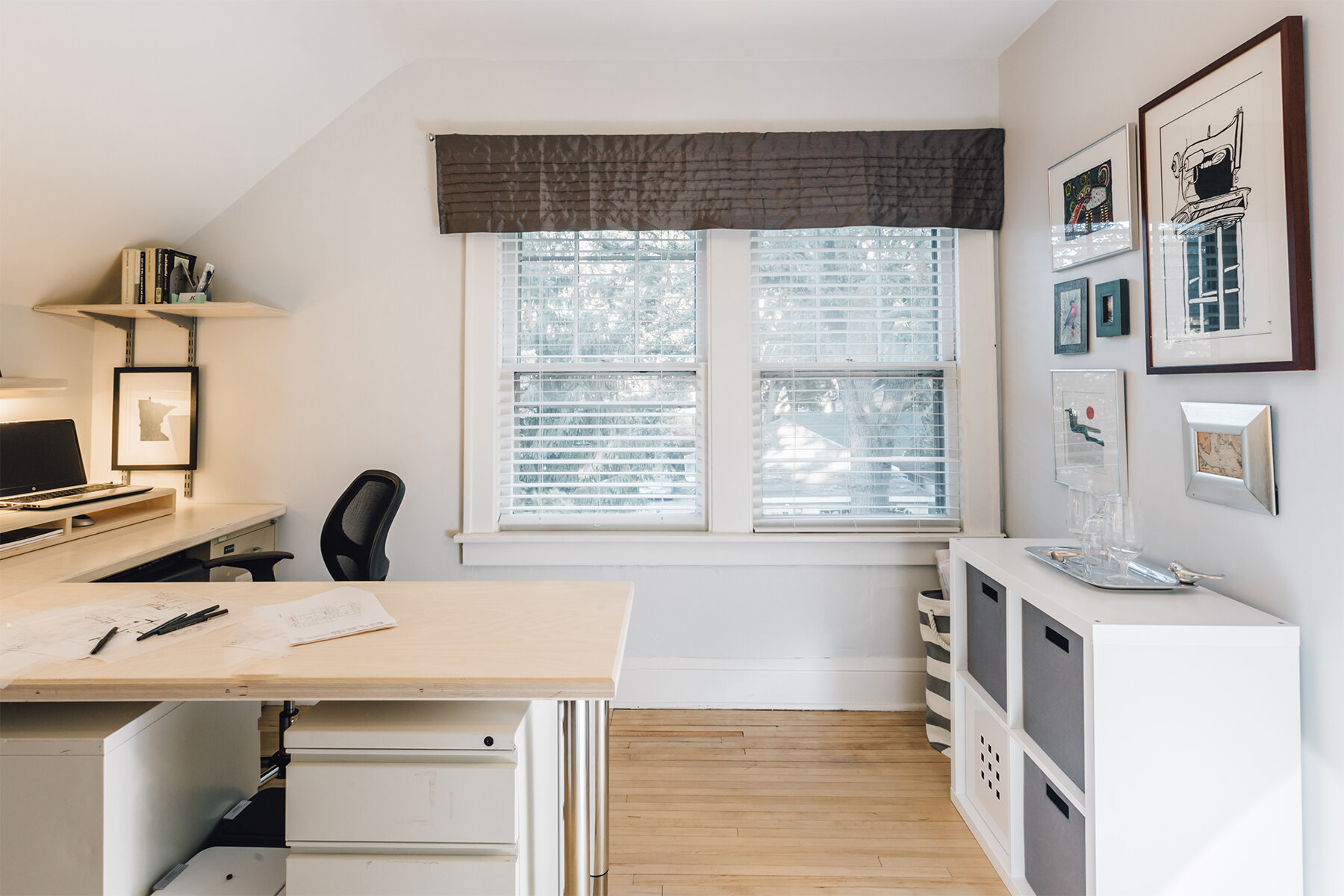
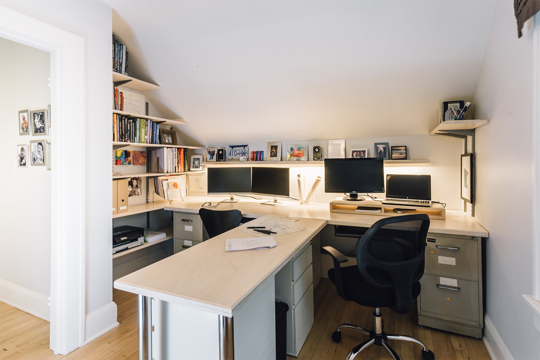
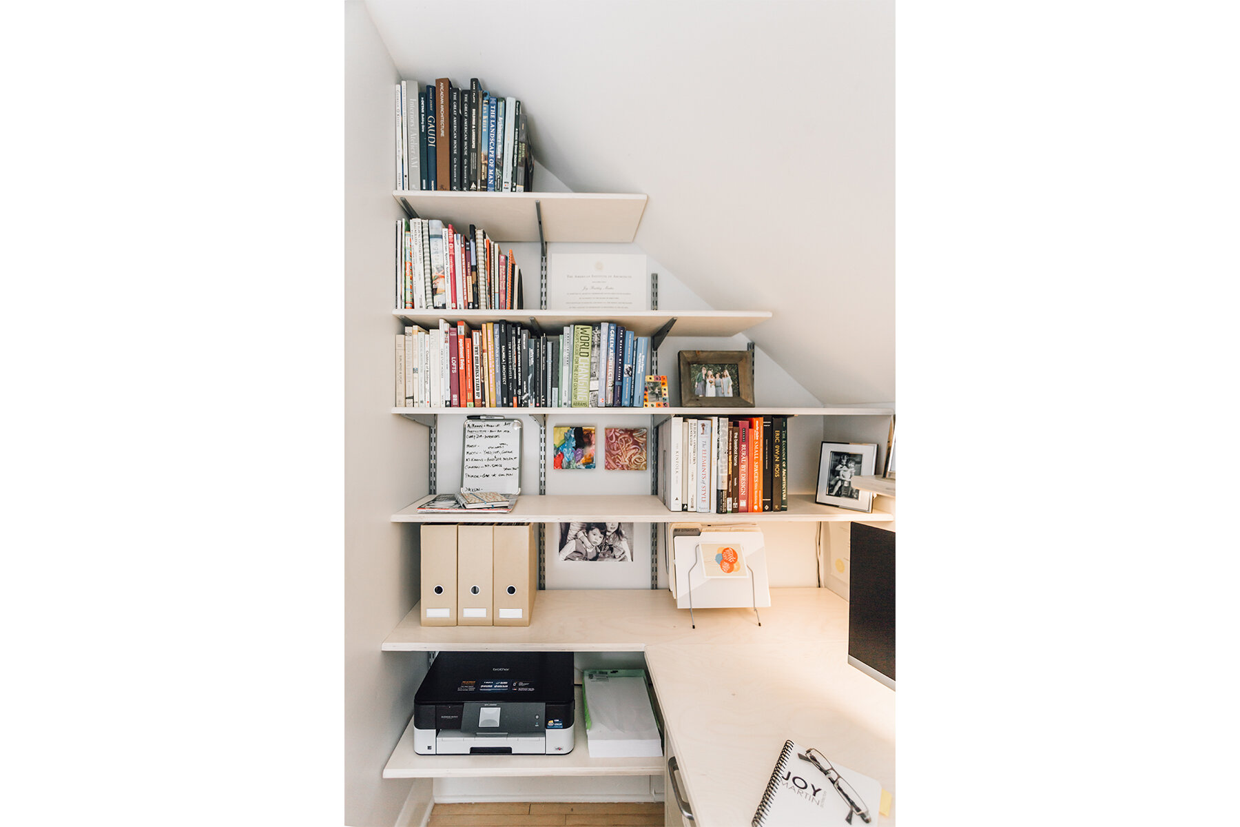
If you had ascribe this workspace to a particular profession, which one would it be? If you guessed architecture, you are correct. For her own home office, Joy Martin filled an underutilized second-floor space with a variety of storage features, a library zone, and expansive desktops for hand drawing and reviewing large plans. Clean Scandinavian birch and white furniture and storage units put the focus on the work at hand. A playful display shelf runs the long length of a wall. “I feel like every office should include a space to display things that bring you happiness,” says Martin.
Design by SALA Architects. Photos by Gaffer Photography.
Guest Bedroom
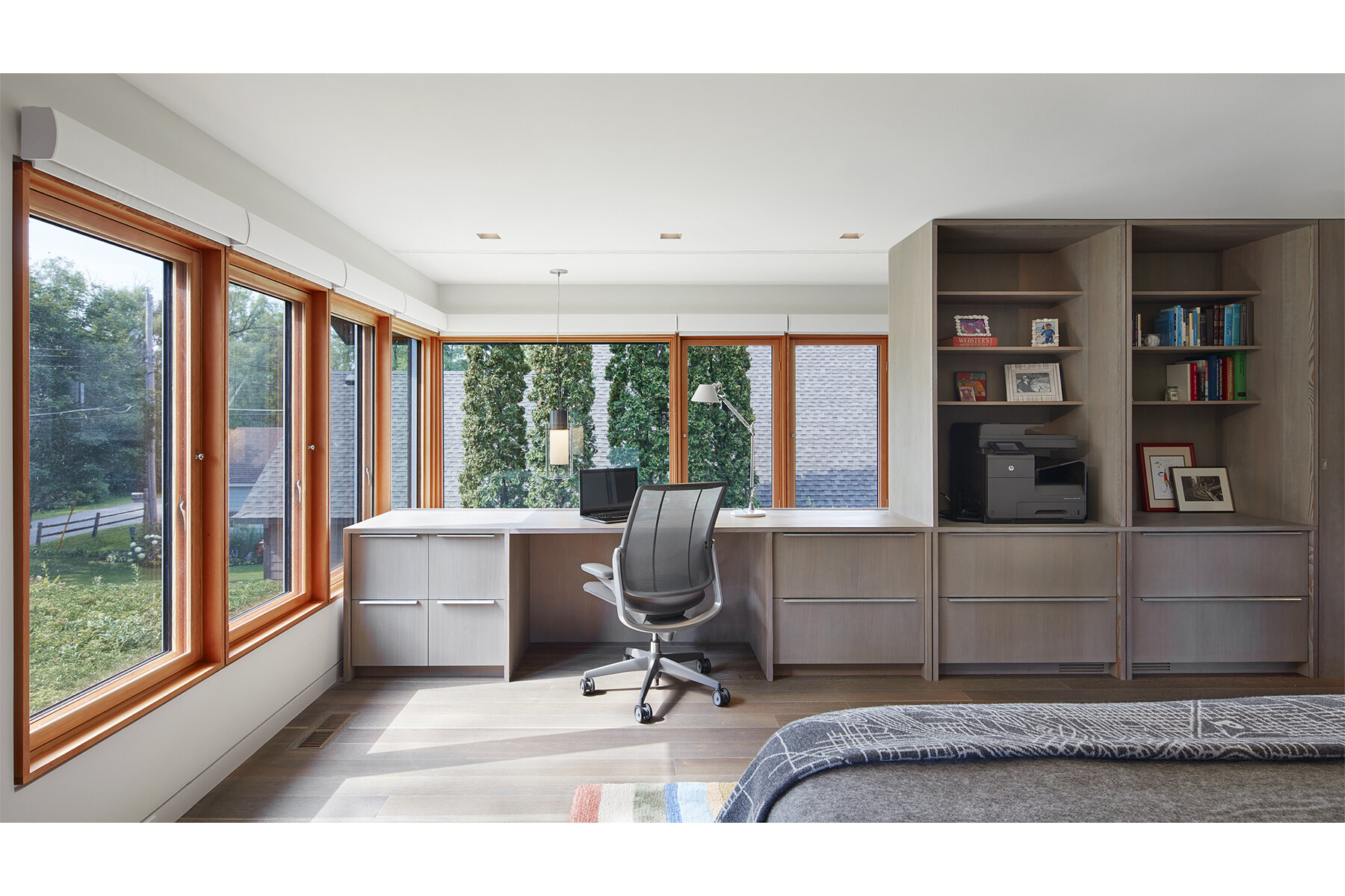
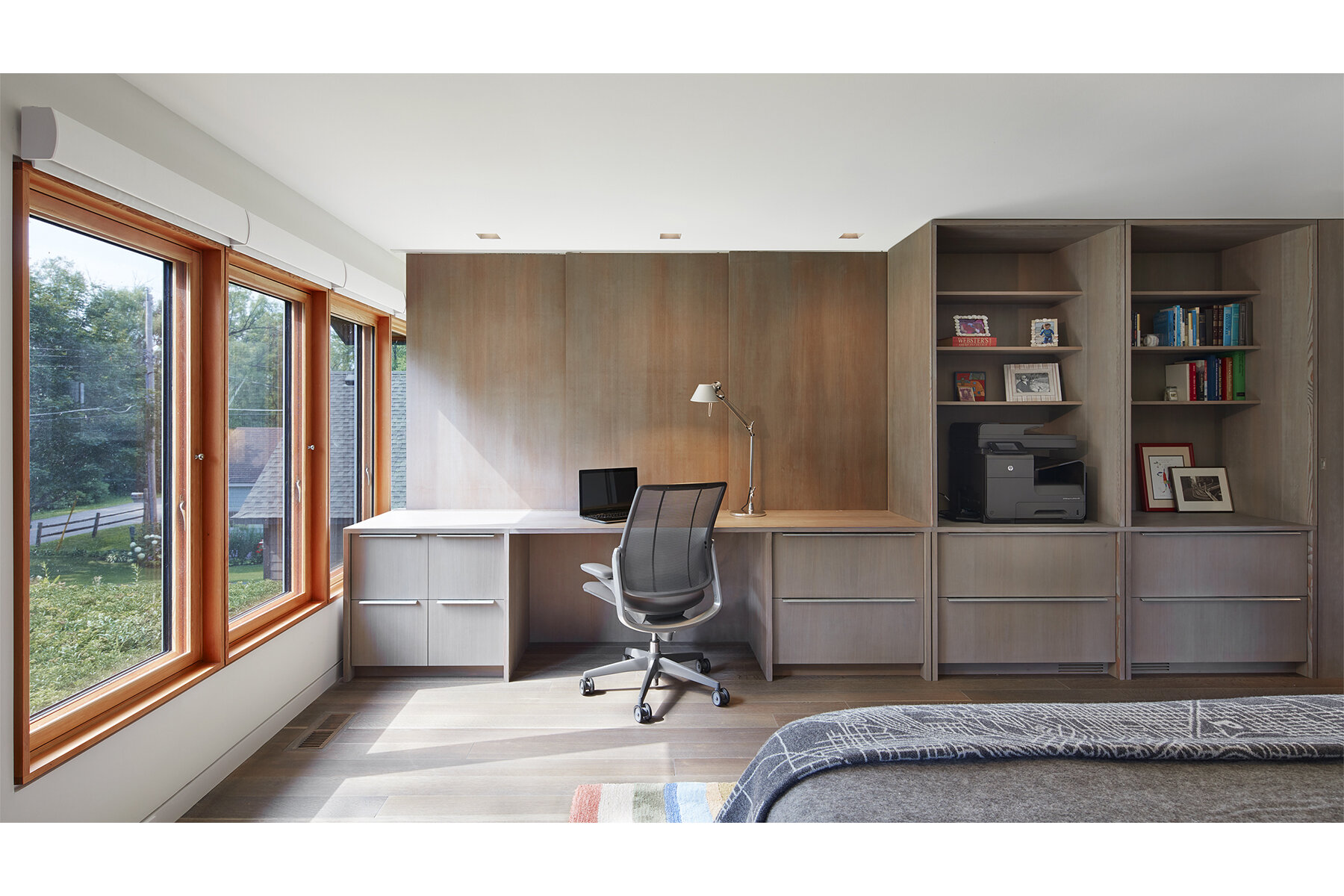
Sleep experts say that you should never work in your bedroom. But if your office is in a guest bedroom? That’s a different story. SALA Architects shaped this dual-purpose space in a net-positive-energy home tucked into a narrow lot on a lake. The neighbor’s house is right there, but David Wagner, AIA, wrapped the windows (glorious passive lighting!) around a corner. One view frames a pastoral green roof. The other—toward the neighbor’s home—is adjustable, says Wagner: “You can slide a simple panel unit across the window to control light or distraction levels.”
Design by Christopher Strom Architects. Photos by Alyssa Lee.
Attic
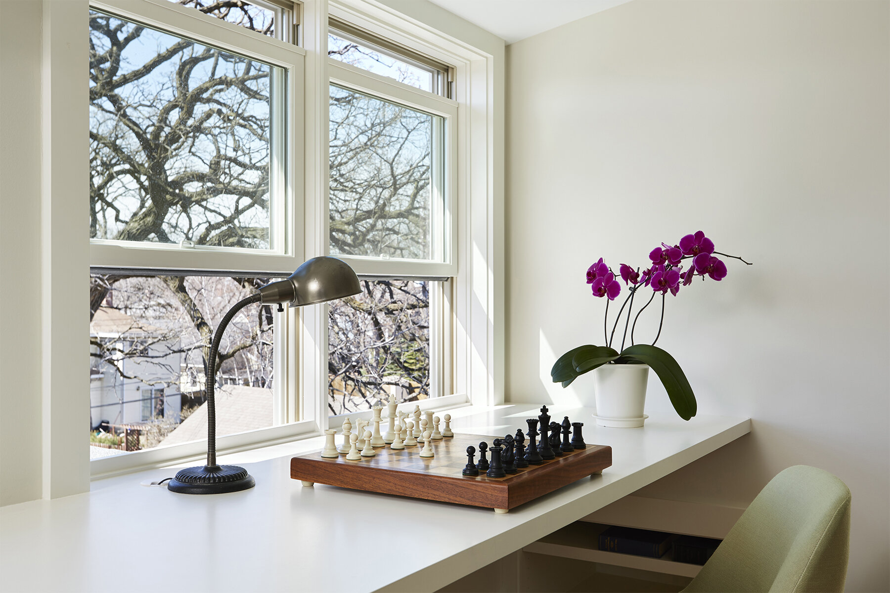
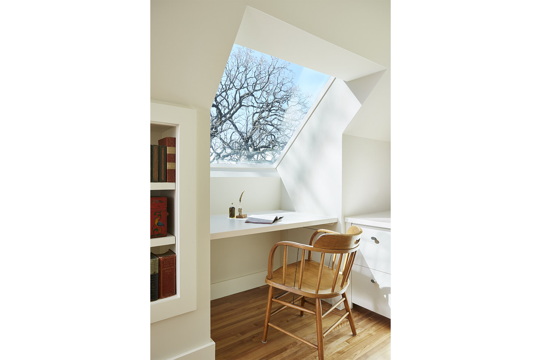
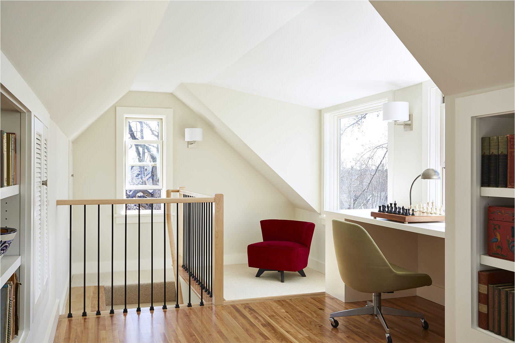
The joys of working with old houses include finding creative workarounds for constraints. When Christopher Strom Architects turned a standard narrow attic into a stunning office in South Minneapolis, the biggest challenges became the most satisfying elements of the new space. A bank of cabinets and shelves are just the thing for the archivist client, and they add interest to a long wall. “We like to put the walls to work to activate the space,” says Christopher Strom, AIA. A shed-dormer desk nook with a skylight came to life because of code requirements. “The solution has more character because of the constraints,” says the architect.
Design by Christopher Strom Architects. Photos by Alyssa Lee.
Whole House
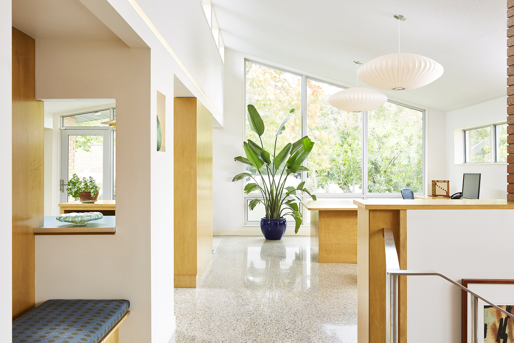
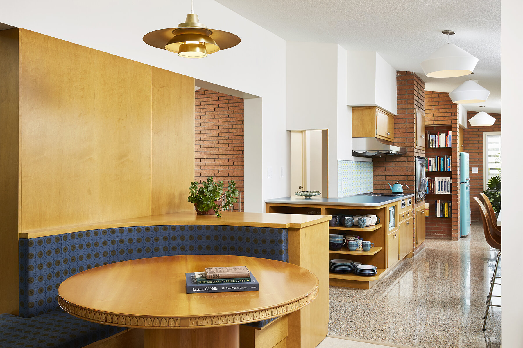
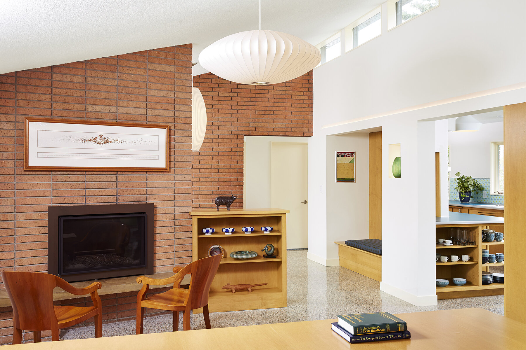
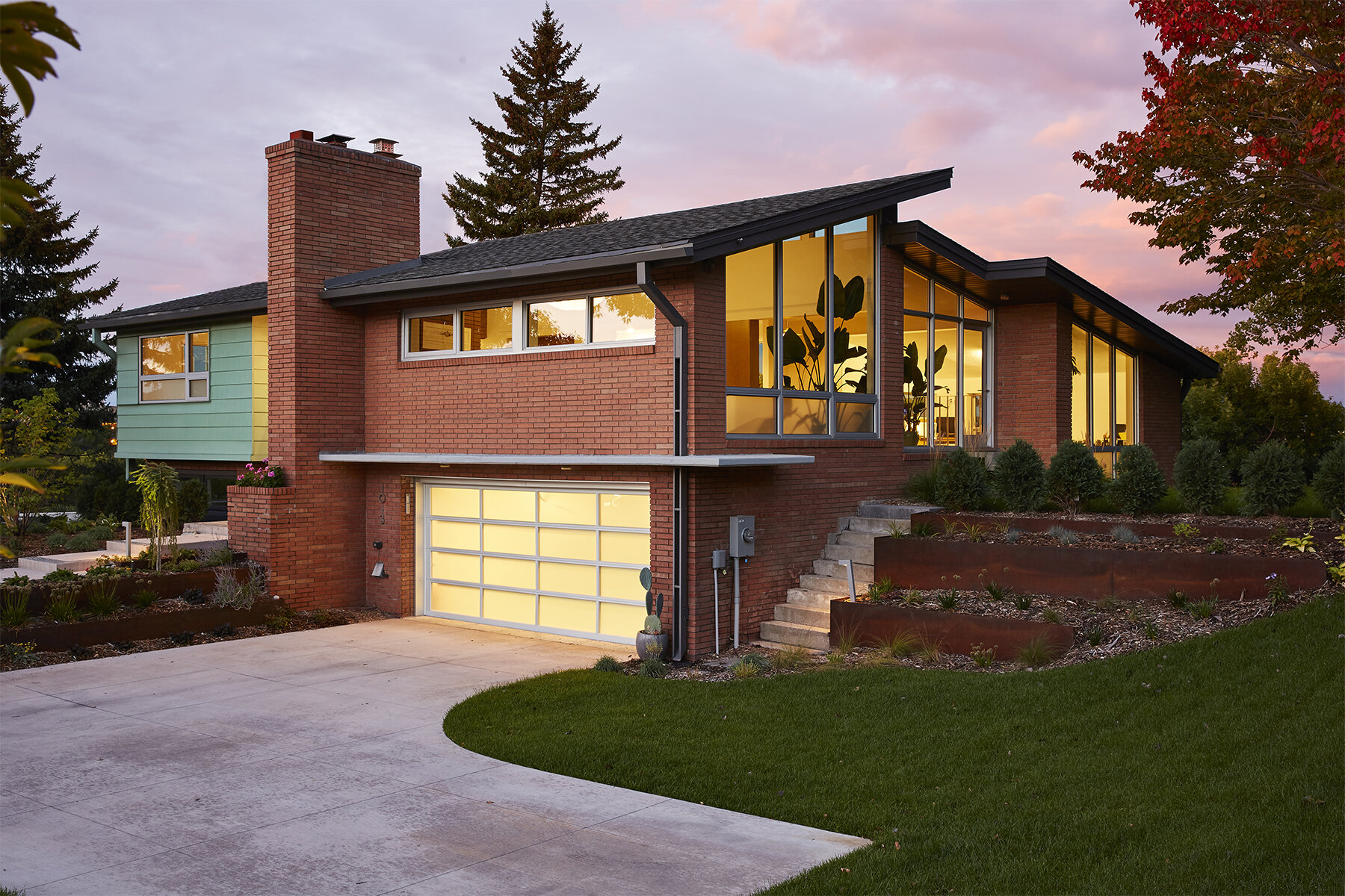
The midcentury house marooned by freeway development was too beautiful to demolish. Its new owner took one look at its terrazzo floors and high, modular brick walls and thought the structure had enough grandeur to greet the public. Now it has a new life as a small, showpiece office building.
“Every aspect of the home has been improved to that purpose, but in keeping with the original design,” says Christopher Strom. New siding in pre-patina copper, a frosted glass garage door, architectural planters, and a glass-wrapped entry give the home a clean, formal look. Inside, a waiting area includes a wood-paneled nook with a bench. A built-in banquette encircles a special table the owner brought in, creating an intimate meeting spot. A variety of workspaces, along with storage and library shelving, make this a quirky but fully outfitted office environment.
Even so, a few distinctly home-like touches remain. The original kitchen is largely preserved, for example, for lunch prep. An Olympic hammer-throwing range in the backyard beckons if there is time for a work break. “The owner doesn’t live here, but she uses the office as if she’s working from home,” says Strom. “It’s just a very comfortable, very energizing work environment.”


