Architect Alan Howell on Art and Architecture at MSP International Airport
A conversation with the Metropolitan Airports Commission’s senior airport architect
Interview by Robyne Robinson | June 16, 2022
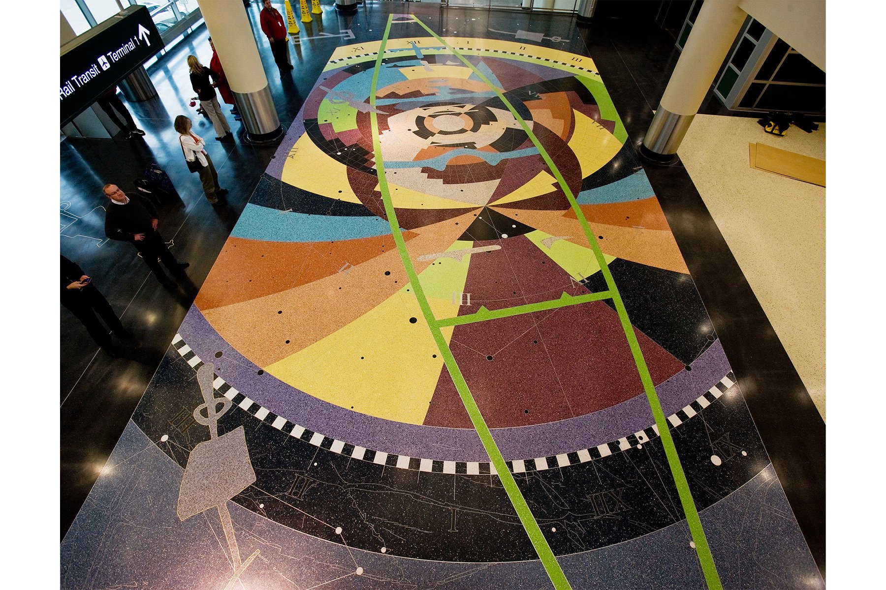
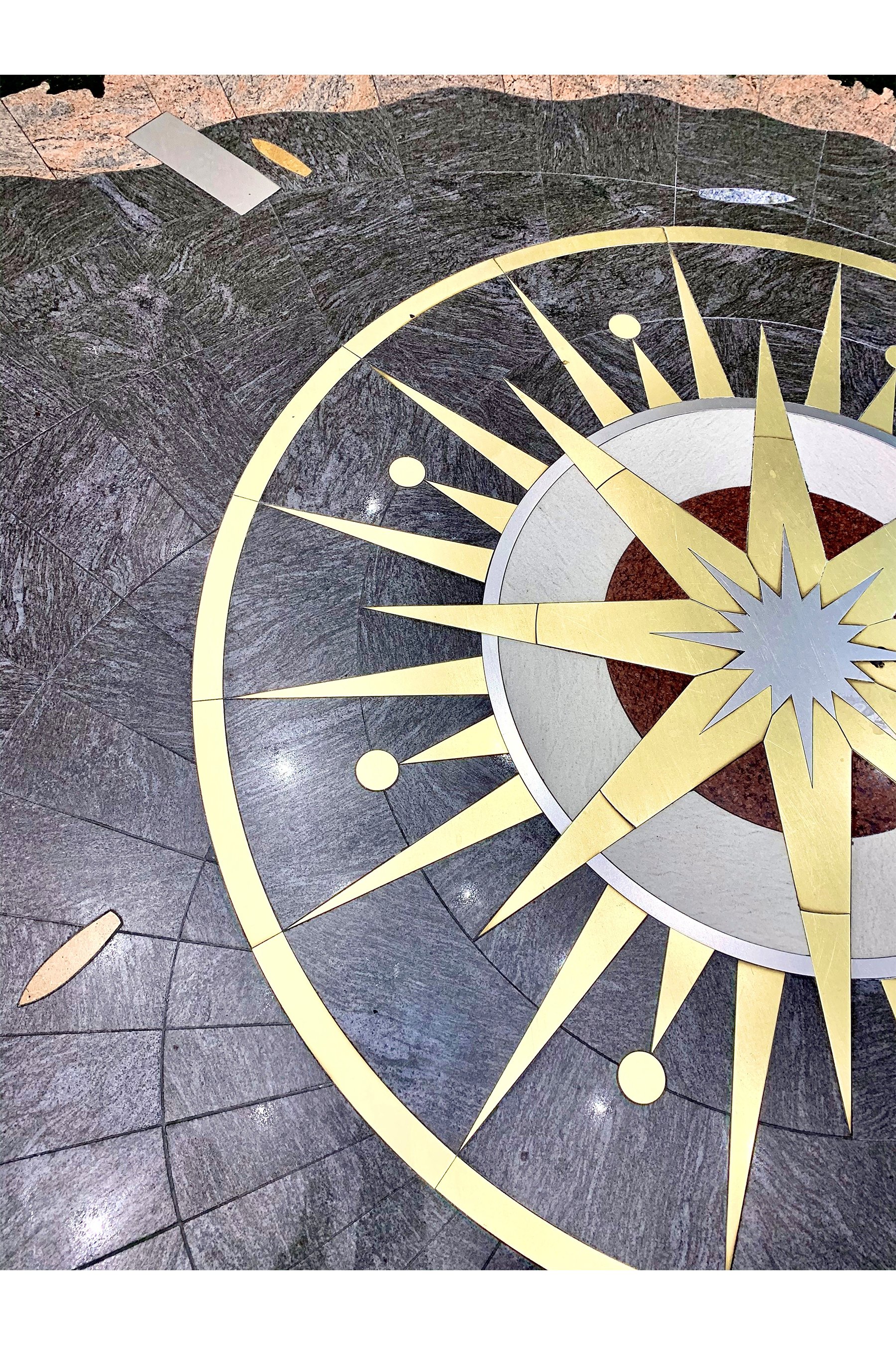
Memory Piece, by Andrea Myklebust and Stanton G. Sears. Terrazzo. In the A-B Rotunda in Terminal 1. Photo courtesy of Arts@MSP.
FEATURE
Minneapolis–Saint Paul International Airport (MSP) is a shining example of what’s possible when all the elements of architecture and art come together successfully. Named the Best Airport in North America in its size category (25 to 40 million passengers per year) five times since 2016, MSP has achieved its five-star reputation in part by continuously developing public art experiences in the many construction and renovation projects across the campus.
The original terminal debuted in 1962 in an open landscape, with plans to eventually accommodate four million travelers annually via expansion. Today, the airport hosts 10 times that many passengers, on a campus now surrounded by the Twin Cities metro. To grow capacity without more land to build on, the Metropolitan Airports Commission (MAC) and its architects have learned how to get the most out of every opportunity. In 2001, a small charter terminal on campus was rebuilt for commercial travel—the Terminal 2 we know today. More recently, Terminal 1 added gates to its G Concourse, updated its baggage claim with a new carousel and digital display system, and even squeezed in an international hotel. Long-term plans continue to call for much growth at Terminal 2.
Alan Howell, AIA, senior airport architect with the Metropolitan Airports Commission.
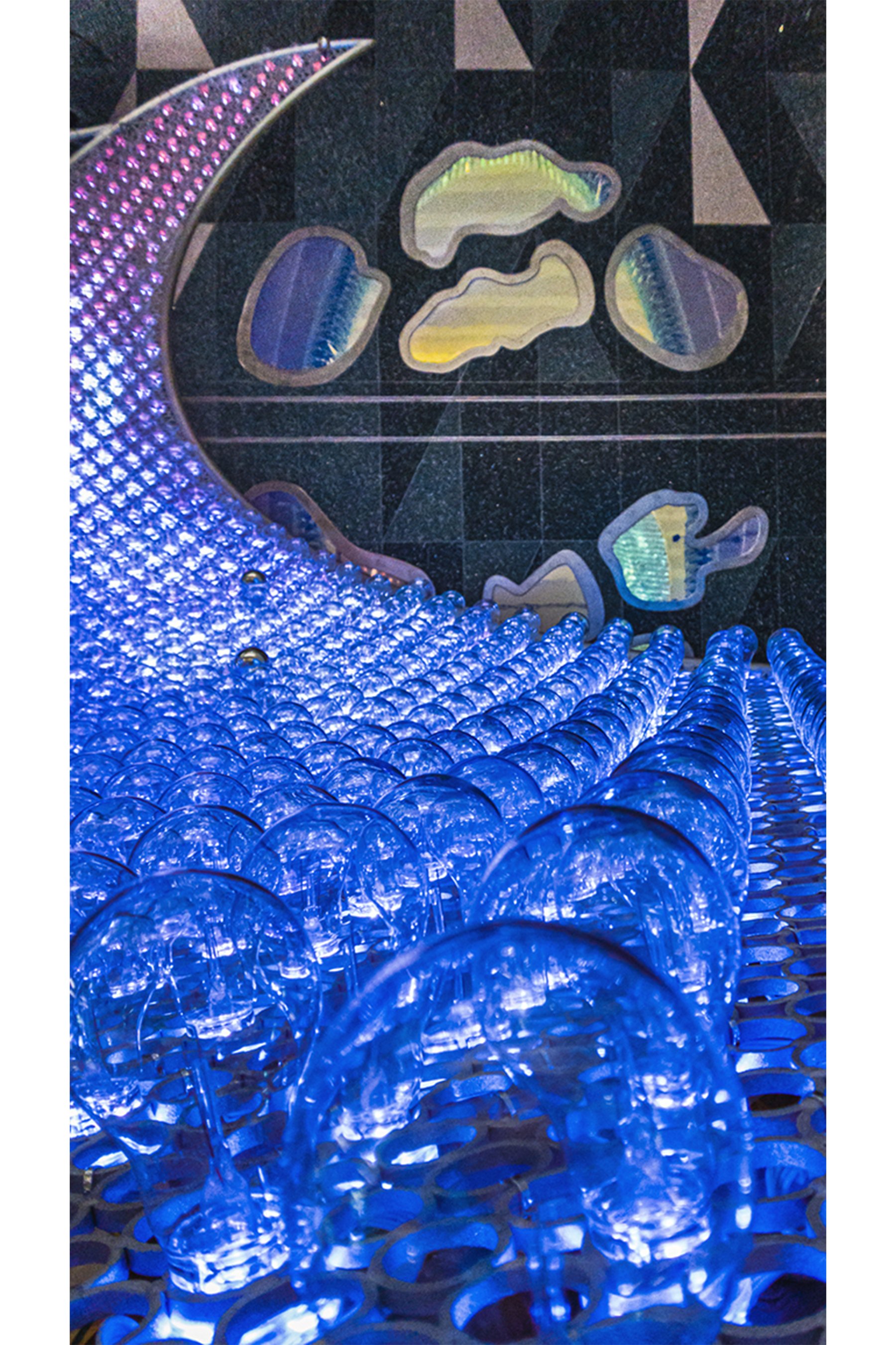
Engaged in all these efforts is MAC senior airport architect Alan Howell, AIA. Howell and his team work with architecture firms Alliiance and Miller Dunwiddie, among other project partners, on operational upgrades and long-range planning for the two terminals. Howell is also instrumental in shaping MSP’s public arts planning in collaboration with community leaders, airport administrative staff, and the Airport Foundation, where I served as art director from 2013 to 2018 and art consultant in 2018 and 2019, working closely with Howell on projects like The Aurora, the 29-foot digital glass-and-metal sculpture suspended between the ticketing and baggage claim levels in Terminal 1. We also collaborated on the installation of several concourse display cases; See18, the first film screening room in a U.S. airport; and MSP’s celebrated mosaic restroom murals.
I sat down with Howell to talk about the synergies and distinctions between architecture and art—and on what lies ahead at MSP.
Does the public understand the difference between architecture and public art when it comes to art and airports?
Art leaves some things to chance, whether it’s the moment that you’re experiencing the art, or the moment that you’re in while you experience the art, or the background that you bring to that experience. I think architecture does some of that because it mediates between ourselves and the world—whether it’s keeping the weather out, changing how sunlight moves through a space, or changing the natural acoustics to something else. Whereas I always think of art—at least modern art—as wanting to be a little bit of an explanation of the world to you. Architecture asks you to be; it allows you to be in the moment as much as you are.
So, I’m very conflicted. A lot of architects are artists [as well]. Engineers sometimes think of architects as artists, and artists often think of architects as engineers. We know that we’re neither. We’re interested in what that experience is as a person moves through spaces to understand what they need to do. [At the airport] we want to make that experience as seamless and frictionless as possible and provide opportunities for de-stressing, to have things taken care of that need to be taken care of.
Intuitive wayfinding is helpful. We opened up the Terminal 1 lobby to create sight lines and easier understanding of where the checkpoints are. How do I get to my airline? Where are the escalators? Where are the elevators? Airport staff and the technology built into the architecture can help direct people, but really the architecture should do that work all by itself. That’s the hope I have about good architecture: That it’s functional first. The beauty that it has is a result of good design, which means functionality. It means sustainability. It means use of durable materials—and natural materials, as much as possible. Great sound and use of daylight throughout the space. Those elements can be artful. But I would call the experiential what we will perceive as people.
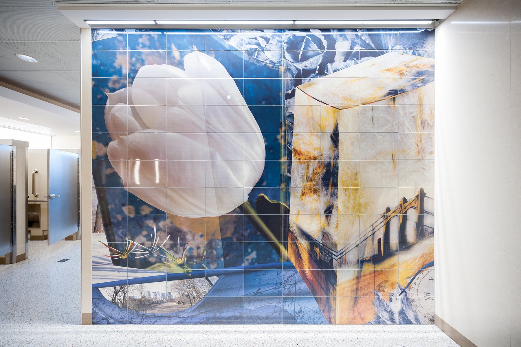
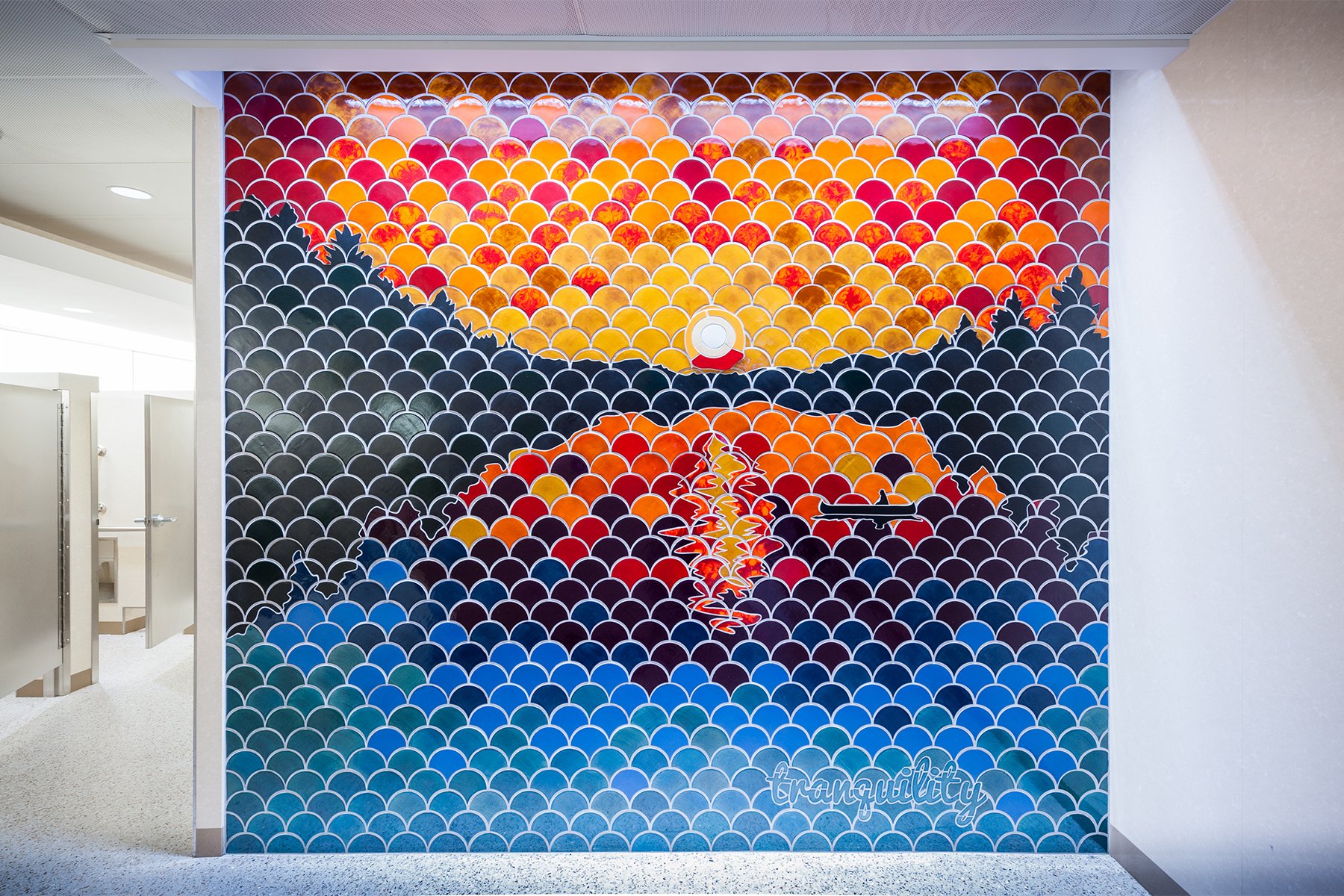
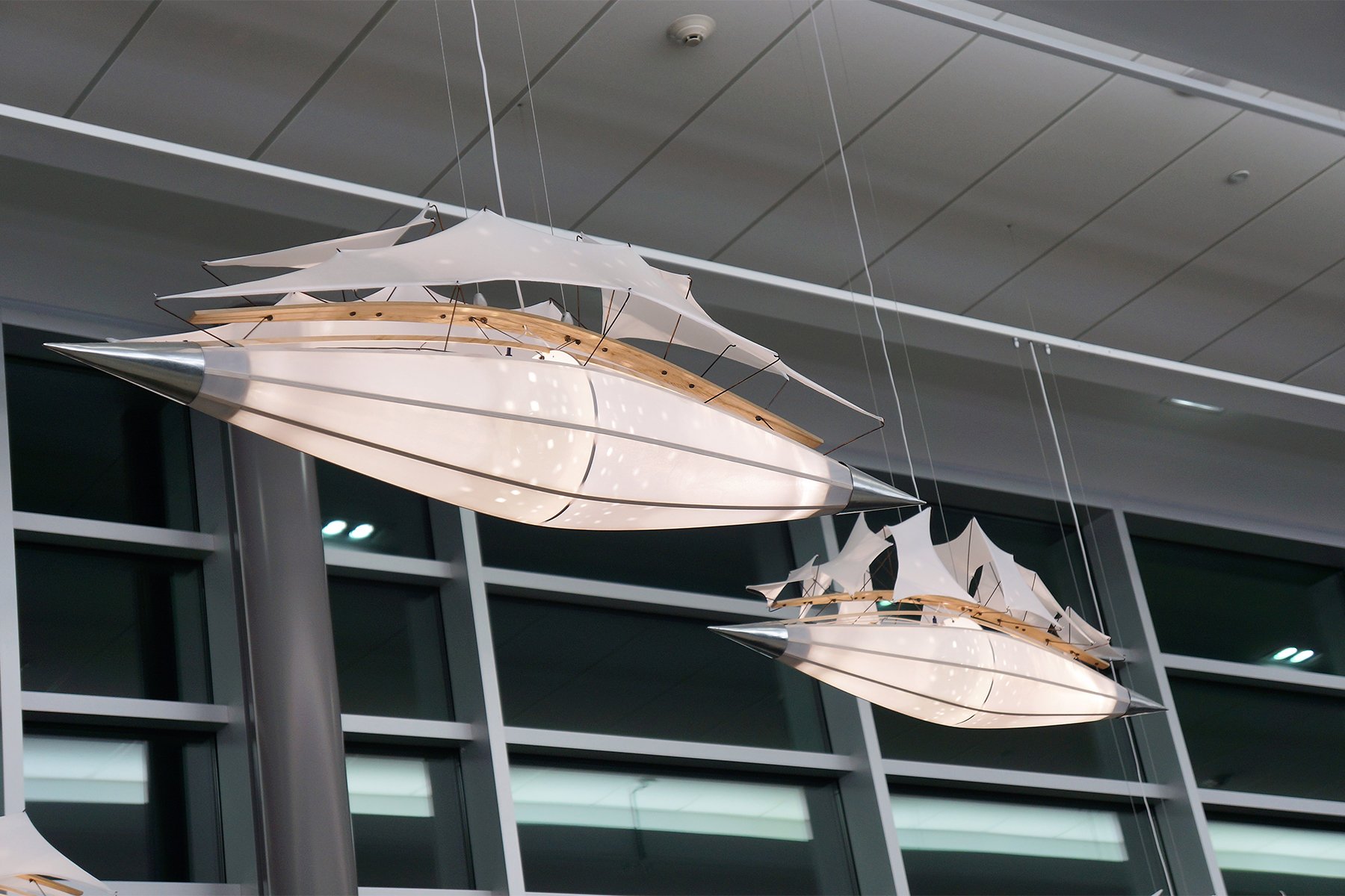
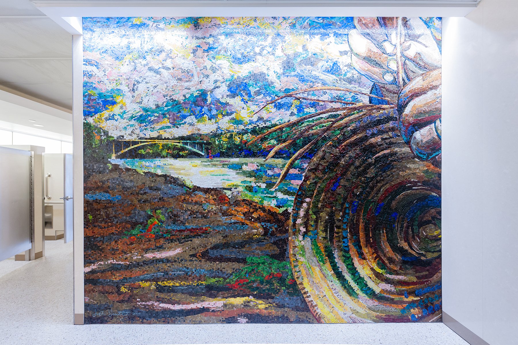
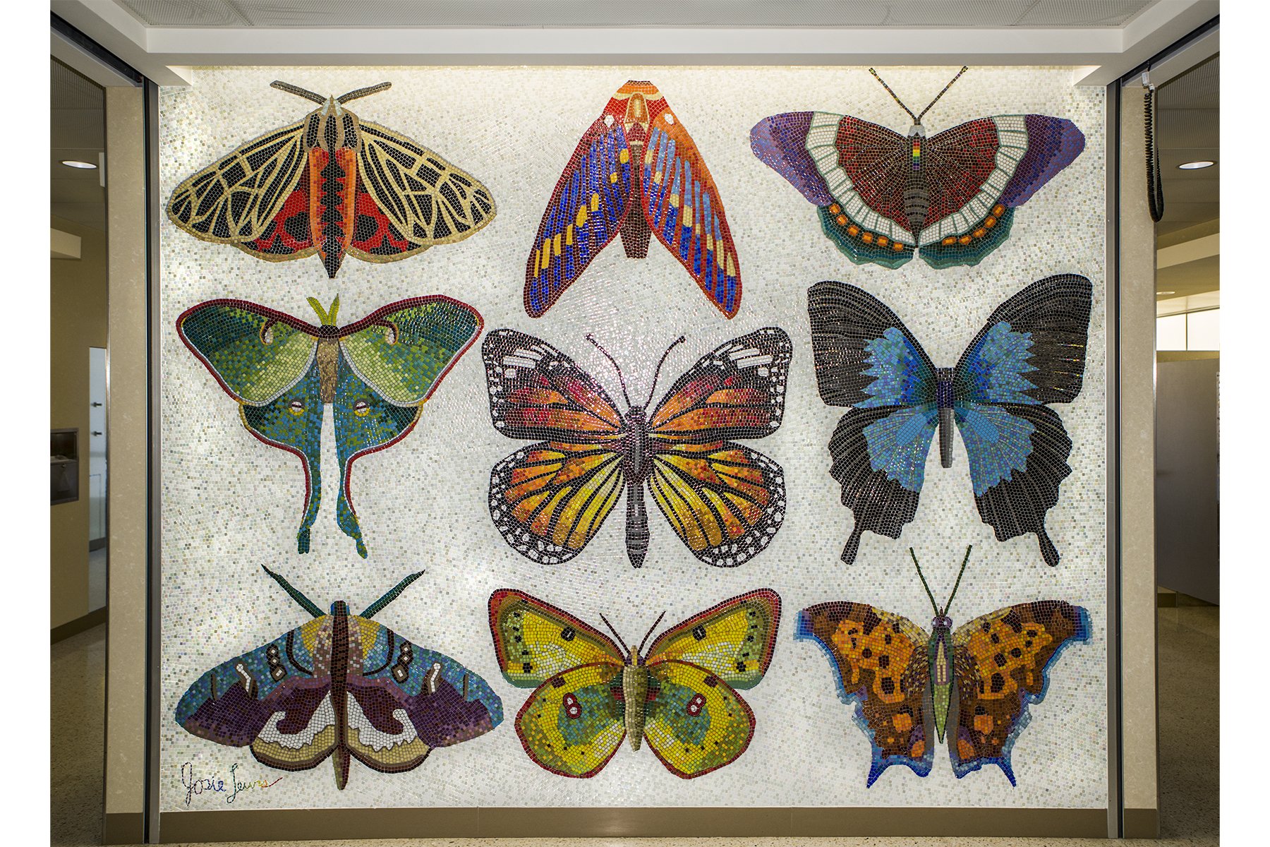
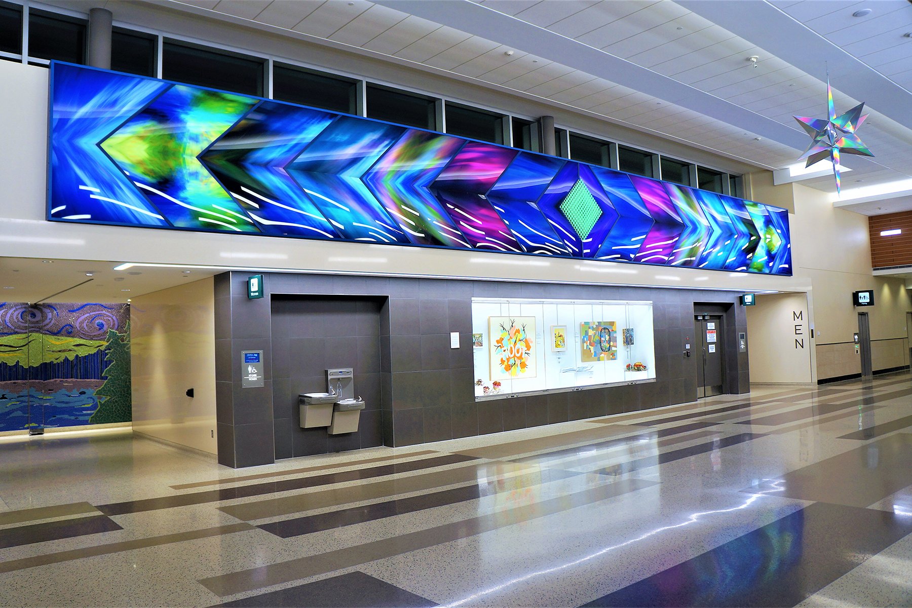
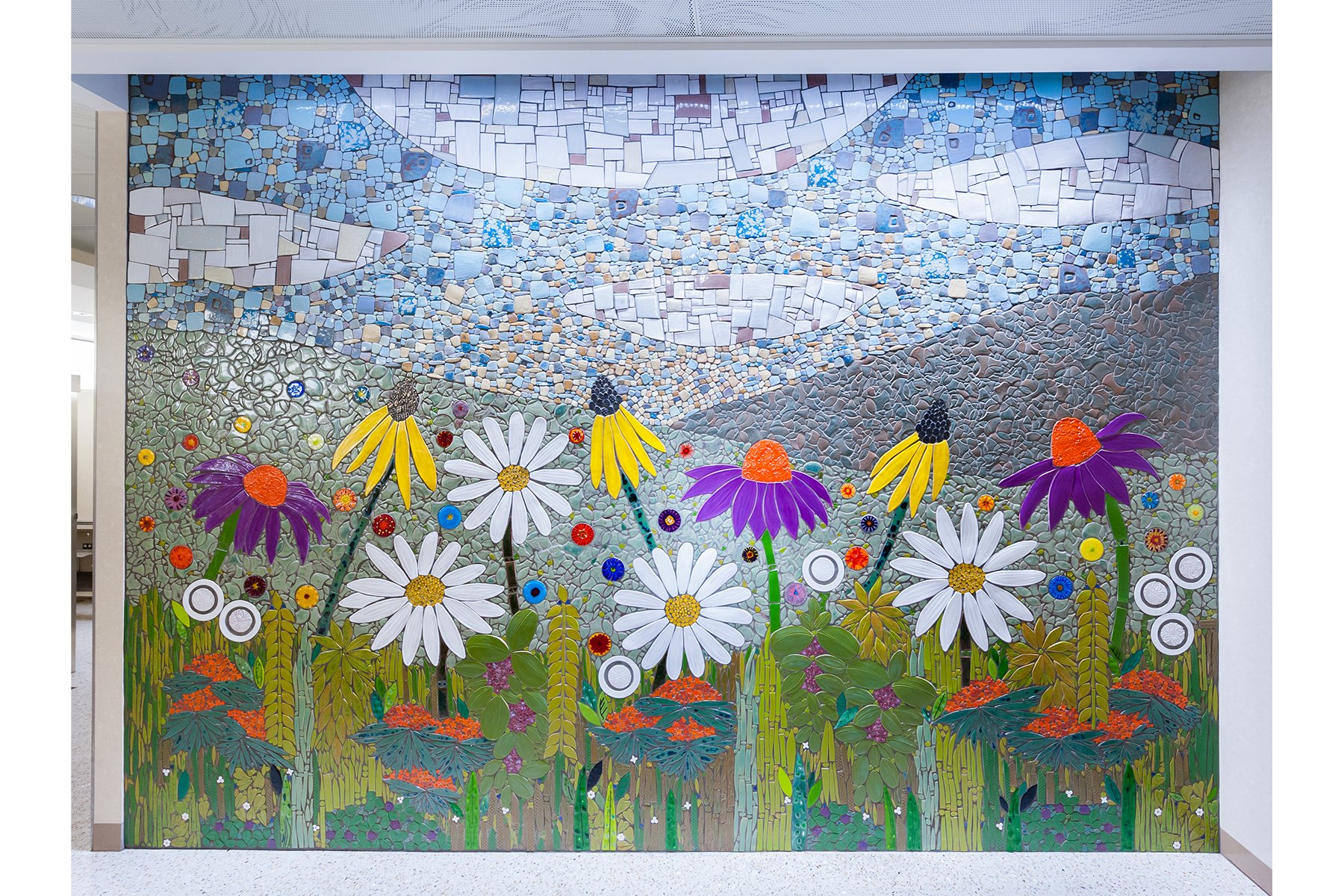
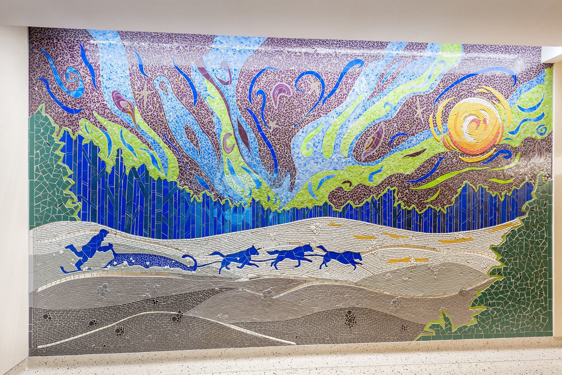
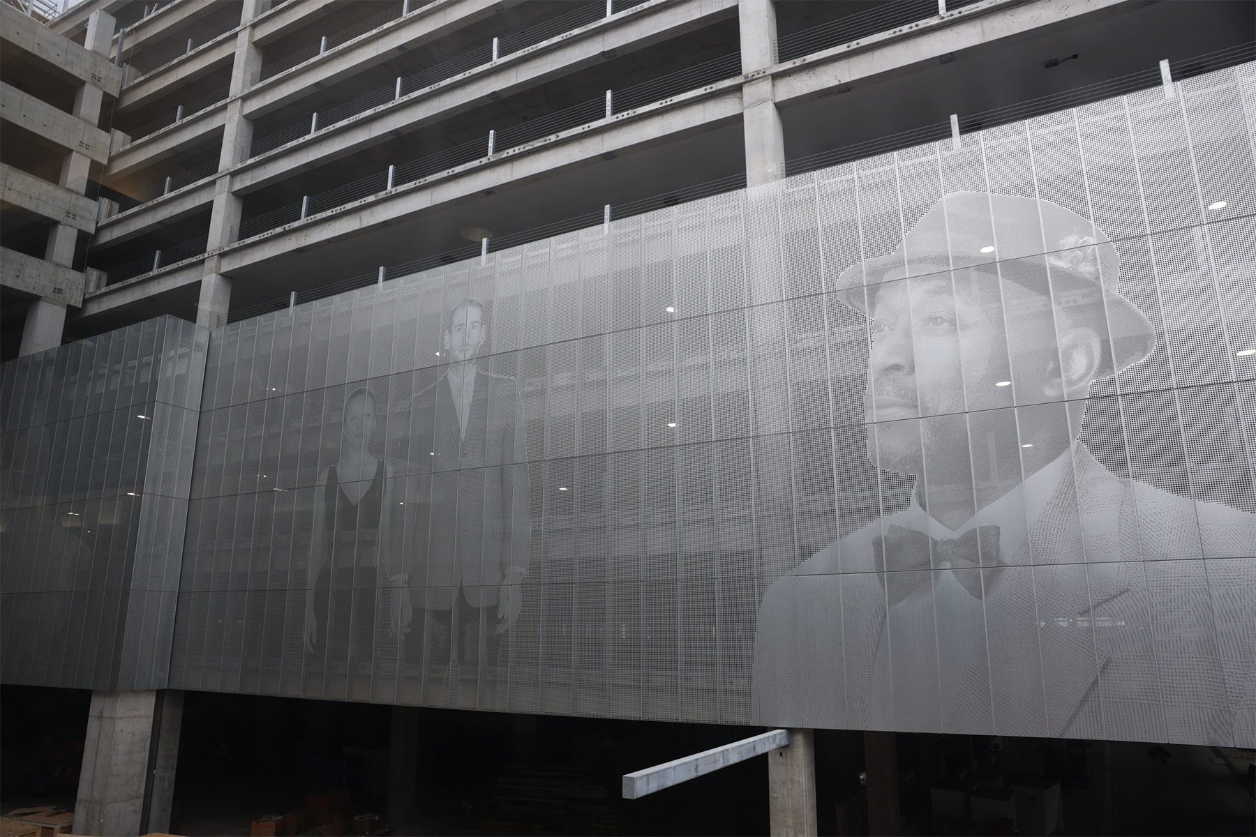
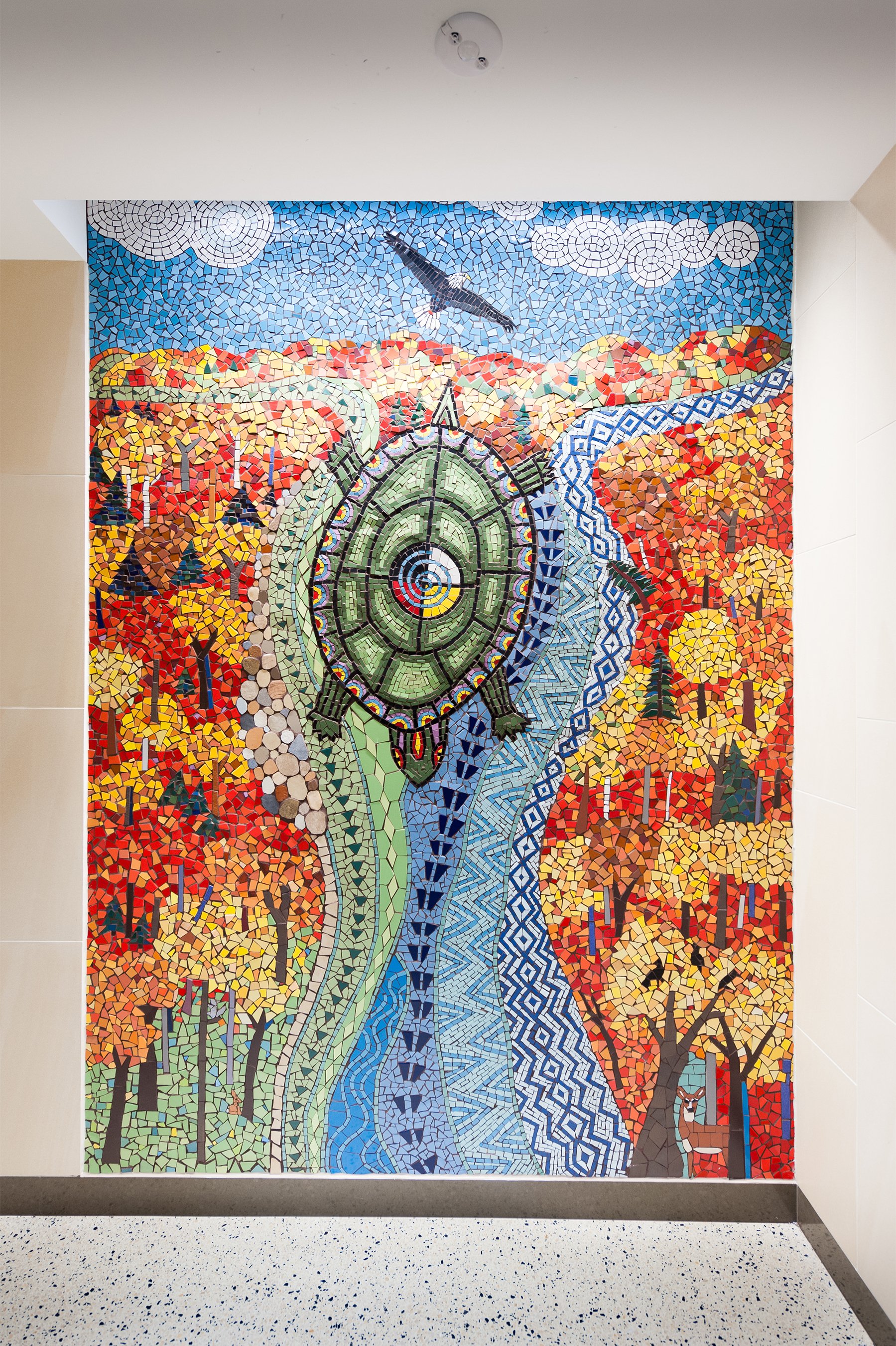
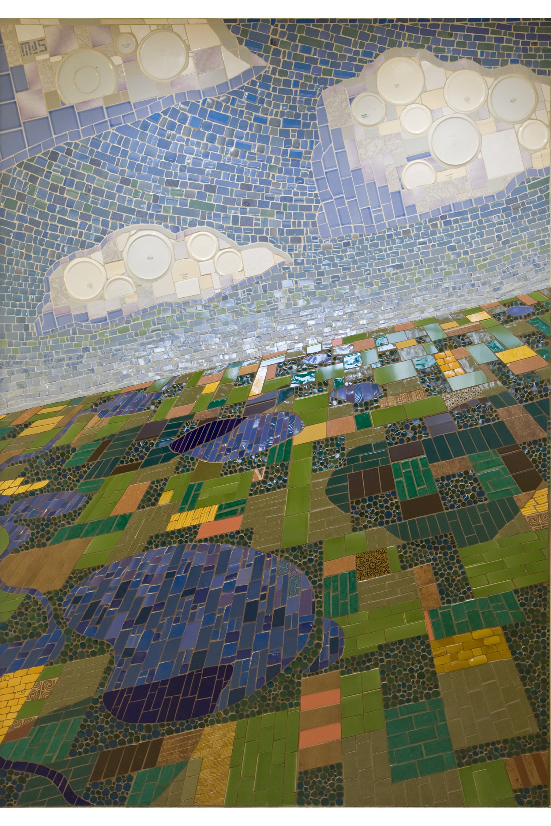
Images 1–12: Blueprint, by Amy Baur and Brian Boldon. Ceramic. Terminal 1, Gate E4. Living in the Moment, by Carol Bell and Mercedes Austin. Ceramic. Terminal 1, Airport Mall. Migration, by Danny Saathoff. Aluminum, polyester, and light. Terminal 2, H13. Constellations of Connection, by Greta McLain Natchez Beaulieu and Hapistinna Graci Horne. Terminal 1, Silver Ramp Ground Transportation Center. Two Mississippi, by Janet Flom. Glass. Terminal 1, C6. Touching the Sky, by Josh Sarantitis. Glass and ceramic. Terminal 1, C1. Minnesota Lepidoptera, by Josie Lewis. Glass. Terminal 1, F4. Aurora Borealis and L’Etoile du Nord, by Philip Noyed. Acrylic. Terminal 2, H10. Starwheel, by Scott Parsons. Terrazzo. Terminal 2, Pre-Security. Minnesota Prairie, by Sheryl Tuorila. Glass and ceramic. Terminal 1, Airport Mall. Northern Lights–Winter Run, by Stacia Goodman. Ceramic, glass, and stone. Terminal 2, H10. Interrupted Landscapes of the Incomer, by Steve Ozone. Terminal 1, Silver Ramp Ground Transportation Center. Photos courtesy of Arts@MSP.
If architecture is just to “be,” why do you try to achieve some idea of de-stressing?
We’re interested in designing for people. We know that the experience of being put in a pressurized tube, of going up in the air and coming back down, safely both ways, is a stressful situation for most people—even those that fly all the time. Or the stressors can be the traffic on 494 [on the way to the airport], a long line for security, or forgetting something you needed for your meeting. Our architecture at the terminal is designed to provide travelers with the least amount of friction as they move through curbside drop-off, check their bag, go through security, and get to their gate.
The goal is to provide the best experience that we can provide—the right staff is available, the technologies are working, and the wait times are short. Travelers know what they’re doing, and it’s easy to do.
What’s the most stressful part of creating a de-stressing environment?
The OI—the operational improvements program—for Terminal 1. One of the most stressful parts of the project, which is scheduled to be completed in the third quarter of 2024, is looking at a building that has been in use since it opened in 1962 and rethinking its passenger flow and use of space . . . rethinking a constrained environment.
“Our architecture at the terminal is designed to provide travelers with the least amount of friction as they move through curbside drop-off, checking their bag, going through security, and getting to their gate.”
An architect who used to work at SEA-TAC [Seattle–Tacoma International] Airport called this kind of work “inspansion.” Making things bigger without making things bigger. For operational improvements, we added to the square footage provided for baggage carousels. We gave the airlines more space for queuing. We decreased the number of escalators and elevators, but we increased their visibility, redundancy, and use by placement. We consolidated our security checkpoints to create more queuing space for passengers and allow TSA to process more people through fewer lanes.
So, when I look at this project—which is really 18 projects in one—it’s about how we take this old building, modernize it, and plan for it to function for 50 more years in this new configuration. This is a once-in-a-lifetime opportunity to rejuvenate the building for the next half-century.
The airport has a finite footprint.
Yes.
How long can you reconfigure the square within a square?
There are several advantages for us here. In the airline industry, we’ve seen larger and more fuel-efficient aircraft showing up, which has decreased our number of operations since the 1990s by more than 20 percent. So, we’ve got an airfield and airfield capacity that can take a lot more aircraft work, or as much as we had in the 1990s.
In terms of operations, that will grow from 40 to 50 million passengers by 2034.
The bigger question is: How do we use more of the facility more efficiently for more hours of the day? And when I say more hours in the day, I don’t mean 3 a.m. flights and 11:30 p.m. arrivals. What I mean is: How do we fill in the blanks—those times when we have fewer guests? We’re a hub airport, and we know that folks flying to, say, Mexico want to leave early in the morning so they’re on the beach by noon. So, how do we use the facility to its full potential? It’s not the standard airline model right now.
Images 1–5: Seasons of Change, by Barbara Benson Keith. Ceramic. Terminal 1, 1E8. Big Woods Summer, by Andrea Myklebust and Stanton G. Sears. Granite, quartz, marble, limestone, and stainless steel. Terminal 1, C Food Court. The Aurora, by Jen Lewin. Terminal 1, Arrivals and Departures. Confluence, by Lori Greene. Ceramic. Terminal 2, Pre-Security. Land of Lakes, by Michael Sweere. Ceramic. Terminal 1, F10. Photos courtesy of Arts@MSP.
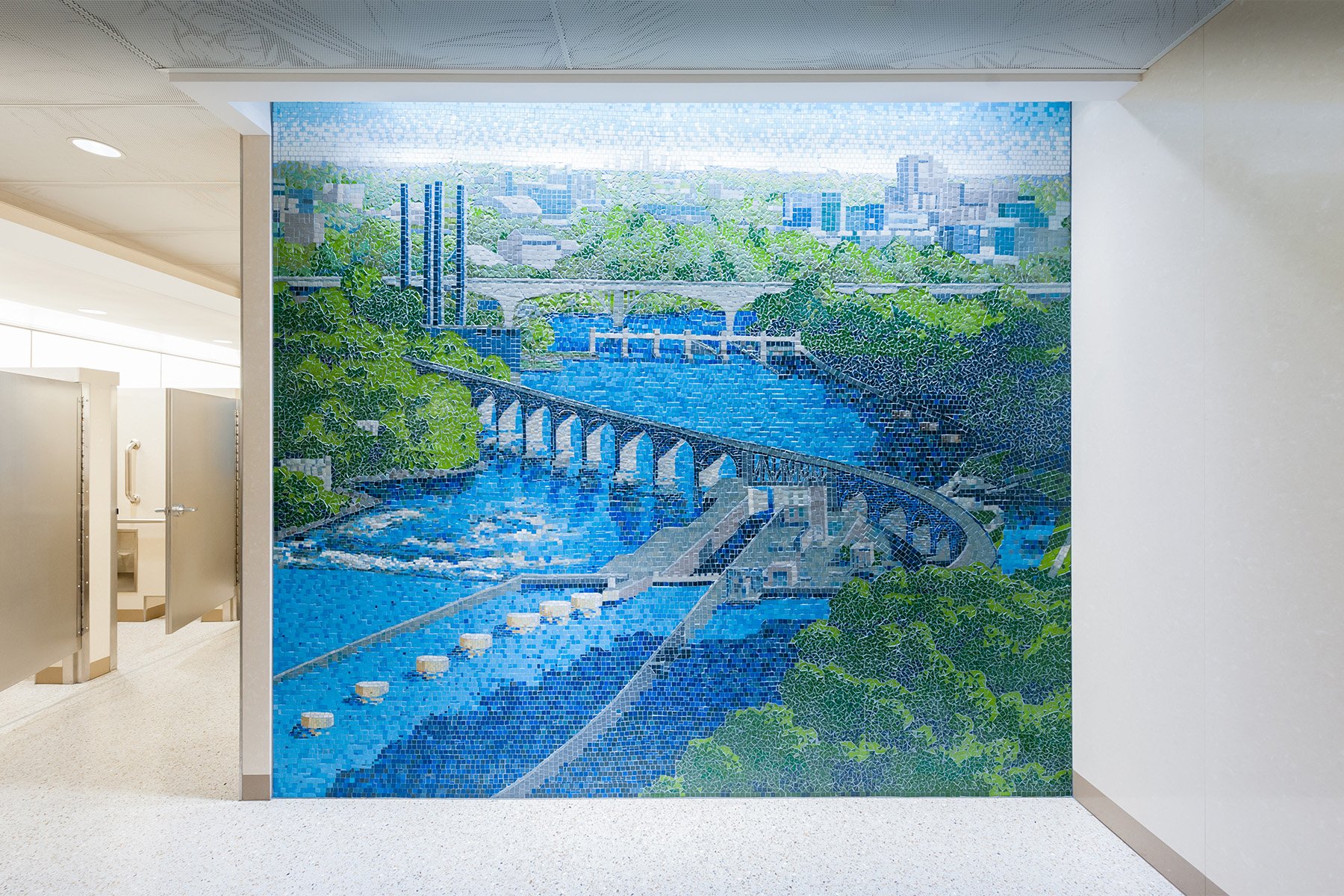
MSP’s restrooms have garnered a lot of well-deserved accolades. The mosaics are fantastic. But there’s also art in how the art and design are working together. The materials, including opaque glass, all contribute to making the spaces feel unusually bright and open. And the Minnesota-themed mosaics instill a sense of place. I just think it’s all art—not just the artworks themselves.
With the restrooms we replaced, we were able to put a thousand great ideas into one space. That’s a rare thing, that we were allowed to do that. We walked through every single restroom on campus in the two terminals—employee restrooms, public restrooms—and we found things that worked and others that didn’t work. Then we set some great goals for the program. And we got to have some fun with potty humor along the way.
[Laughter]
I always cheer you and your team on because you have a vision, and you have to think big, both in times when funding is great and in others when it’s not. Even in the down years, the expectation is, “Give us a spectacular airport.”
We do try to do a lot with very little. The goal is the Delta experience—a high-end, polished experience. We’ve been very lucky with the arts program to have access to the funding we have. In 2016, the MAC put in place its own version of Minnesota’s Percent for Art in Public Spaces program, and it’s been phenomenal. But sometimes we do need to do more with less.
I look at our C Concourse gallery, and that space is on par with a museum gallery. Not just in the quality of the architecture and the display cases but also in the art itself. Some of it is artists bringing in work for a curated show. For a decade now, we’ve also had a showcase of work by airport employees, volunteers, retirees, and family members, which we now call MSP Creates.
MSP Creates was the first thing you implemented when you arrived. It took a tremendous amount of vision and a tremendous amount of work, and it was well worth the effort. Every day, thousands of passengers walk past artwork by employees that’s equal to the work of every other artist we showcase. And we got it for free. To me, the employee art show is emblematic of our approach to the arts program in general: We do as much as we can with what we’re given. Our music program, too . . .
We had a lot of musicians show up because I’d tell them, “If you have new material and you’re not really comfortable with it onstage, come do it at the airport,” and they would. Or I’d hear from somebody, “Oh my god, this guy from South Africa was walking through, and he sat down and jammed with me. It was unbelievable.” Those kinds of shared experiences got the artists to put their faith in us, which helped the program grow. But I don’t think it would be the success it is today if you hadn’t thought of it far in advance. Even if you didn’t have the full picture, you had the seeds that were necessary to get the program to become what it is now.
Well, it takes time. I think that’s the most important thing for us to be thinking about—that it takes time. And then, what is the intent? If our intent is to connect the traveler and the artist, that’s easy. If the intent is only to show others what we can do, then we’re doing it for the wrong reasons.
What we’re doing with our arts program is different from what other airports have done. I hope it continues to be different because we are different here in Minnesota. Yes, we could have paintings and sculptures everywhere, but some of the things we’re doing are truly out of the ordinary, like the short film space we created and using a formerly unusable space for the C Concourse gallery. We should be proud of being a little different.
Let’s look ahead. I know you haven’t planned any further out than 2032, but give ENTER readers a sense of where the operational improvements plan is going. And do operational improvements ever end?
No! They never end. For our 2010 program, we did a lot of work for the connecting passenger in the mall and the concourses and for more aircraft. But we still had the O&D [origin and destination] passenger, and our O&D passenger percentage continues to grow. So, it makes sense to look at the front of the house with that program.
We’re also going to be working with Delta on what they call an “MSP modernization,” which will improve the appearance of things. And we’ve got some larger programs to enhance existing spaces for modern needs. For our international arrivals on the G Concourse, we need to correctly size the gate lobbies for the aircraft they’re serving.
What will 2040 through 2060 look like at MSP? That’s a question I’m asking myself. We don’t yet have many of the planes that will be flying in 2035. But I’d like to think the airport will be as open as it can be. That it will reflect Minnesota even more than it does today. That it will continue to provide a level of service and quality we’re all proud of. And that we’ll still feel like we’ve come home when we arrive.


