A Flexible, Neighborhood-Welcoming Expansion Takes an Arts Center to the Next Level
The Center for Performing Arts in Minneapolis’s Kingfield community grows with new performance and tenant spaces and an inviting “front porch” and lobby
By Chris Hudson | July 14, 2022
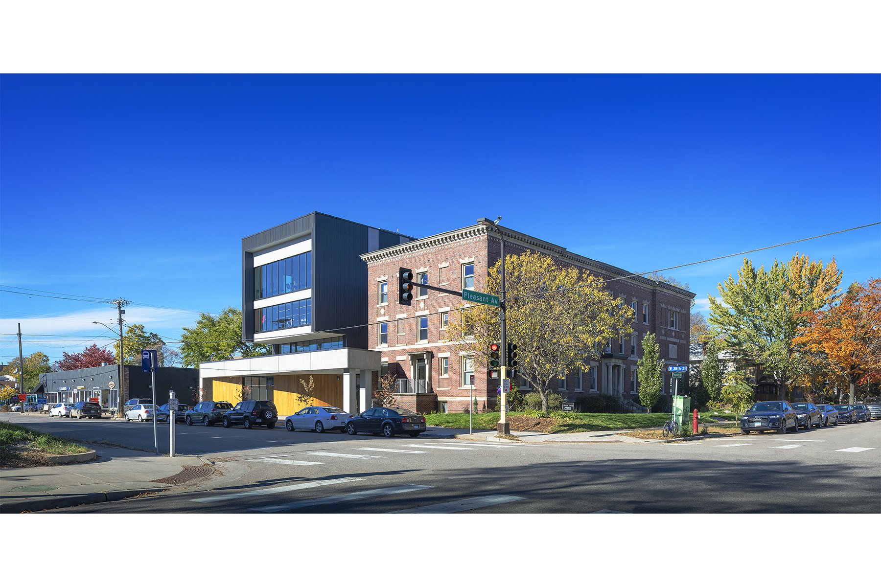
The newly expanded Center for Performing Arts from across East 38th Street. Photo by Peter J. Sieger.
FEATURE
Until recently, the Center for Performing Arts in Minneapolis was a quiet, neighborhood-fabric building near the commercial node of East 38th Street and Grand Avenue. Since its founding in 1995, the center had occupied an historic three-story former convent lightly adapted to provide studios, rehearsal spaces, and offices for artists and small arts organizations. Today, the building can more aptly be described as a standout structure, thanks to a new four-story, 21,000-square-foot addition that dramatically enhances the center’s offerings and neighborhood profile.
Designed by Minneapolis architecture firm Alliiance, the expansion rises on the site of a former parking lot to the west of the original building, complementing the brownish red brick of the historic structure with a contemporary mix of concrete, dark bronze steel, and locally sourced ash. The addition houses two performance spaces on the main level—one looking out to the street, the other a black box—and a range of multipurpose spaces above. In between the new tower and the 1923 building, a new lobby provides a reception area for performances and a hangout space for tenants and visitors, including young music and dance students.
A leading design challenge was fitting all the new spaces the center needed into an addition that related well to the original building in scale and massing. Another was optimizing accessibility and circulation in an expanded facility in which new and old needed to have different levels and ceiling heights on the lower floors. ENTER spoke with Center for Performing Arts founder and executive director Jackie Hayes and Alliiance architects Marcelo Pinto, AIA, and Amber Sausen, AIA, to learn more about the project’s goals and outcomes.
On the goals and challenges of the expansion
Hayes: We needed to address the needs of both the community that was already here and folks who wanted to come in and be part of our community. Some of our existing tenants who had had one office now needed a suite of offices. And we had some folks who didn’t fit well into the rectangular spaces in the convent. The Suzuki harp group, for example, needs to be in a circle, so we designed some spaces in the addition that are square-shaped.
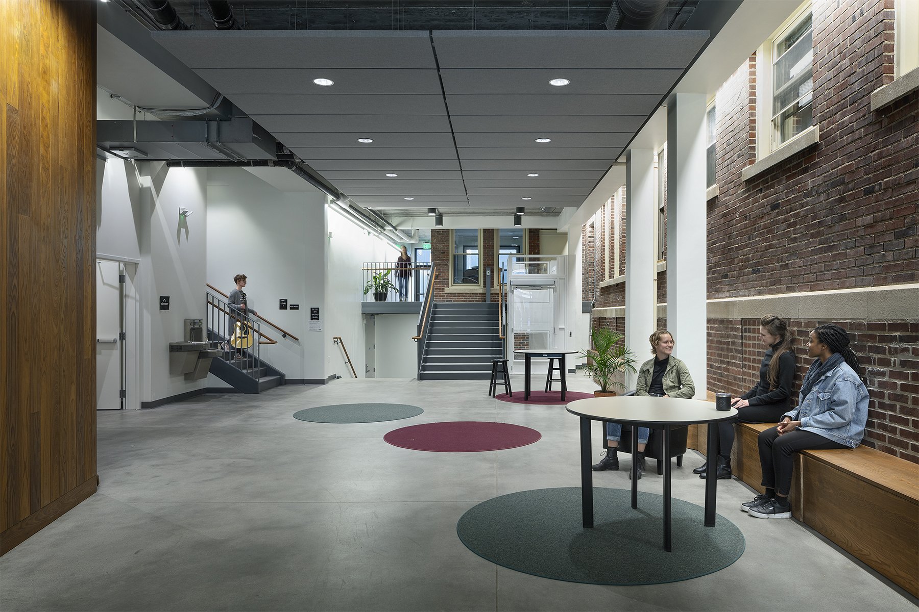
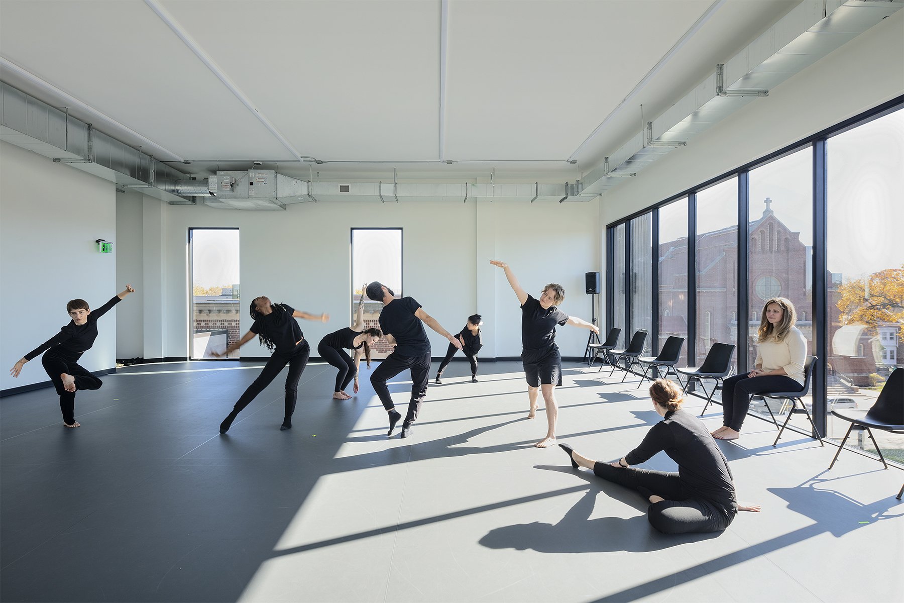
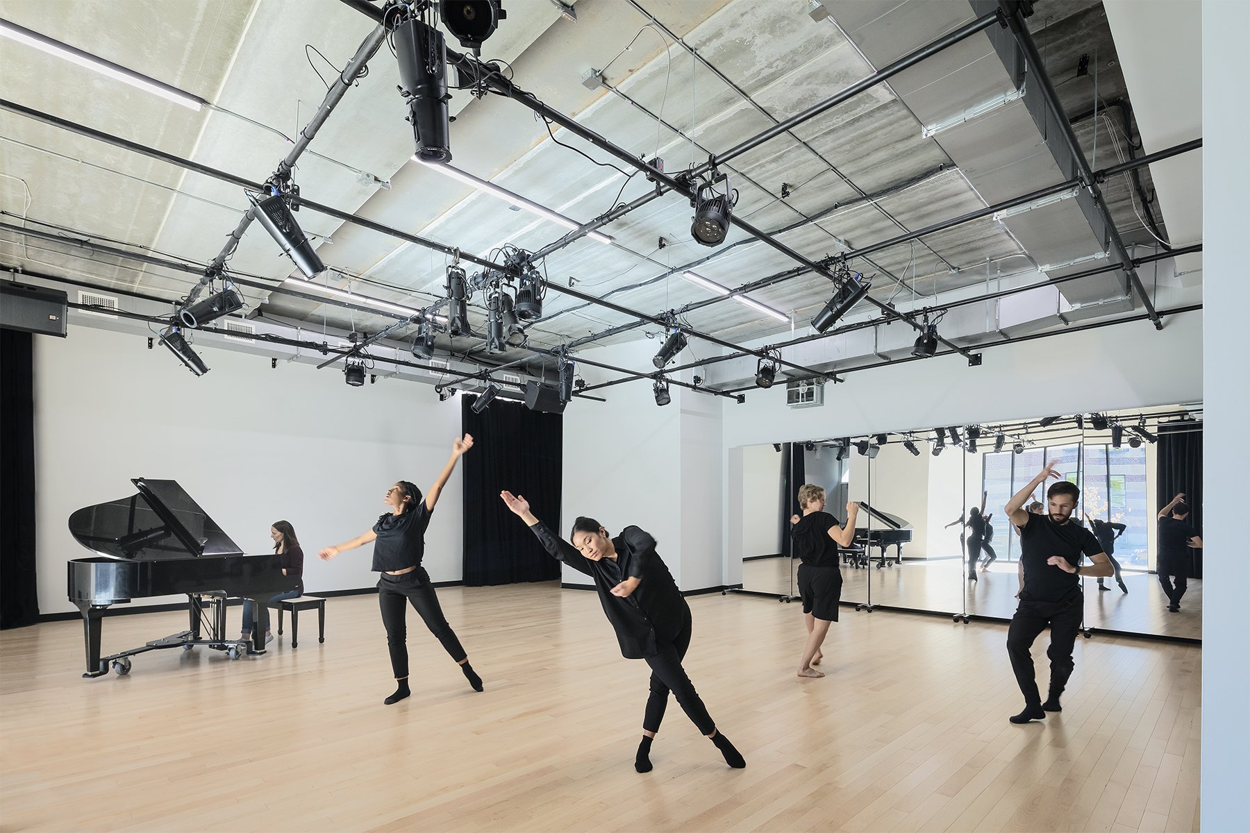
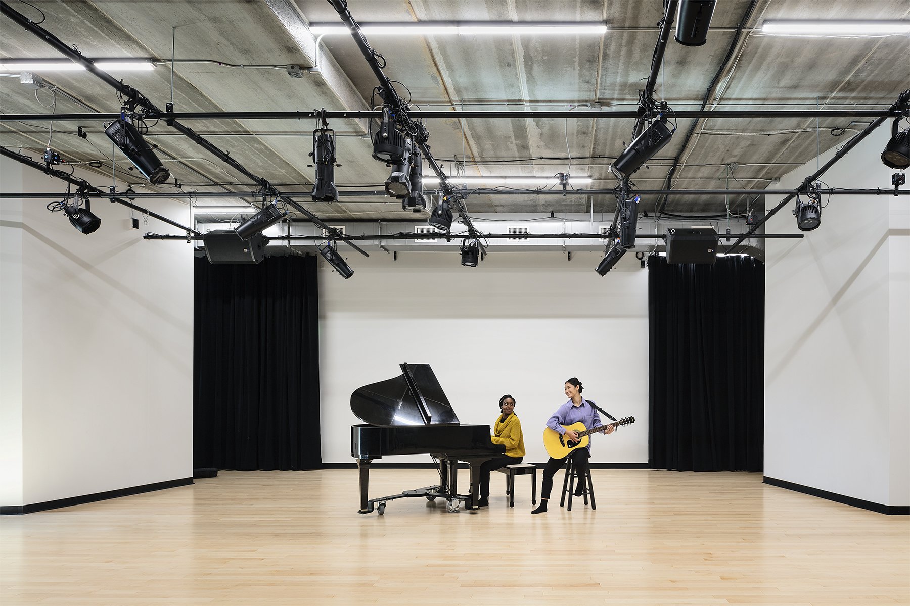
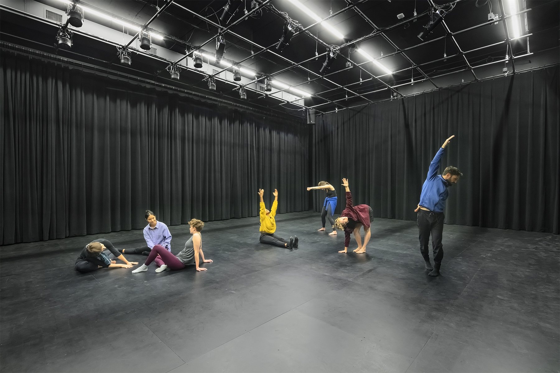
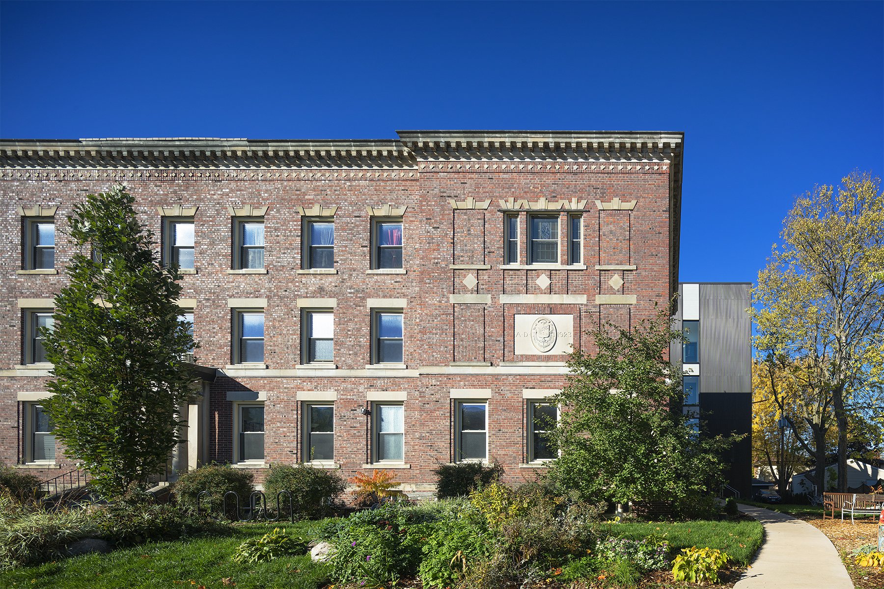
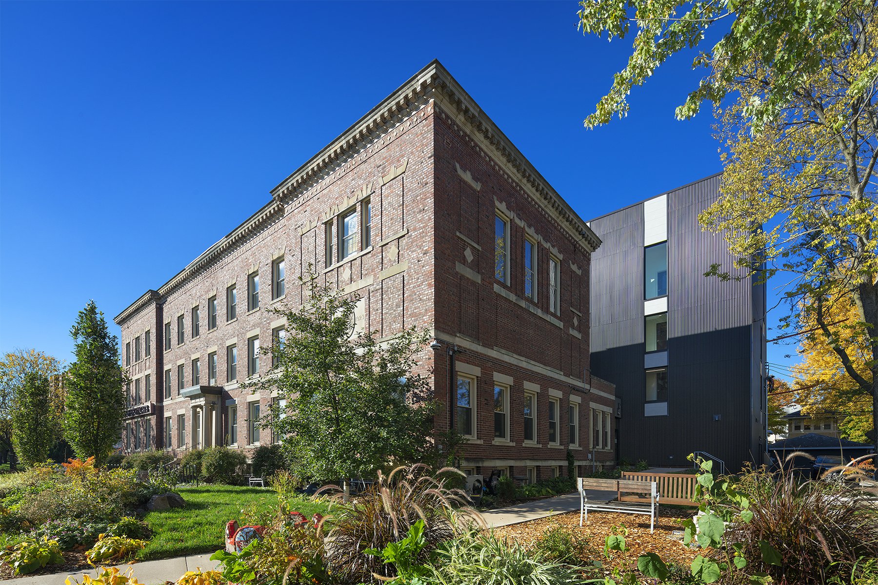
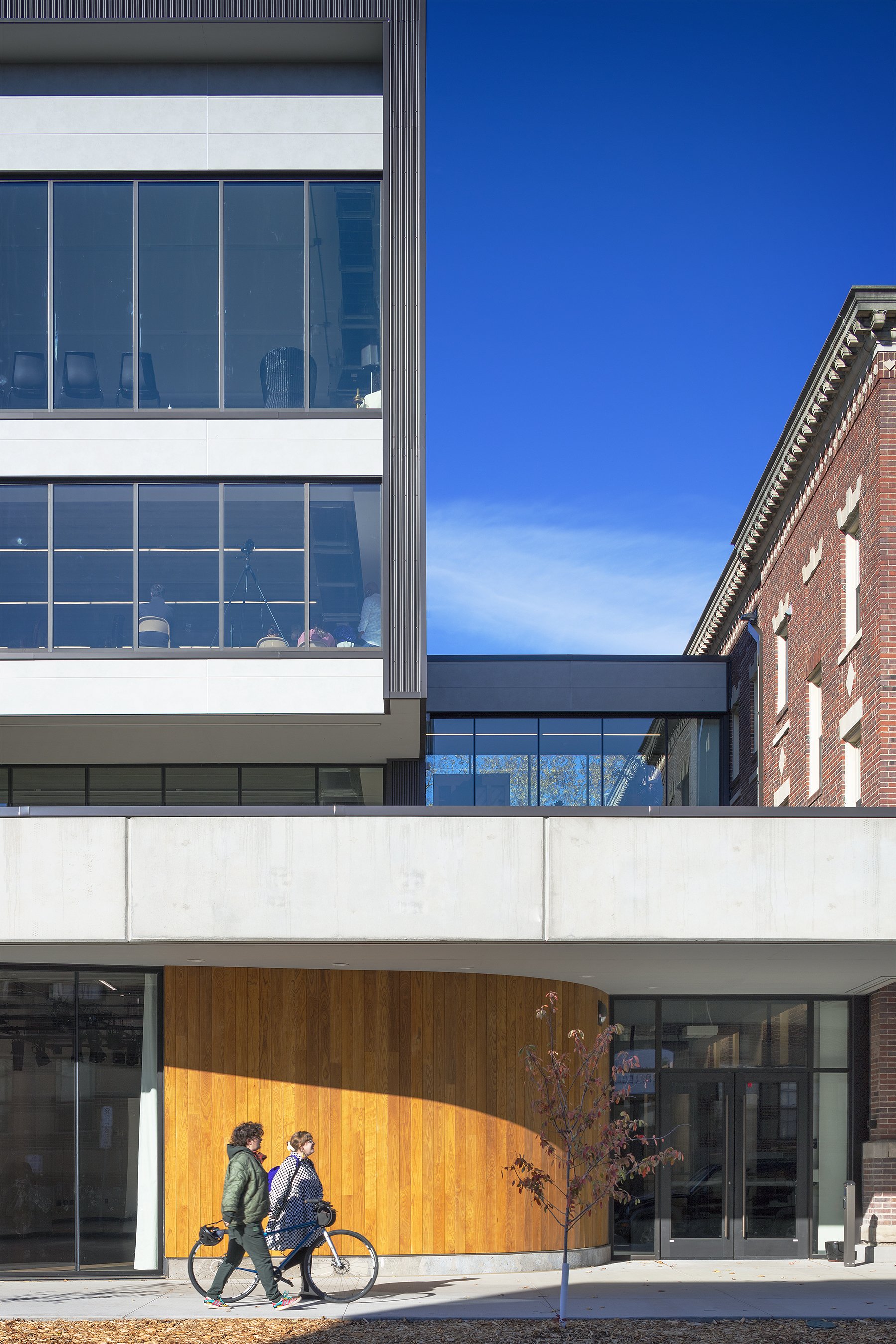
Images 1–8: New meets old in the lobby; a rehearsal room overlooking the street; two views of the street-side performance space; the black box; the expanded facility has a more prominent profile on East 38th Street; and two views of the landscape wrapping the original building. Photos by Peter J. Sieger.
Because we do performances and progress work with artists, we also needed spaces that could engage audiences in a more serious way. So, the two 100-seat performance spaces on the first floor were very important to the design. They were needed among the people who were doing programming here already, and they were needed in this part of the city.
And then [a third driver for the project was] ADA accessibility. In our original building, only the first floor was accessible, with an exterior wood ramp we had had built. Access is an important value for us, so being able to bring accessibility to the performance spaces and rehearsal rooms was very exciting.
Pinto: From the beginning, we knew we wanted to respect the original building and keep it as part of the fabric of the corner of 38th and Pleasant. The direction was always to build on the west side of the existing building and connect to it in a way that would provide, for the first time, accessibility to all levels.
To make the center more accessible to the community, the two performance spaces were placed on the street level, just inside the lobby. And we sized them for usability and flexibility. The challenge was very much fitting the program on that site with its zoning requirements, including height restrictions and setbacks from both the street and the alley. Our options were limited, so it took some doing to fit everything in and create the kind of experience they were looking for.
On the addition’s contemporary character
Pinto: Jackie was very much open to a modern addition that complemented the historic building. We talked about how we would do that in terms of scale and proportion, especially in the street elevation, and about materials that would complement the brick. We studied different colors. The addition’s corrugated dark bronze steel picks up a blend of the brick colors, but it also stands out as a new material. The concrete and other horizontal bands in the addition relate to the cast stone in the original building. There are numerous ways a contemporary addition can honor an historic building and make it even more special.
“What we call our front porch was something I wanted for its sense of neighborliness. I’m also an artist with an installation focus, so I’m very sensitive to the movement of humans and the relationship that people have to structures—and to what an invitation might look like. Marcelo and his team did a great job of jumping all over those impulses [with the welcoming entry].”
Hayes: I was seeking a bold design. I didn’t want the addition to try to match a 100-year-old building. I wanted [the expanded facility] to say, “These [two eras of architecture] are different but related, and they’re both magnificent in their own ways.”
On the “front porch” and its curving wood wall
Hayes: What we call our front porch was something I wanted for its sense of neighborliness. I’m also an artist with an installation focus, so I’m very sensitive to the movement of humans and the relationship that people have to structures—and to what an invitation might look like. Marcelo and his team did a great job of jumping all over those impulses [with the welcoming entry].
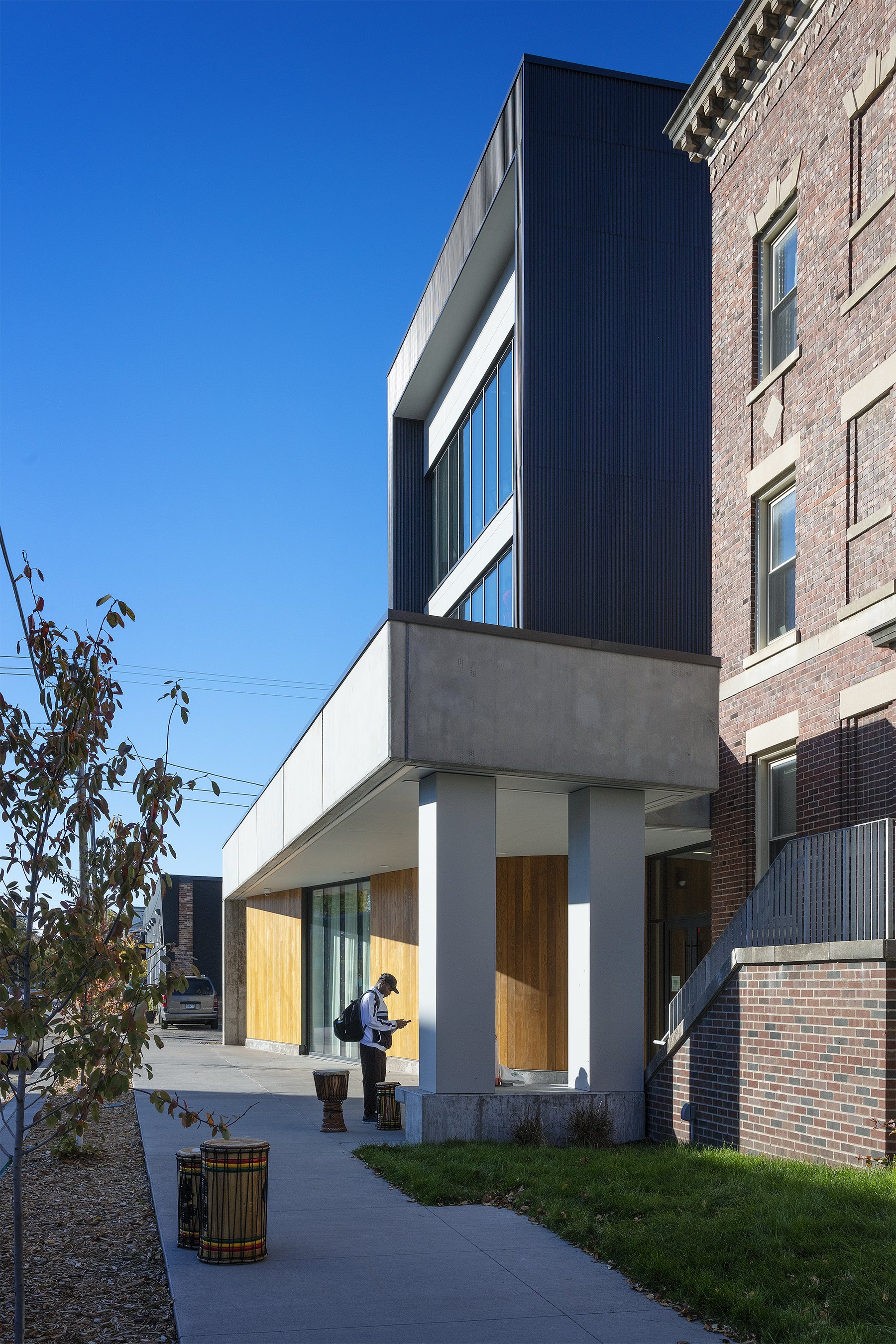
Pinto: We wanted something along the street that really brings people into the building. Something tactile and natural. The curved wall of the street-facing performance space created an opportunity to do a soft, inviting curve clad in ash boards at the entry. The wood, like the corrugated metal, complements the brick in an interesting way.
Sausen: The front porch is a civic gesture. With its canopy and with a real-time transit display just inside the glass entry, it acts as a bus shelter for a busy transit corridor. Even when the building is closed at night, you can see the display in the vestibule. The front porch became part of that attitude of being a good neighbor.
Hayes: It’s become a social space, too, especially during COVID. People can be with each other and unmask for a little while. Yesterday, we had a meeting under the porch while it was pouring rain, and it was fabulous. We have lots of dog walkers in the neighborhood, and with the glass entry and the floor-to-ceiling window into the performance space, people can now see what’s going on in the center. The convent was designed as an introverted residential space, a place for contemplation, so it was missing that sense of openness and welcome we wanted. The porch provides that for us.
Pinto: It does two things at once: It reaches out to the community, and it kind of frames you and brings you into the new lobby.
On the new lobby
Pinto: Putting the lobby on grade with the street was the best way to make the performance spaces accessible. And then we had to deal with the different levels inside. An elevator in the addition has connections to the upper floors in the original building, and for the split level between the lobby and the original building’s basement level and first level, we have a platform lift. We had to use a few tools to make the facility truly accessible.
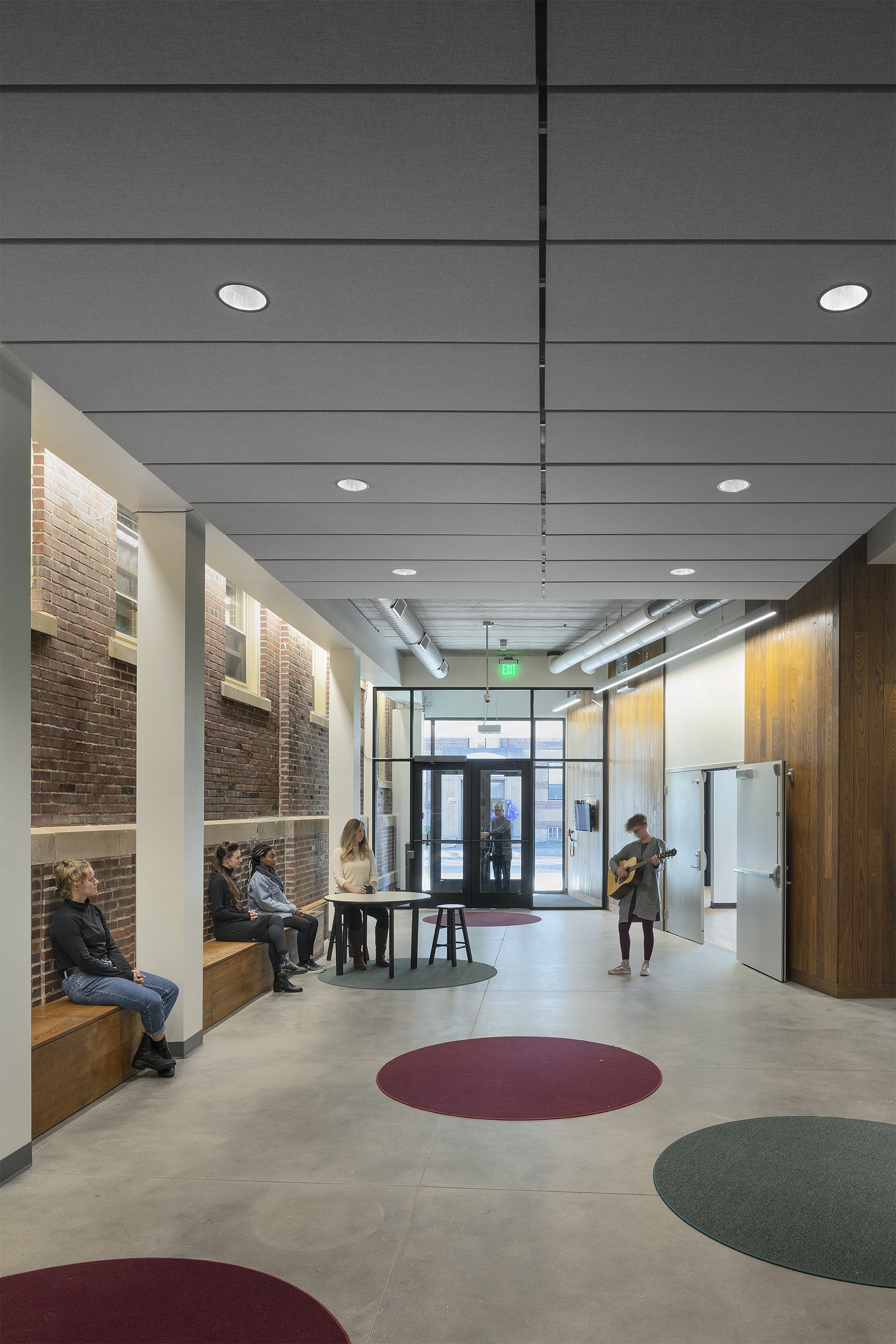
Jackie would always say, “I need a central space where people can orient themselves to where they need to go.” During the day, parents sit on the long, built-in wood bench while they wait for their kids to come out from their lessons. After performances, guests linger in the lobby. It’s designed to be a flexible, multipurpose space that connects everything.
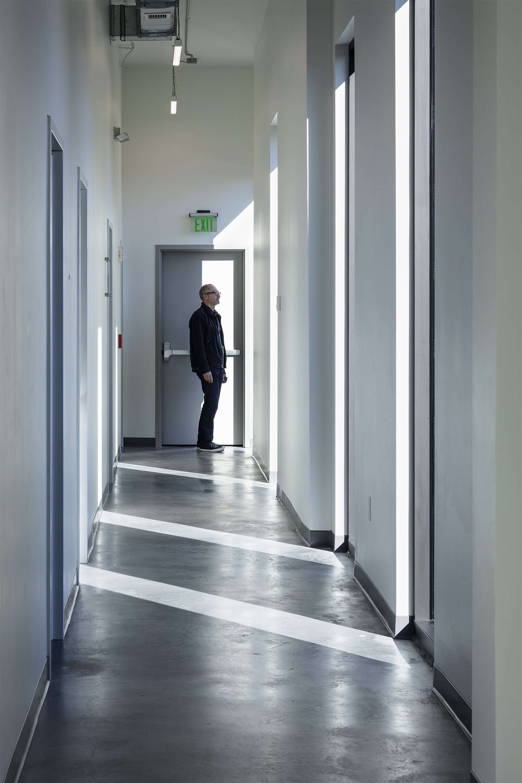
Images 1–4: Ash paneling lends warmth and texture to the entry; the covered entry effectively doubles as a bus shelter with a bench; the ash panels continue into the lobby; and an upper-floor hallway in the addition. Photos by Peter J. Sieger.
Sausen: Jackie says that everyone’s favorite spot is the walkway half a level up, outside the original building’s sunroom, overlooking the lobby. It’s a fun spot to see and be seen. It’s also a vantage point that presents the original building’s exterior, which is now embedded in the lobby, opposite the curving wood wall of the porch as it wraps into the building’s interior. It’s a place of potential—new and old tied together by the lobby.
Hayes: In the original building, we didn’t have a lobby—only hallways, which were not conducive to conversations. Now we have four, six, or 10 different things going on and people passing and recognizing each other. Some folks come early to classes so they can sit and chat with others. The lobby is a space that helps us build relationships and build a community.
On the mix of spaces and the need for flexibility and sound attenuation
Sausen: It was a fun 3D puzzle figuring out how to stack all the needed uses. We put a conference room or rehearsal space at the south end of levels 2, 3, and 4, facing the street. And there was a wide range of program requirements for the tenant spaces. Our structural solution for the flexibility they needed was to use precast planks that span the width of the addition. That allowed us to say, “If you have a big tenant coming in who’s going to take up an entire floor and doesn’t want any interior walls, no problem. And if you have 20 small tenants who each need a small compartment of space, we can accommodate that, too. We can freely arrange the floor plans for different needs.”
Hayes: We have musicians next to body workers next to writers, so we knew we needed to build sound attenuation into the bones of the addition. Material choices and doing precast concrete were part of addressing that sensitivity to sound.
I also wanted the hallways to run along one side of the addition, as opposed to down the middle of the building, as they do in the convent. That allowed us to shape spaces that are more flexible [than the rectangular spaces in the convent] for classes, lessons, and rehearsals. The idea also being that we wanted variety. So, no matter what you do or where you are in your process as a creative practitioner, you can find the right environment here.
We also wanted light everywhere, understanding that a space could always add a curtain. The design for the lobby, in particular, was driven by a desire to have as much airiness and light as possible.
On the garden and PorchFest
Hayes: We love our garden spaces around the building, and we’re talking about doing some art pieces that engage the community in the garden on the north side of the building. There’s enough space there where we can invite people to come for a poetry reading or a dance performance—Ragamala Dance Company is one of our tenants.
Today, we’re participating in the Kingfield PorchFest to support neighborhood artists who are presenting on their porches. We’ll have a couple of artists, teachers, and students presenting next to our porch, so we don’t block the exit. We consider our green spaces essential to the balance we hope people experience here, whether they’re rehearsing outside or just taking a break.
On what’s next
Hayes: For a building for artists, we don’t yet have much color and artwork; we’ll add those elements over time. We did the minimum of finishing touches, so that we could discover who we are in this new space. We’ll bring in artists and artwork as we evolve.
Sausen: Jackie asked us for a space with honest, industrial finishes that could support future engagement and activation by the artists and tenants of CFPA. So, there are a number of areas slated for future artwork, and we know that Jackie will find even more opportunities throughout the space than we imagined.
Pinto: We’re also excited that the roof over the entry is designed for the future installation of a terrace. It’s just off a multipurpose gallery space for artist shows and receptions. Guests will be able to step out onto a terrace overlooking 38th and have that view above the street.
Hayes: [The roof terrace] is an opportunity for more than just receptions. Imagine performances that audiences and passersby can see from the street. I’m starting to talk to artists who say they’d love to perform on such a platform. We’ll see how crazy we get.
The Center for Performing Arts project team included Stahl Construction, Alliiance, Pierce Pini & Associates (civil engineer), BKBM Engineers (structural engineer), and Kvernstoen, Rönnholm & Associates (acoustics consultant).


