A Conversation with 2022 AIA Minnesota Gold Medal Recipient Tom Meyer, FAIA
The architect looks back on two historic-mill projects that help tell the story of adaptive reuse in the 21st century
Interview by Chris Hudson | January 26, 2023
Tom Meyer, FAIA, at MSR Design, the firm he cofounded more than 40 years ago. The office, completed in 2020, received Living Building Challenge Petal certification in 2021 for design achievements in materials, beauty, and equity. Photo by Andrea Rugg.
FEATURE
ENTER recently sat down with Tom Meyer, FAIA, cofounder of Meyer, Scherer & Rockcastle and recipient of the 2022 AIA Minnesota Gold Medal. The firm—now MSR Design, led by a new generation of owners—has a long résumé of award-winning libraries, higher-education facilities, cultural spaces, nature centers, and workplaces over its 42-year history.
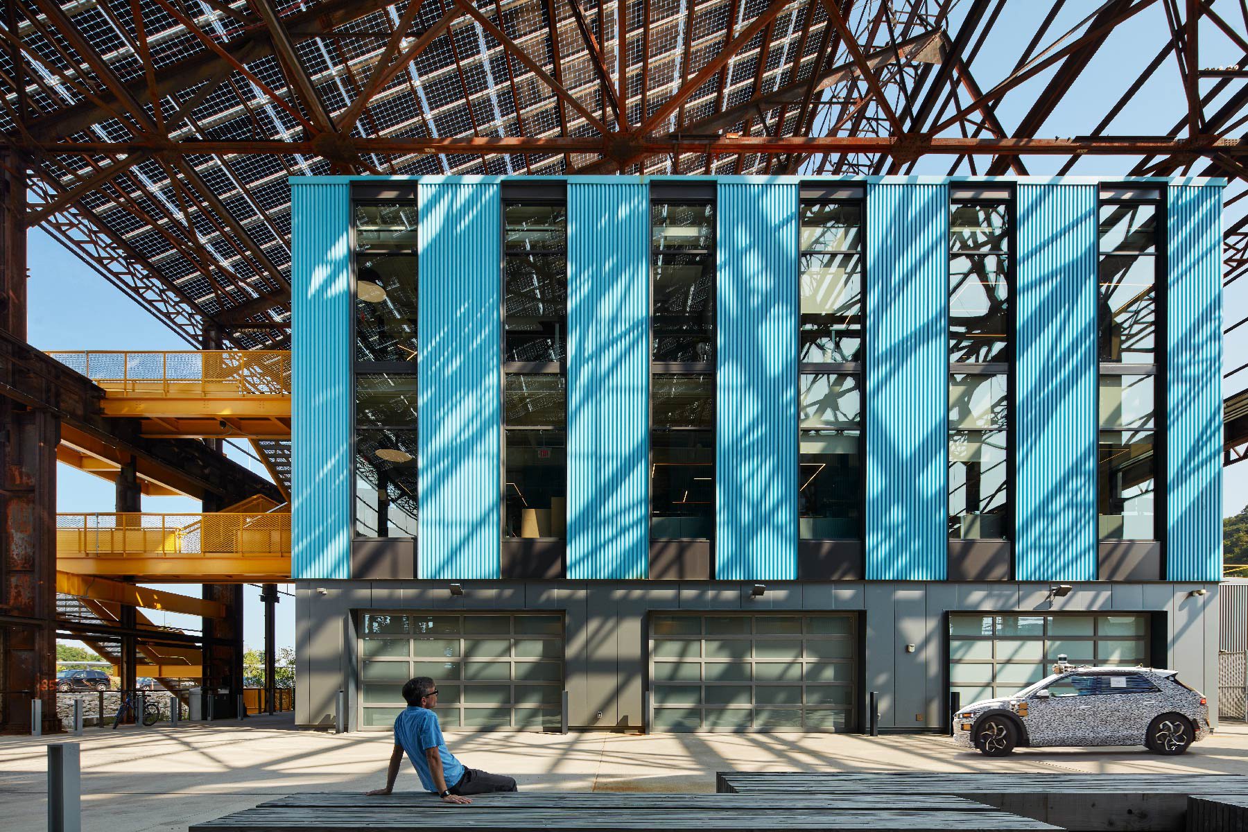
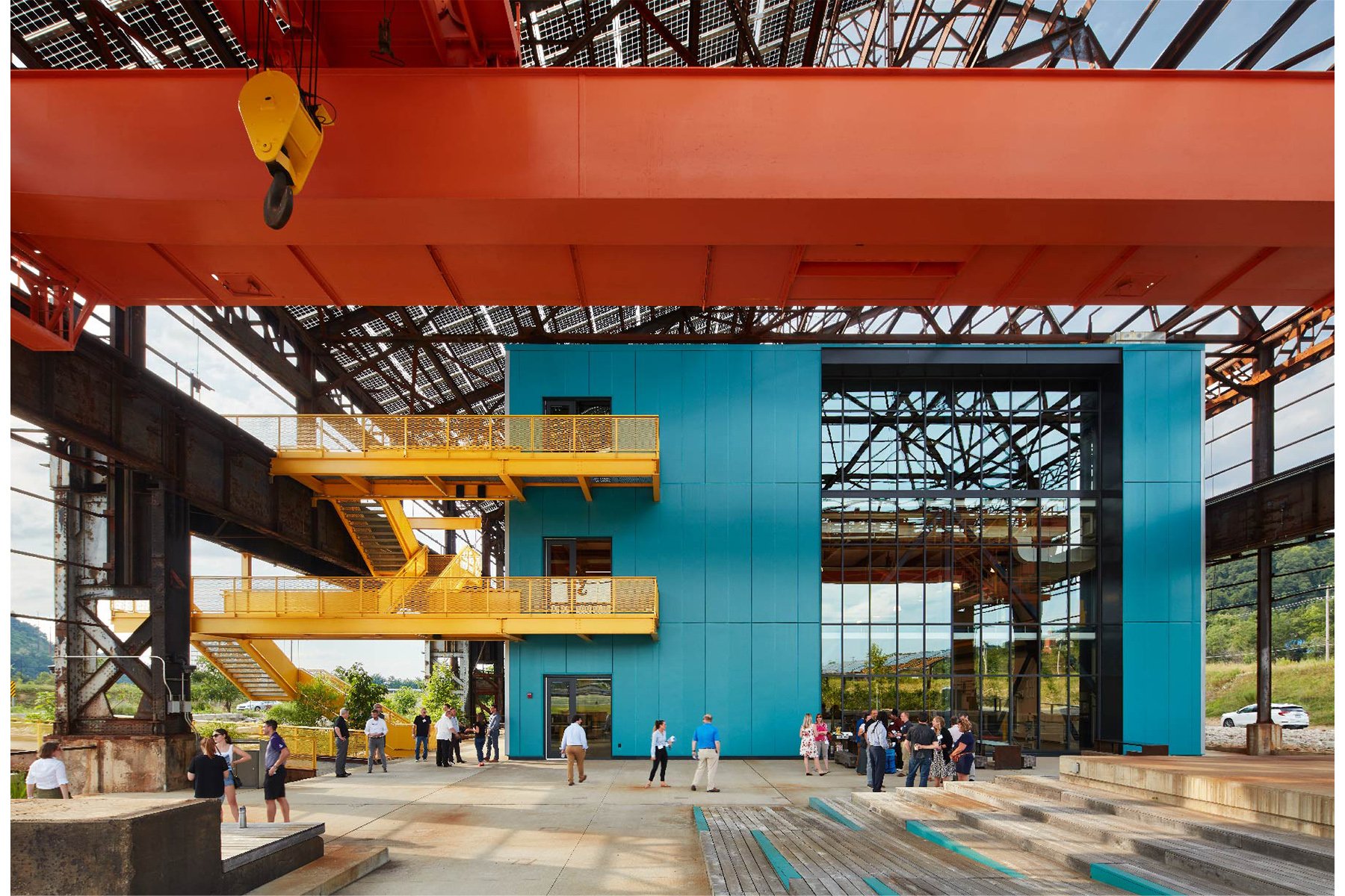
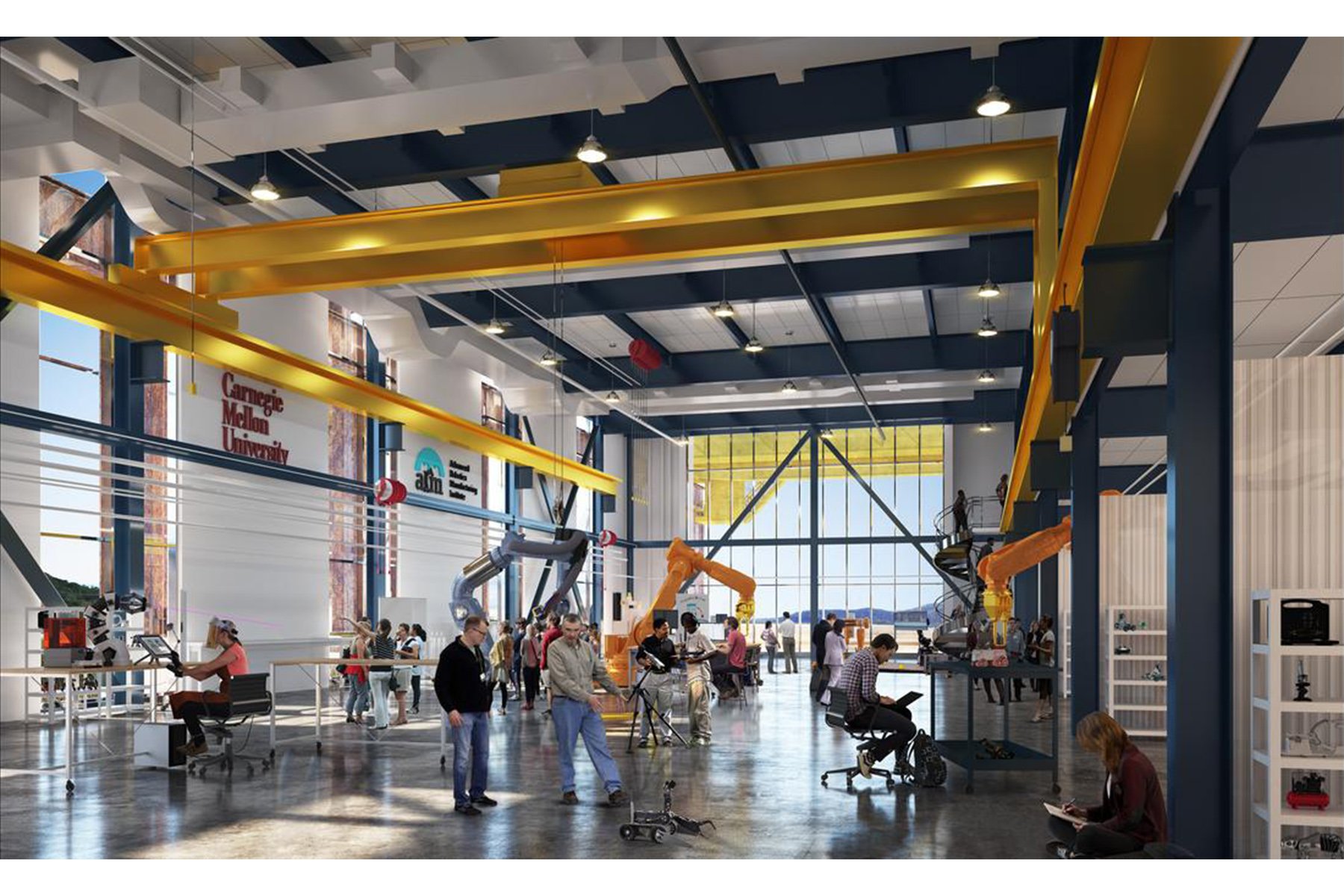
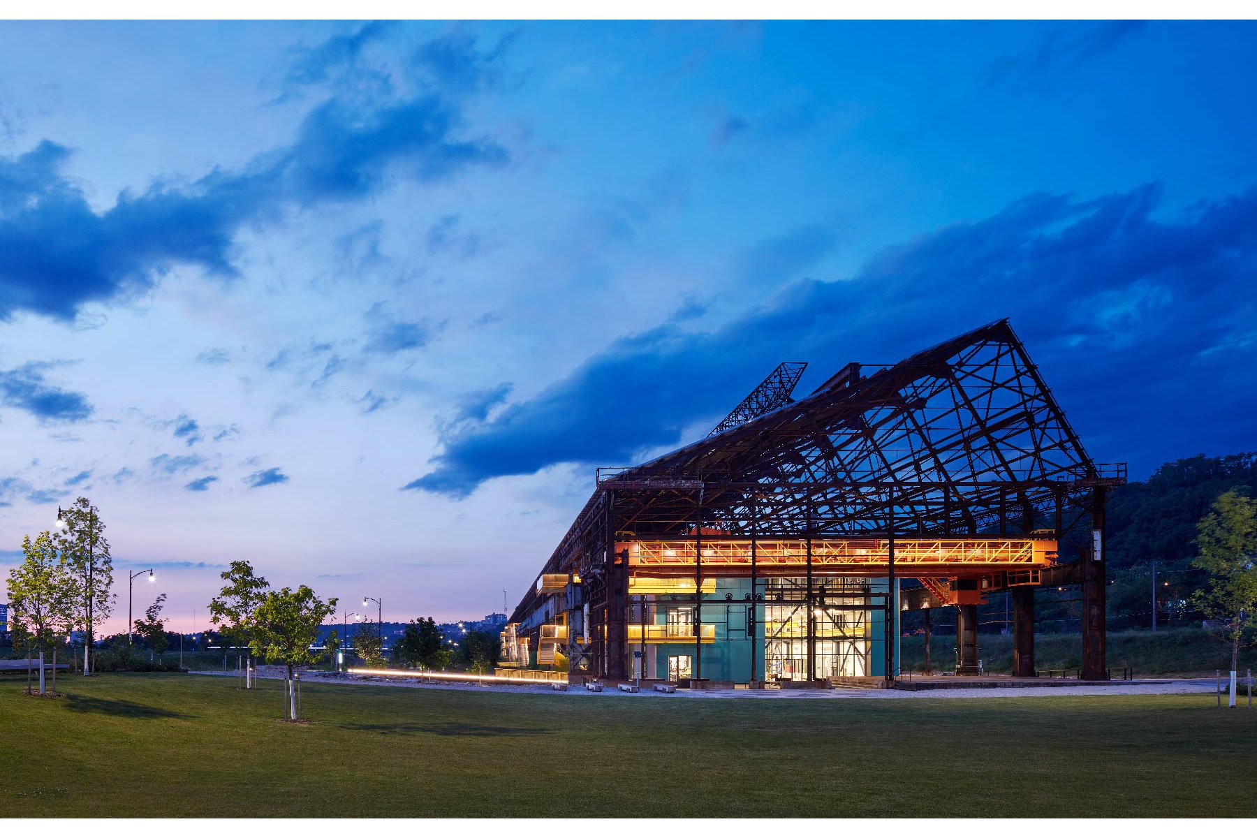
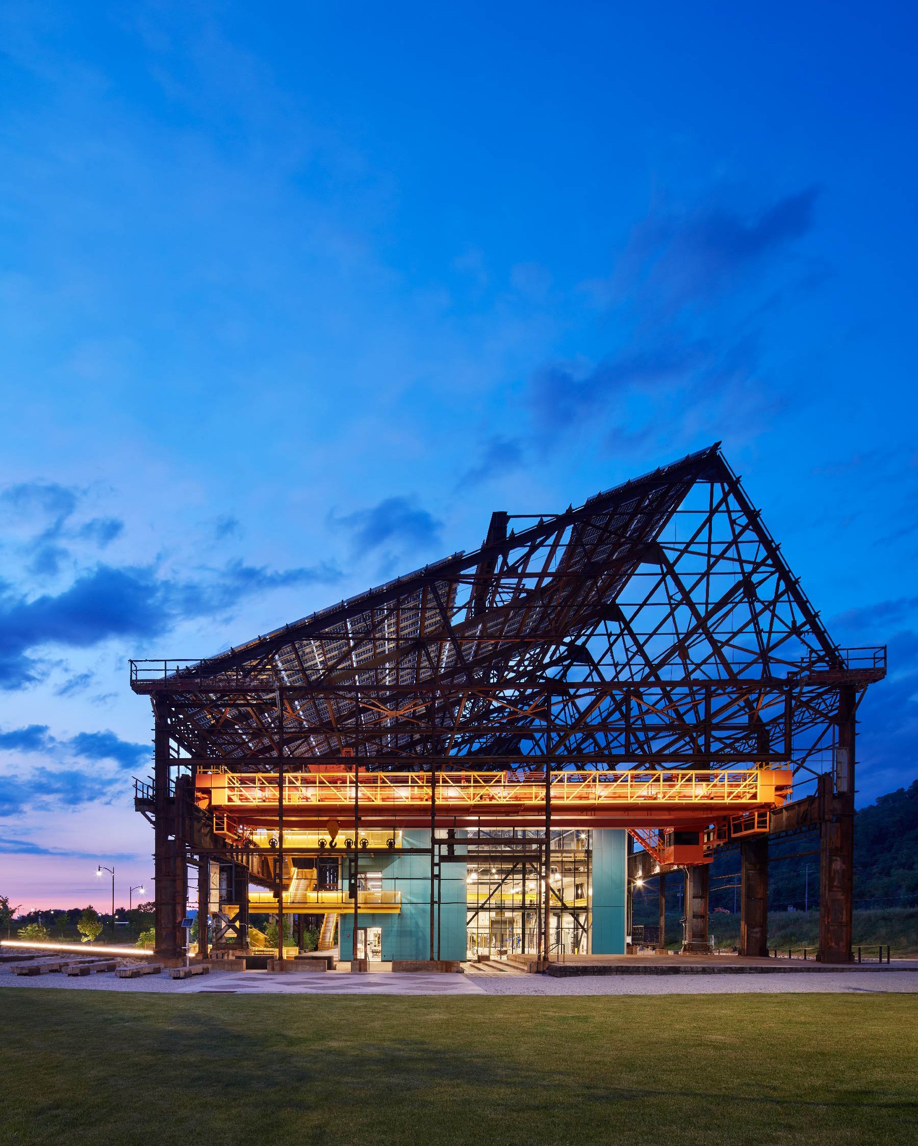
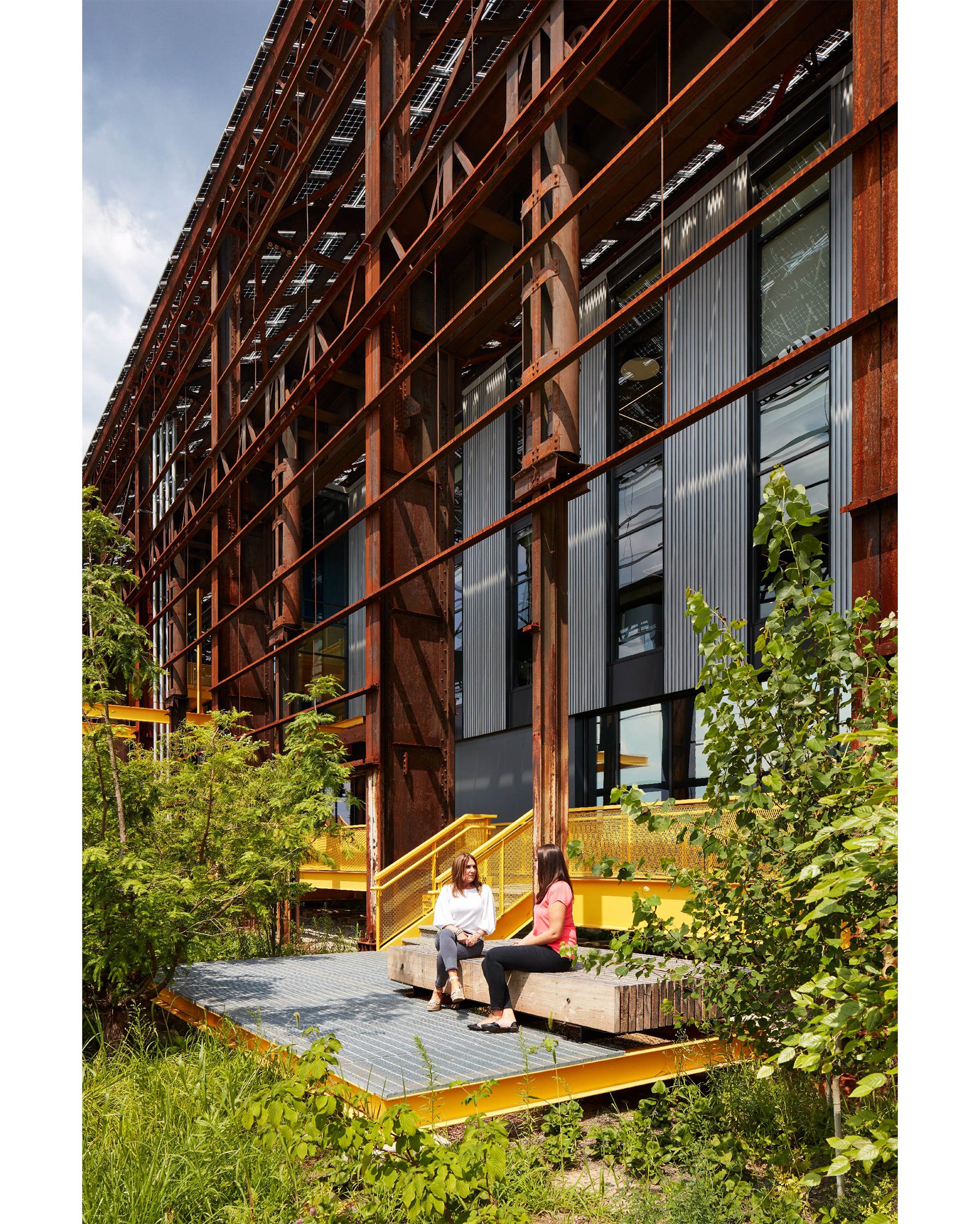
Meyer may be best known as the lead designer of Mill City Museum in Minneapolis. Before his retirement in 2022, Meyer also led MSR Design’s adaptive reuse of Mill 19 in Pittsburgh. Winner of a 2023 AIA COTE Top Ten Award and 2022 AIA Minnesota Commendation for Excellence, the Mill 19 project involved repurposing the steel skeleton of an abandoned steel rolling mill as an outer shell for new high-tech office, lab, and manufacturing facilities. The mill’s roof supports the largest single-sloped glass solar array in the U.S. ENTER spoke with Meyer about the two mill projects.
Tell us about your time as a student at the University of Minnesota and your early interest in the Minneapolis riverfront.
I grew up on a farm, and I went to architecture school without knowing really anything about architecture. For a couple years, I did okay, but honestly, I have to say I didn’t really get what was being taught—designing new buildings on mostly urban sites. There wasn’t a lot that I could find to relate to.
I kind of understood modern architecture, but then I went to Italy and Greece with fellow students, and, boy, was that an eye-opener. I saw buildings that responded to their landscapes—Italian hill towns, island architecture in Greece, and ruins in Rome and other places.
When I came back, I lived near the river, and I began to see similar things—bridges, dams, and mills that had to engage in a direct way with the landscape. Suddenly, something clicked: “Oh, this is architecture.” I went on to do my thesis on a riverfront museum near Pillsbury A-Mill. That was a real turning point, those things coming together for me. Buildings in landscapes. Architecture and place.
Meyer, now founding principal emeritus at MSR Design, with colleagues Byoungjin Lee, AIA, and Ben Lewis, AIA. Photo by Andrea Rugg.
You went on to work with architect Peter Hall in 1979 and 1980 on the riverfront in a makeshift studio in the otherwise disused Washburn Crosby Utility Building.
Peter had the office on the fifth floor pretty much set up before I joined him. The heating in the building was steam heat. The owner kept the heat on at probably great cost so that the plumbing and sprinkler system would continue to work. There was no cooling, so it got very hot in there. It smelled like rotting grain and maybe a bit like rat poison.
But it was astonishing. I’d take my lunch into different corners of the building and just sit in the quiet among the machinery. The golden sunlight coming in through the flour-fogged windows created an aura. It was magical to be in this empty place that was once noisy and vibrating.
Fast forward a decade, and the derelict mill complex next door to the Utility Building suffers a catastrophic fire.
In 1991, our firm had been underway for 10 years. We’d been doing some modest planning work on the riverfront for the city and the Minnesota Historical Society [MNHS].
I remember a city council meeting where someone said, “We own a brewery that doesn’t make beer [the not-yet-renovated Grain Belt Brewery], theaters on Hennepin Avenue that don’t show plays, and now a ruined flour mill that doesn’t make flour. Are we crazy?” But Nina Archabal—MNHS’s director at the time—and others said, “Let’s give it a little time.” So, the city spent some money to temporarily prop up the ruins.
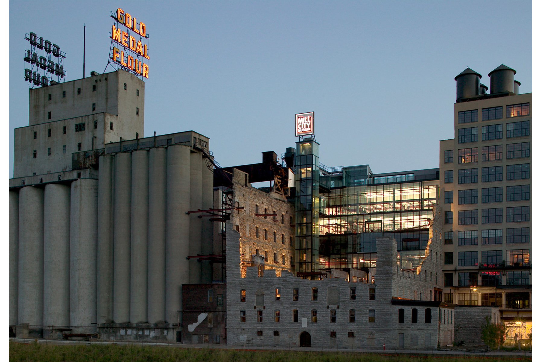
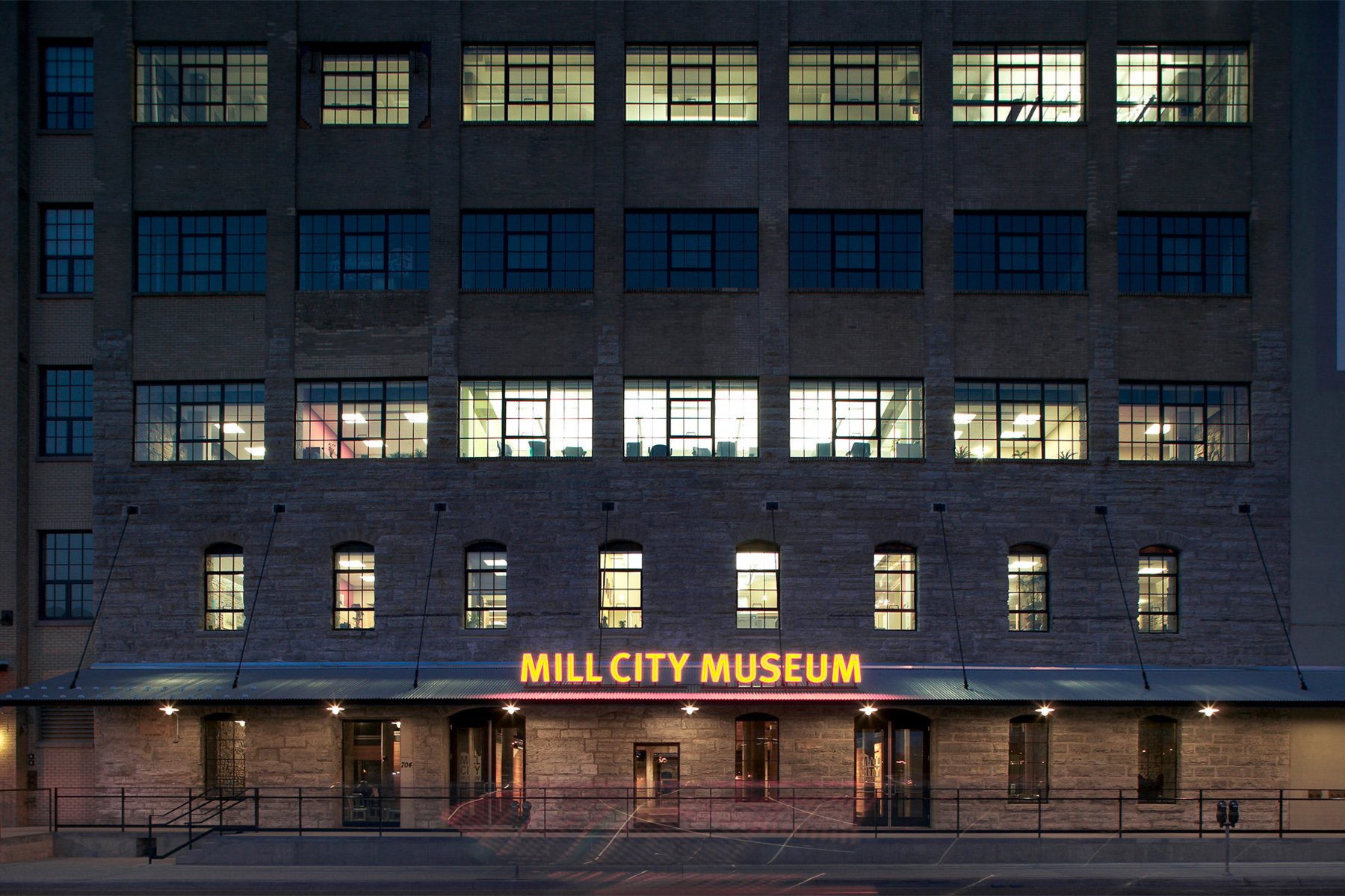
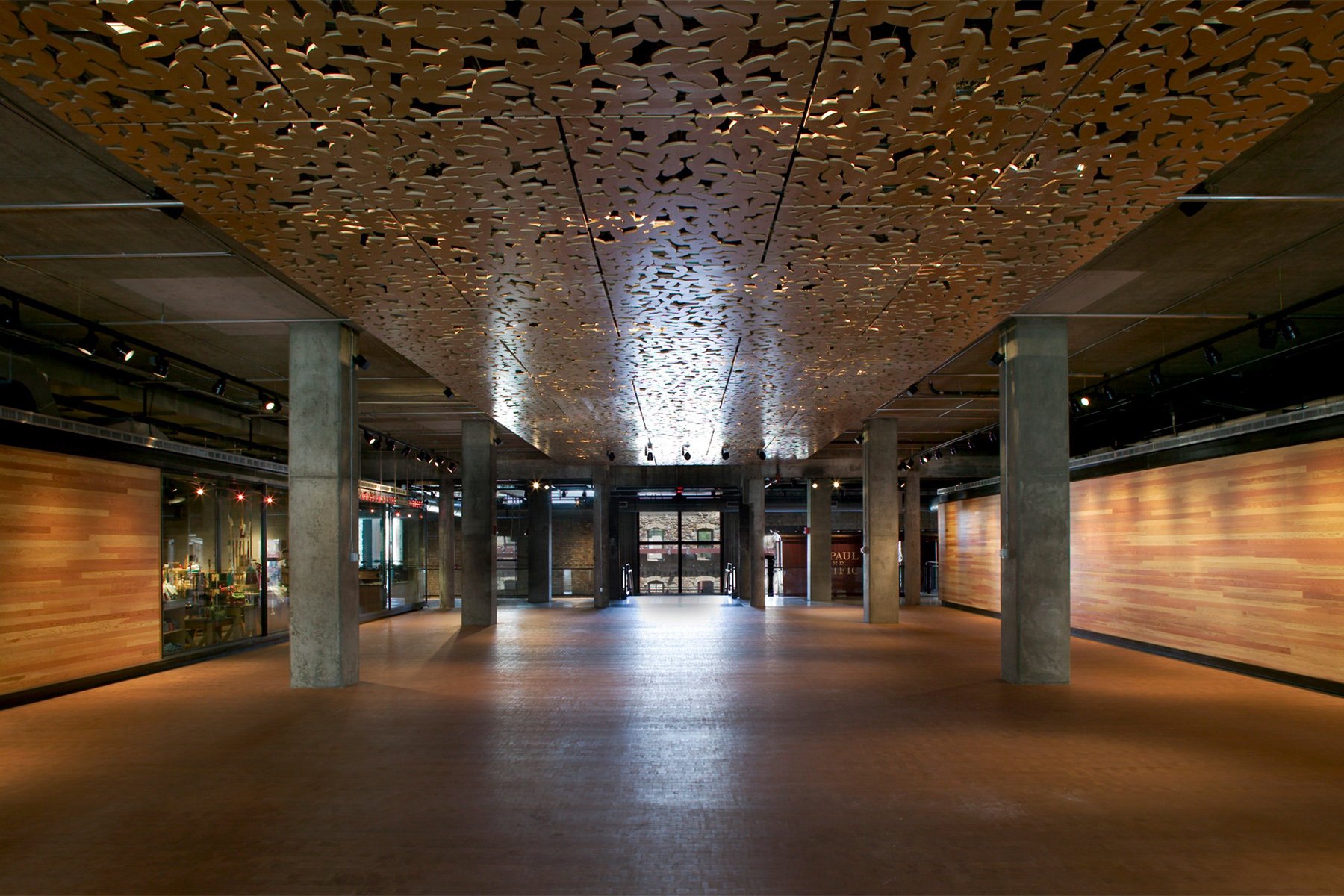
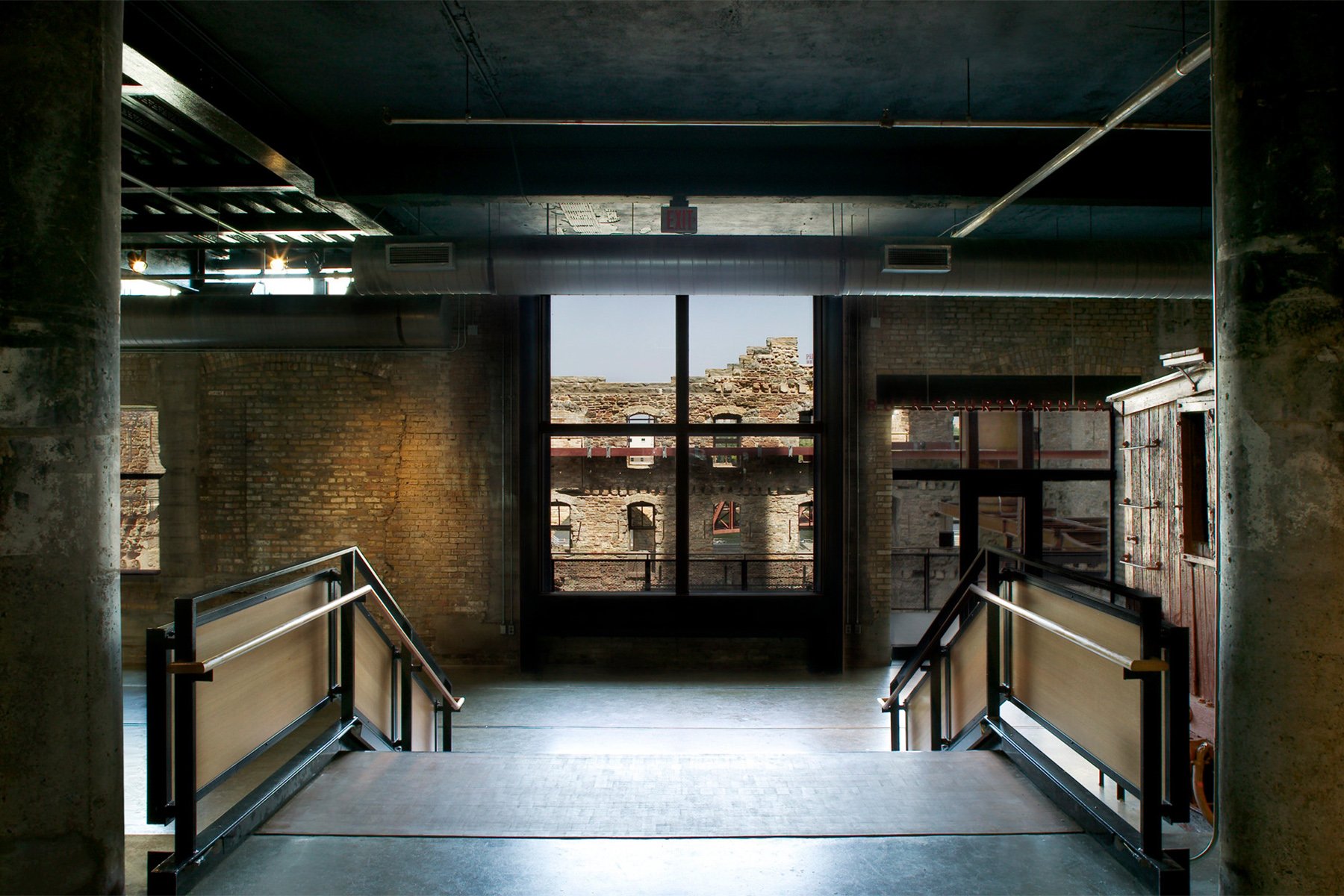
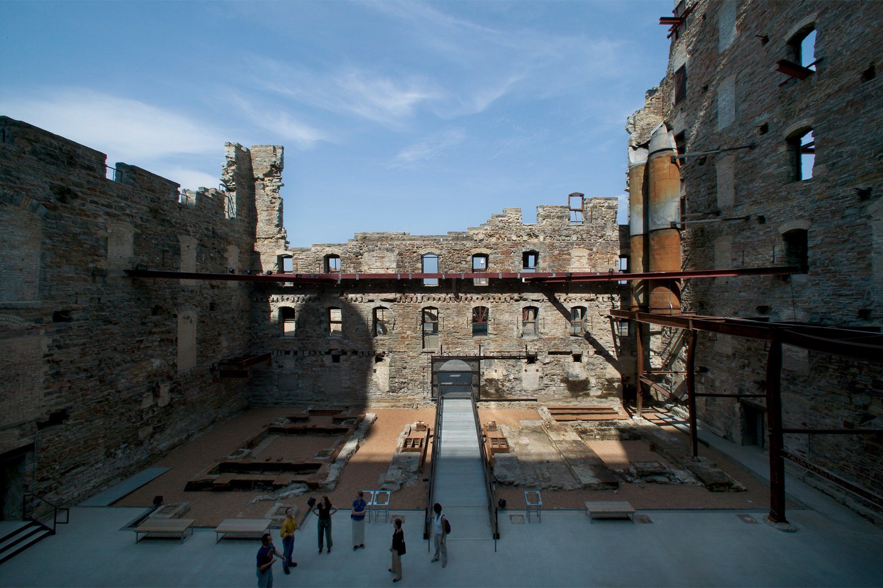
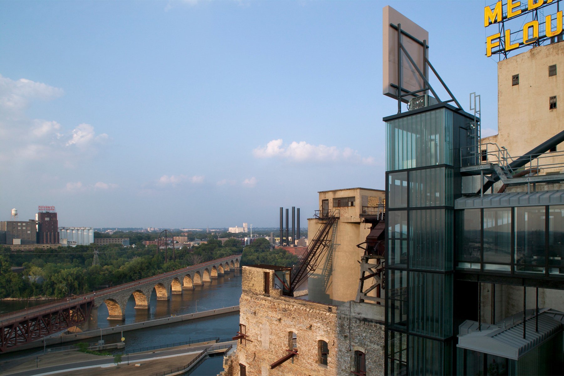
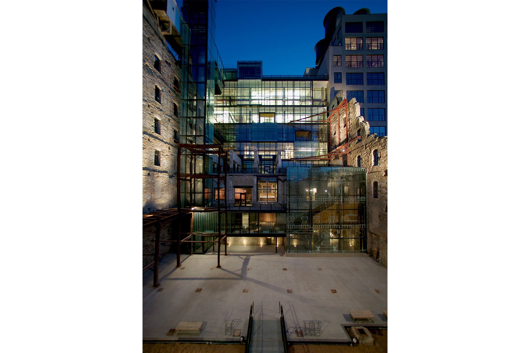
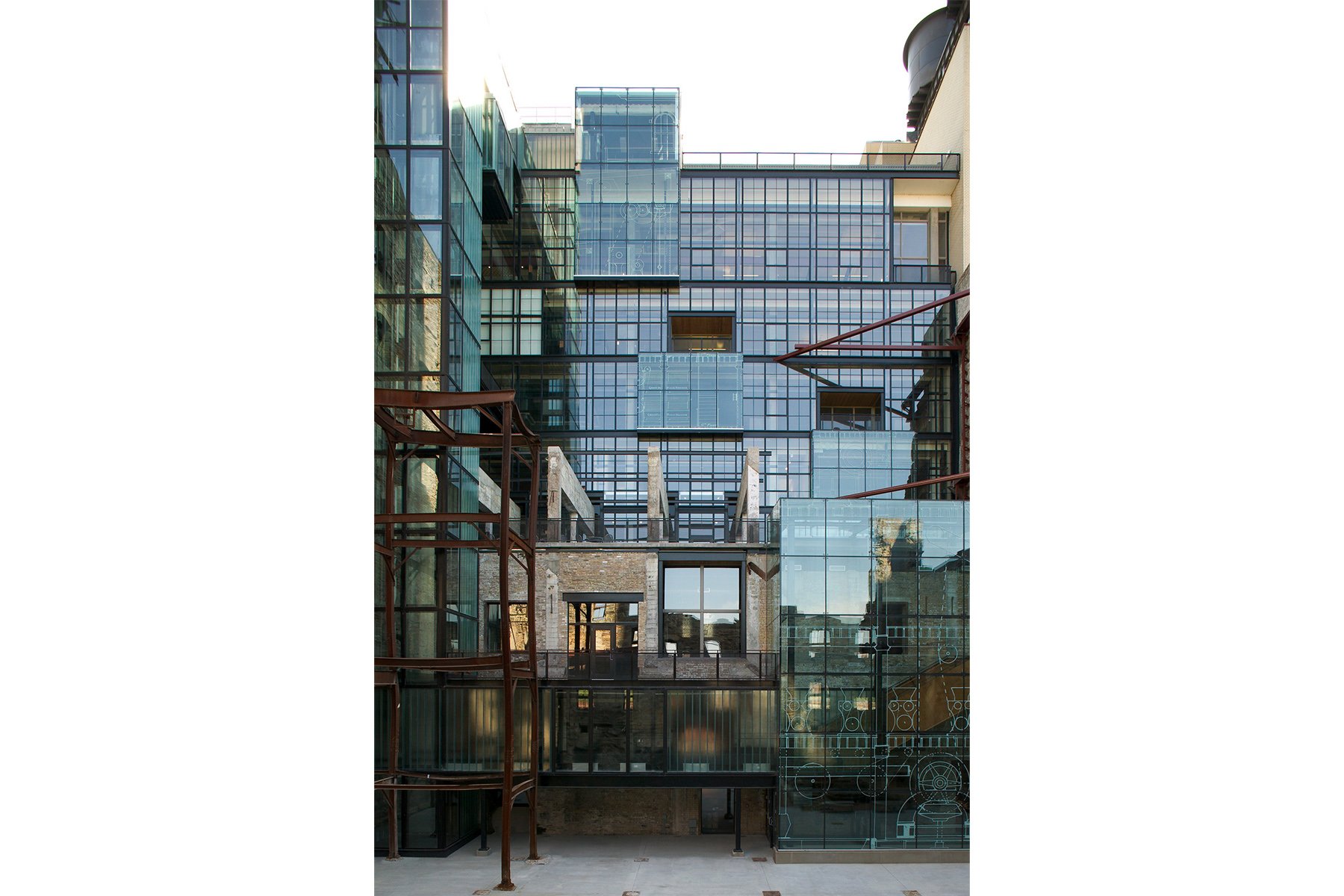
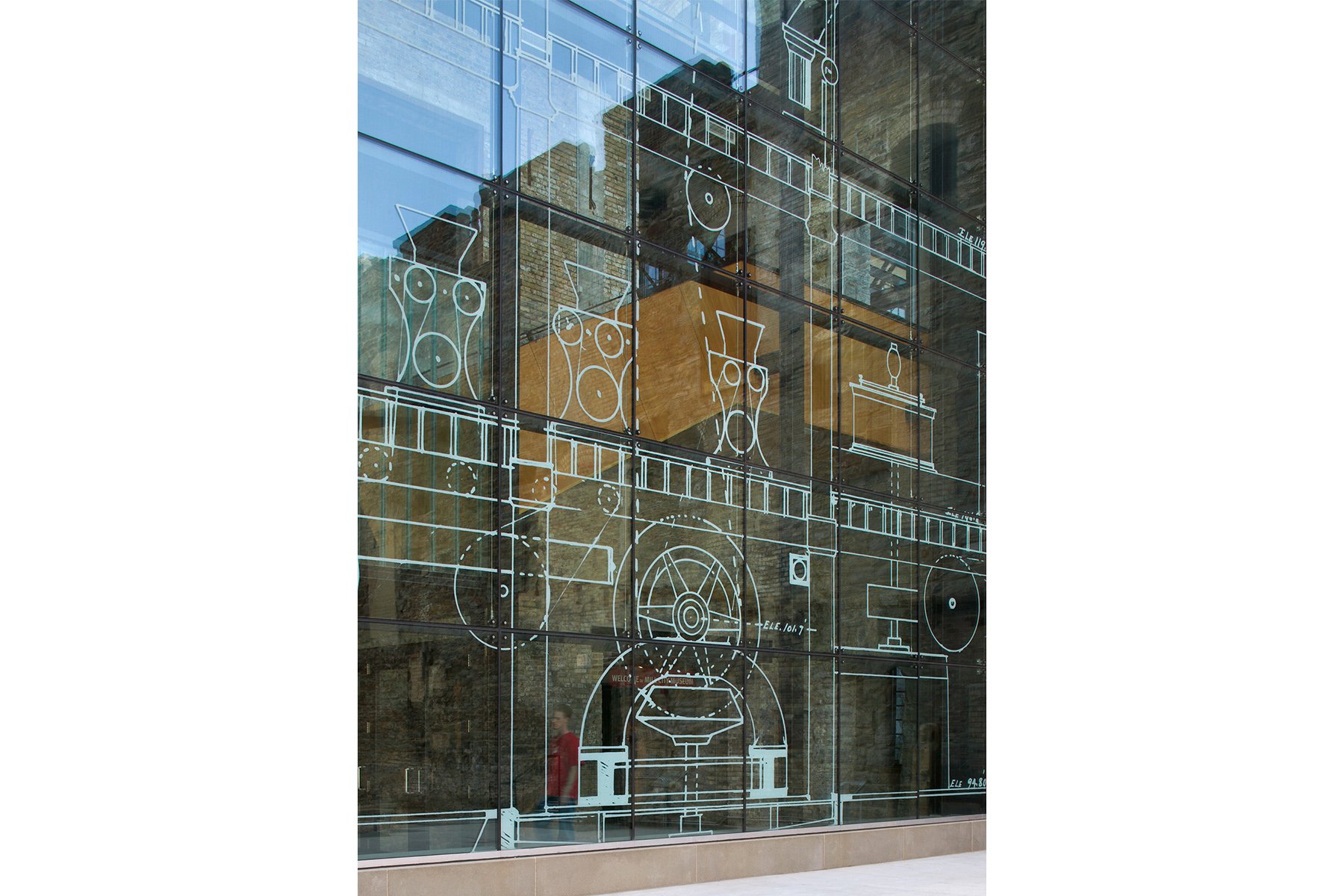
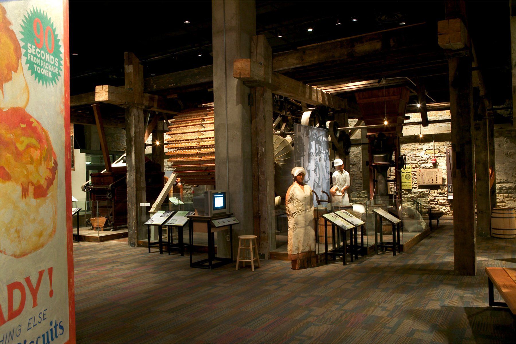
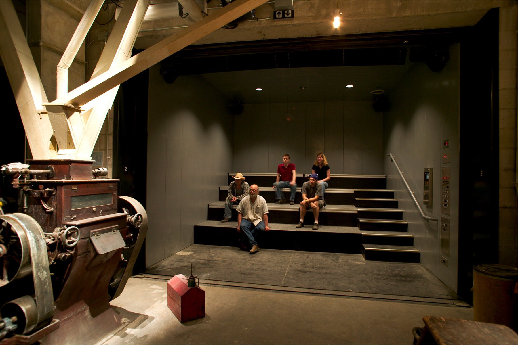
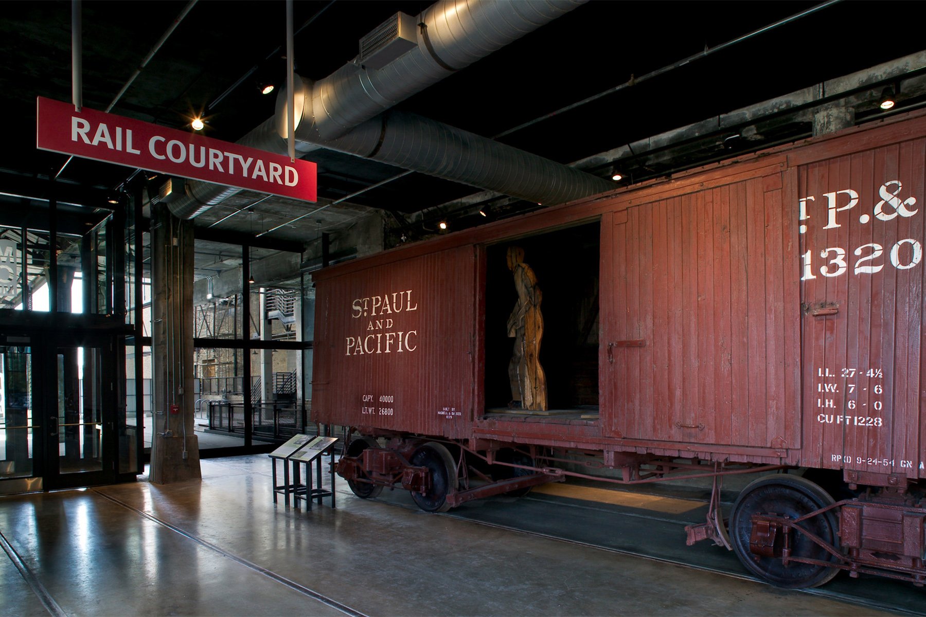
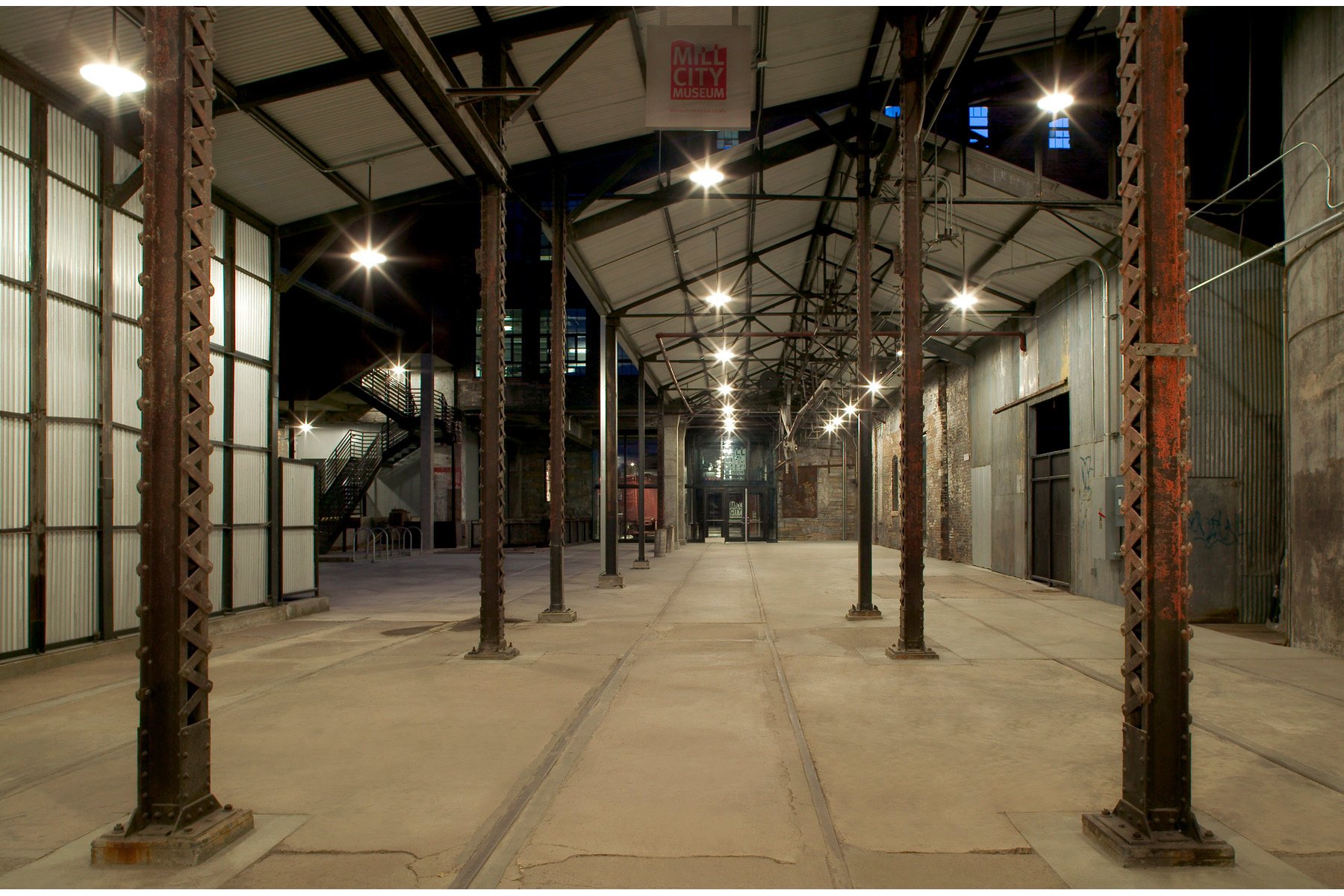
Photos 1–13: Mill City Museum at the time of its opening in 2003. The project won a 2004 AIA Minnesota Honor Award and a 2005 AIA National Honor Award for Architecture. Photos by Farshid Assassi.
A few years passed, and our firm did a survey of all the stuff that survived and could be repurposed. We did drawings of the existing complex because there weren’t any. And I began to develop an argument that the fire had burned a kind of atrium or courtyard into this previously dark, cavernous complex, and that a courtyard would allow for more reasonable footprints.
I taught at the University of Minnesota, and I used the prospective reuse of the complex as a studio project with the idea of the courtyard cooked in. The students built a beautiful model, and I trudged that model around to the city council and other meetings. MNHS had long wanted to create an orientation center there—a small place where you could get a map and walk around. Soon, the idea of creating a museum started to gain traction because of Nina’s advocacy and some fundraising efforts.
Meanwhile, the city was convinced enough to say, “Let’s permanently support these walls.” That investment, in the mid-1990s, ensured the survival of the ruin courtyard. And MNHS did an interpretive plan for the stories that could be told there and the kinds of exhibits that would support those stories.
“It was astonishing. I’d take my lunch into different corners of the building and just sit in the quiet among the machinery. The golden sunlight coming in through the flour-fogged windows created an aura. It was magical to be in this empty place that was once noisy and vibrating.”
In our conversations with Dan Spock, then head of exhibits, we talked about how the historic architecture has a voice and the museum program has a voice, and that the two need to speak to each other. In other words, the opposite of writing a program and then forcing it into the building. Those conversations were important to the design that ultimately became our commission in the late 1990s.
When Mill City Museum opened in 2003, the courtyard with its juxtaposition of masonry ruins and modern glass seemed to instantly strike a chord with people—especially the overlay on the glass of the 1897 millwright’s drawing of how the mill worked.
That was the biggest design challenge: What new facade do you put in a national historic landmark where there never was a facade? We explored several concepts, including one that looked to tell the story of milling in a sectional way.
What was certain was that the facade wanted to be, at least conceptually, three-dimensional. We were thinking of the facade as a collage of the twisted steel, projecting rail corridor, and adjacent ruin walls. So, not a one-foot-thick facade but maybe 40 feet thick. That was what we were composing.
Somewhere along the line, we had access to the amazing General Mills Archives, and we found the millwright’s drawing. We all knew we had to work it in somehow. And we did, with the new enclosure. The old drawing floats on glass in fragments, reversed to be white on black. We hoped it would further the spectral quality of the ruin.
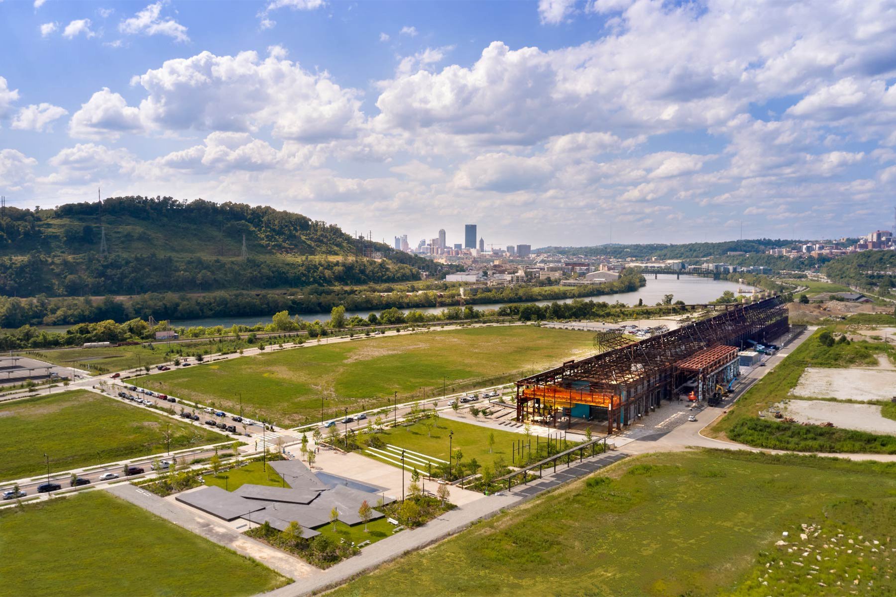
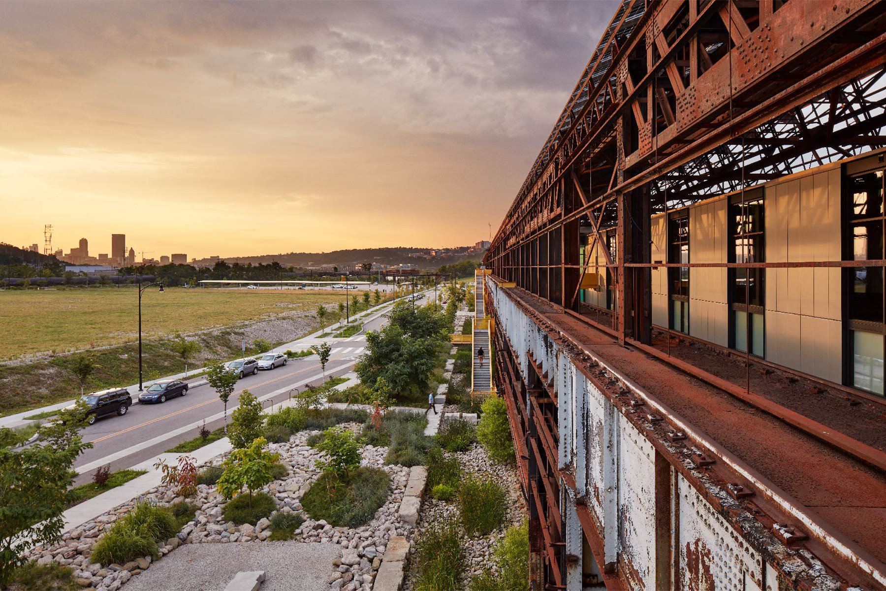
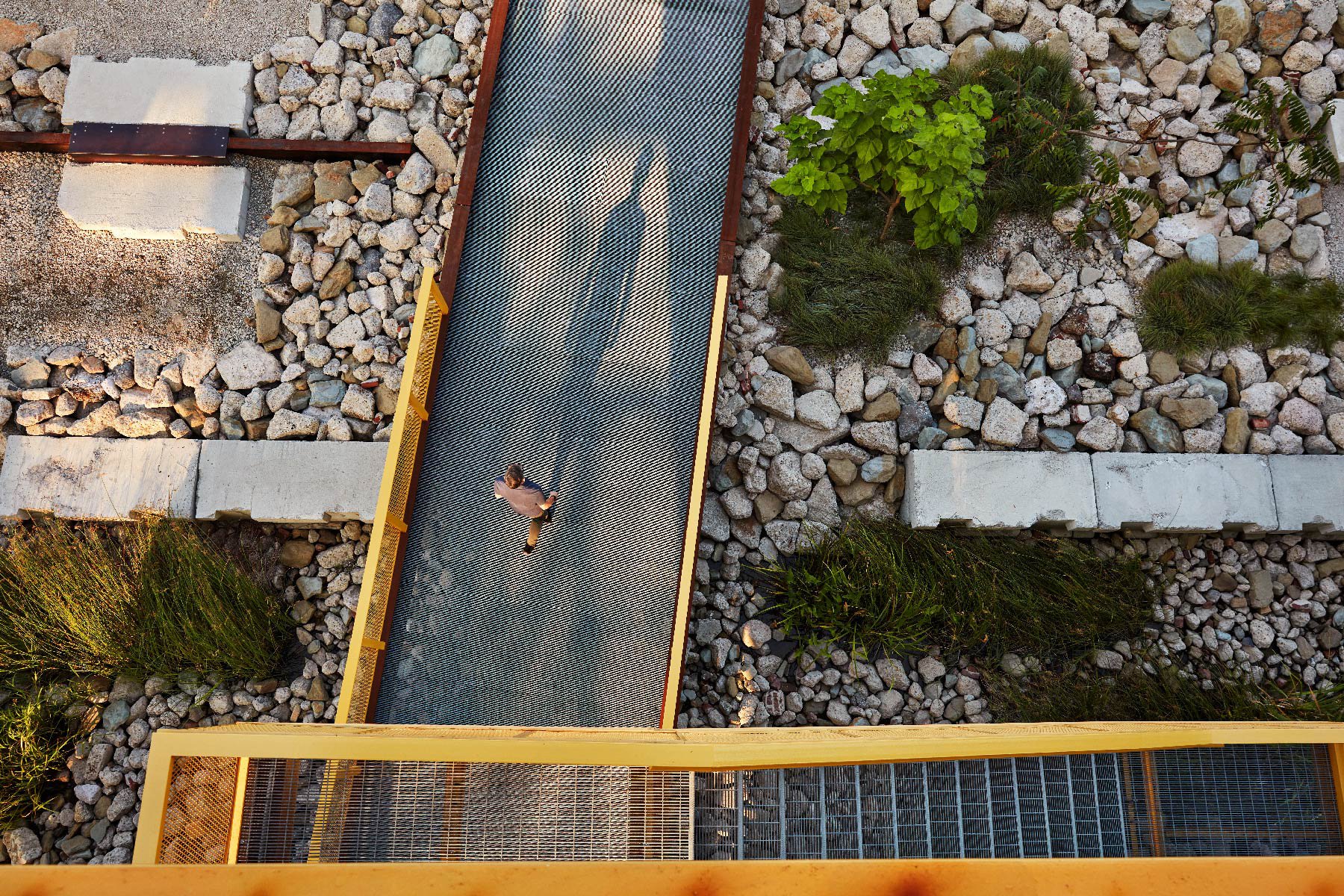
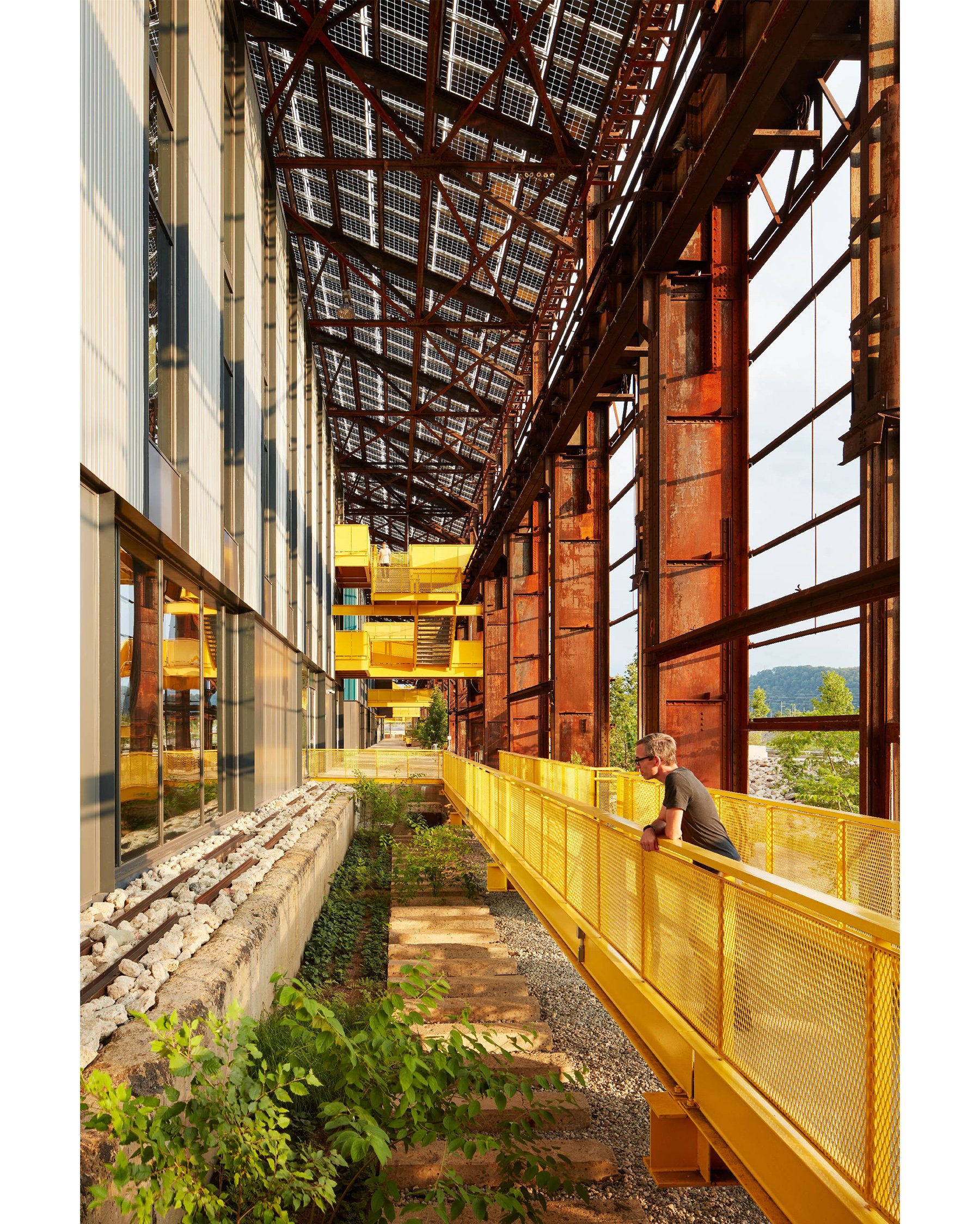
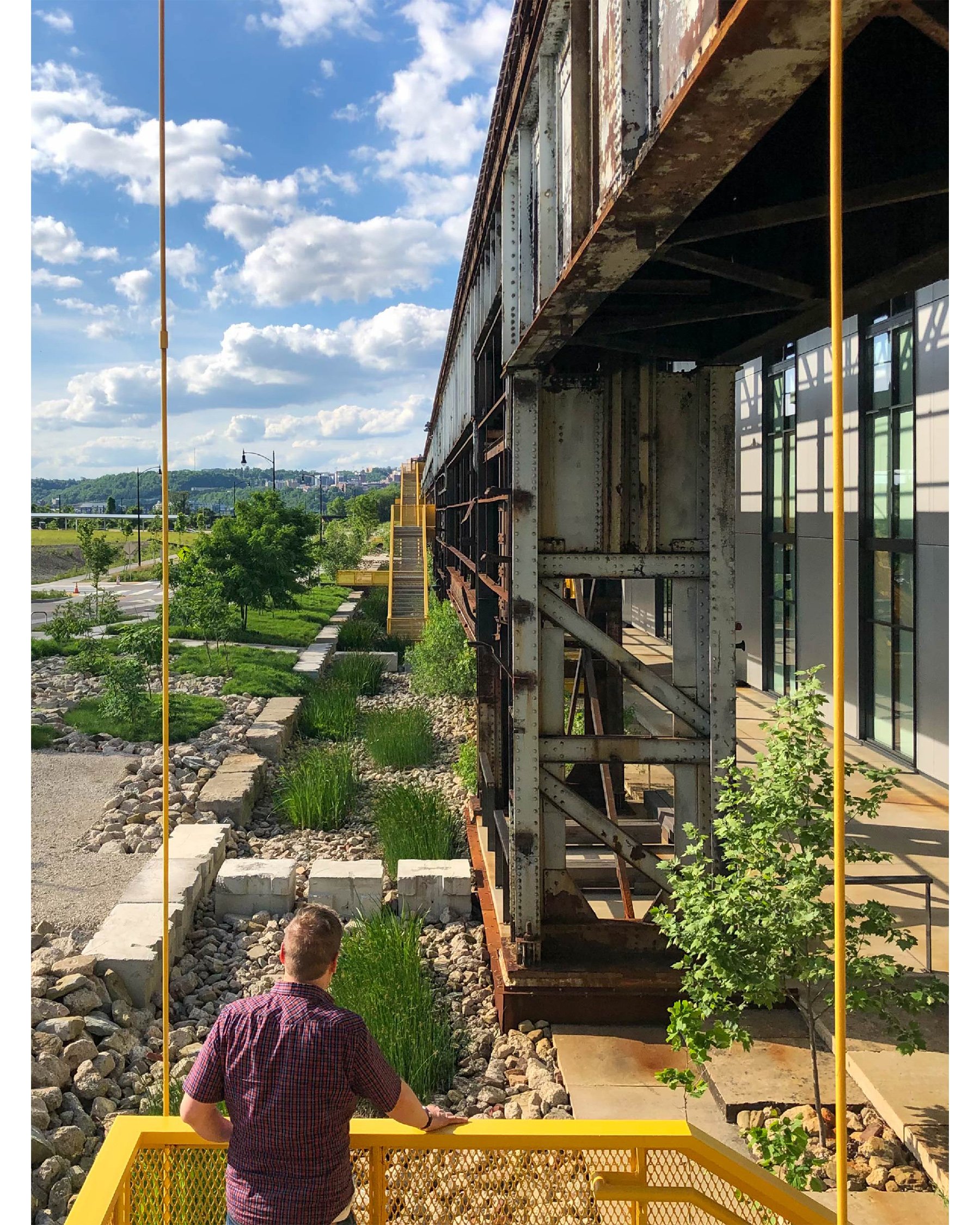
Photos 1–9: Mill 19 is the first completed project within Hazelwood Green in Pittsburgh, the redevelopment of a 170-acre brownfield site on the Monongahela River into a mixed-use innovation district. Photos by Gaffer Photography.
Fittingly, your last major project before retirement—RIDC Mill 19 in Pittsburgh—was another adaptive reuse of a mill relic on a river. It too features a striking interplay of yesterday and today, and it too was planned to help spark economic revival. But Mill 19 is all about renewable energy and environmental stewardship.
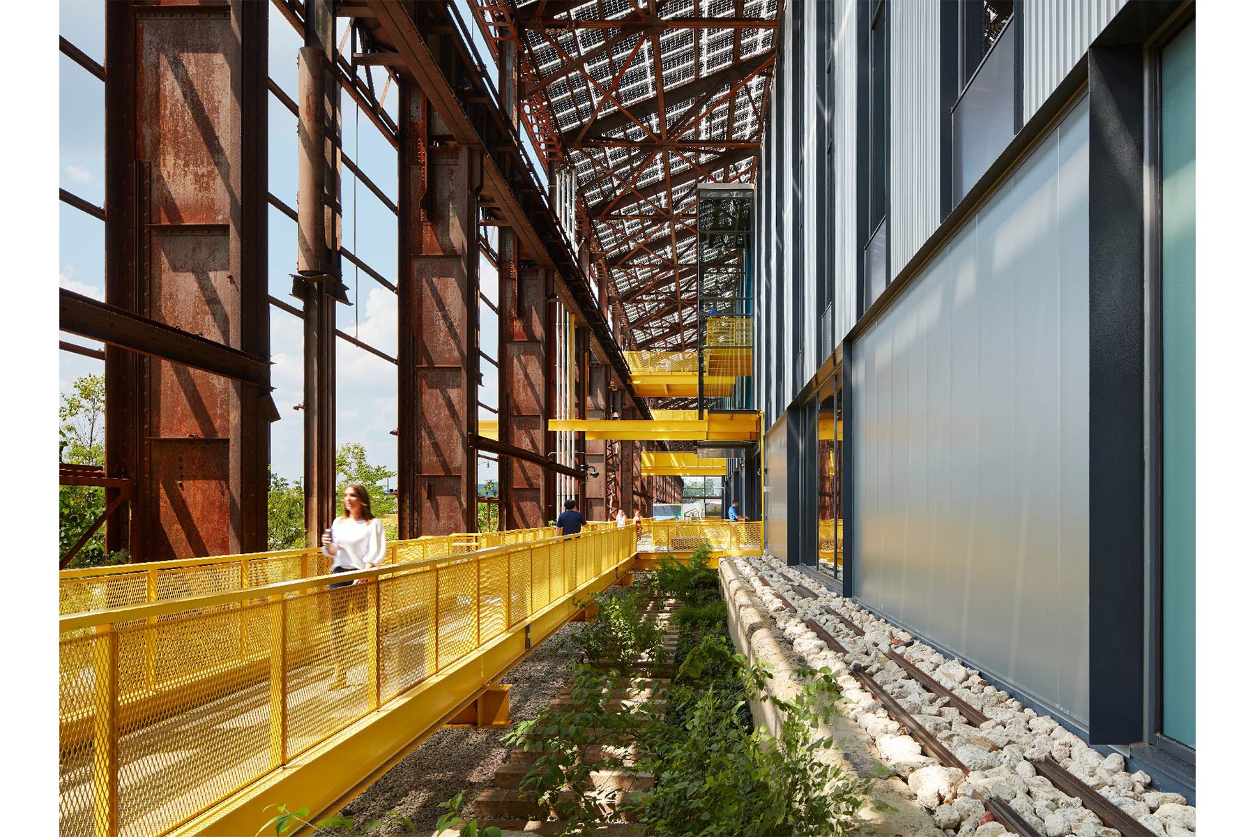
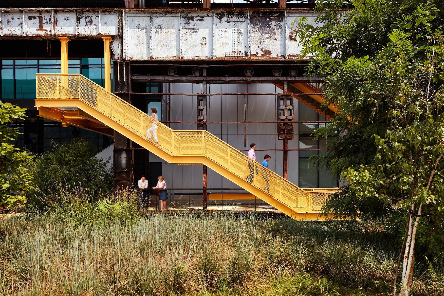
We went all-in on the design competition for that project because it was an adaptive reuse with advanced environmental performance goals, and we thought we had good ideas. It was a poetic notion, the Steel City cleaning up and reusing a 19th- and 20th-century industrial site to set itself up for the 21st century. That idea may have helped foster a mindset that was open to adventurous design, like the yellow bridges and stairs.
Different project types have different strengths and challenges. With adaptive reuse, the constraints are advantages, because they lead you in certain directions. There are elements that, from the beginning, you know you have to respect.
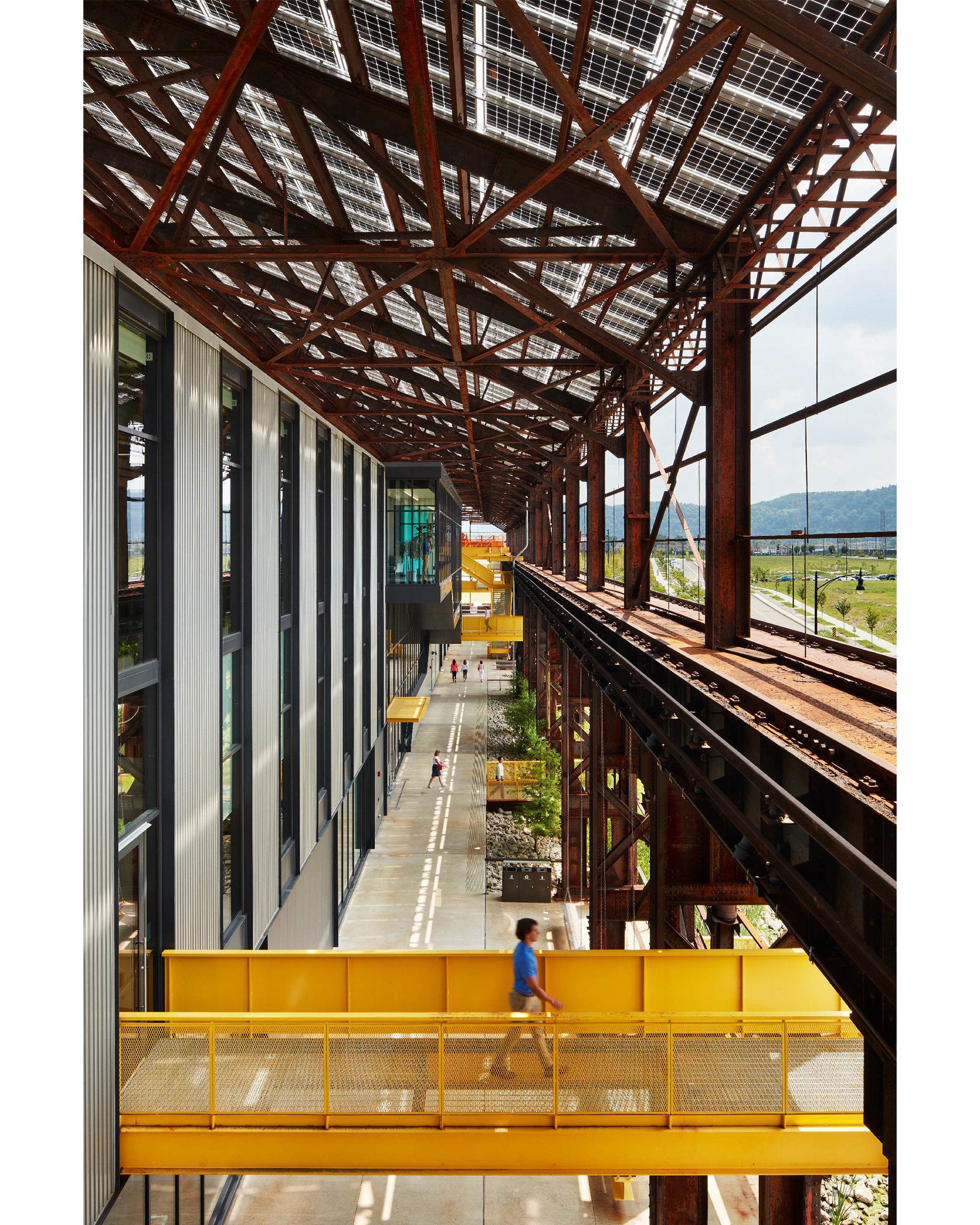
At Mill 19, the site was important. We worked with [landscape designers] D.I.R.T Studio and Ten x Ten on the competition entry, and very quickly the idea of having the landscape grow into the steel skeleton and impact the architecture became a given. When we got into the project, we saw that there were several thousand square feet of interior stairways that would only rarely be used, so we had a practical motivation to explore putting them outside. And once you do that, you start to think of precedents that might come into play, like Pompidou Centre in Paris.
Photos 1–5: The project removed the mill’s failing sheet-metal skin and created a network of plazas, elevated walkways, balconies, and gardens around the new structures that immerses tenants and visitors in the industrial ruins. Photos by Gaffer Photography.
We also knew that the new buildings inside the skeleton had to be economical, because of the money needed for the shell, and that they needed to perform. These are the roots you put down early in the project.
The interlacing of the new bridges, staircases, and balconies with the existing steel skeleton must have required a great deal of exploration and refinement.
It did. From a glance, the 1,500-foot-long structure looks to be consistently rhythmic and detailed. It reads like a music staff in a way, with all these notes and notations on it. But there are subtle differences in the music along the way, and the site slopes about 10 feet from the plaza at the south end to a retention pond at the north end. The public promenade with inside and outside vegetation carries stormwater down that slope.
There was a lot of editing having to do with where a bridge comes out, for example, and how it meets the variations in the structure as it goes along. Does the stair here go straight down or does it double back? If it doubles back, does it land at a landscape place, or is it just about getting people to the ground? If you look closely, you’ll see little variations based on circumstance and others based on composition.
Adaptive reuses that interweave past and present seem to have a special power to stir the imagination.
If you think about it, we wander through buildings and cities unmindful [of our surroundings] for the most part. And architecture should reward our unmindful experience of it. But once in a while, something brings us out of that unmindfulness, and we feel ourselves fully present in a place at a moment in time. Architecture can bring us to a higher state.
Looking forward 20 years, what challenges and opportunities will your successors at MSR Design likely be navigating?
One of the things I’m most proud of is that MSR Design is now a leading firm nationally in its capability to do high-performance buildings. Think ahead another 20 years, and that work is only going to become more important.
Buildings need to be smaller, more efficient. Net-zero energy and passive house are going to be the standards—if they aren’t, we’re sunk. And that’s going to require another increment of leadership, education, and tools, as well as clients to support it. On a good day, I’m optimistic.


